In this article, you’ll find out how to use the HTML disabled boolean attribute, toggle it with JavaScript and style disabled form controls.
Summary
- The HTML
disabledboolean attribute - Toggle the
disabledstate with JS - Style the
disabledform controls
The HTML disabled boolean attribute
According to WHATWG, the HTML disabled attribute is supported by a limited group of HTML elements and by the newly introduced form-associated custom elements:
buttonfieldsetoptgroupoptionselecttextareainput
In this article we’ll be focusing on the basic HTML elements only, so here’s a checkbox input which has a disabled attribute:
<input type="checkbox" id="check" name="check" disabled>
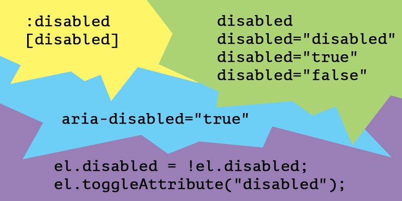
<label for="check">Checkbox</label>Note that setting a value for the disabled attribute is not really required, due to its boolean logic. Therefore, considering the presence of a boolean attribute on an element, all the below values are redundant and the outcome is a disabled behavior anyway:
disabled="disabled"disabled="true"disabled="false"disabled="whatever"
Disabled fieldset
The HTML fieldset element is used to group several controls within a web form. If the boolean disabled attribute is set on the fieldset, then all the form controls contained within will become disabled too.
Here’s an example with both of the form controls being disabled due to being wrapped by a disabled fieldset element.
<form>
  <fieldset disabled>
    <legend>Disabled fieldset</legend>
    <div>
      <label for="name">Name</label>
      <input type="text" id="name" value="Chris">
    </div>
    <div>
      <label for="pwd">Password</label>
      <input type="password" id="pwd" value="topsecret">
    </div>
  </fieldset>
</form>
disabled != readonly
Comparing to the readonly form controls, the disabled ones are not submitted within a form, therefore they are also ignored when it comes to form validation. Also, the disabled form controls are not focusable either.
The aria-disabled attribute
If you can use a native HTML element or attribute with the semantics and behavior you require already built in, instead of re-purposing an element and adding an ARIA role, state or property to make it accessible, then do so.
from W3C
When using an HTML element, such as a form control, which natively supports the disabled boolean attribute, you don’t need the aria-disabled attribute.
Steve Faulkner wrote a good piece on the disabled/aria-disabled attributes so you should go check it out!
Toggle the disabled state with JS
You can take advantage of the fact that the .disabled property returns a boolean value so you can toggle it easily using the following:
let el = document.querySelector(".myFormControl");
el.disabled = !el.disabled;
Also, besides the classic removeAttribute() and setAttribute() methods, you can use the toggleAttribute() method to toggle the disabled attribute or any other boolean attribute. Although the browser support is not perfect, this might come in handy:
let el = document.querySelector(".myFormControl");
el.toggleAttribute("disabled");
Firing events
Speaking of disabled elements and JavaScript, Jake Archibald wrote an interesting piece on firing events on disabled form controls, in which he argues about the need to use pointer-events: none on all the :disabled elements.
With better browser support for the :is() (formerly :any() or :matches(), as @SelenIT2 pointed out) CSS pseudo-class, here’s how we could write a bulletproof CSS rule, to prevent interaction and event issues on the disabled form controls:
:disabled:is(
button,
optgroup,
option,
select,
textarea,
input
) {
  pointer-events: none;
}
The fieldset element is excluded in the above rule in order to avoid breaking other elements or title attributes wrapped within it.
Style the disabled form controls
There are two ways to select a disabled element using CSS:
-
The old
[disabled]attribute selector can be used for any HTML element user that has adisabledattribute, and it doesn’t really have to be a form control element. -
The
:disabledpseudo-class, introduced in Selectors Level 3, is the preferred method to select a disabled element, due to the fact it matches HTML elements that support thedisabledattribute only.
“disabled” links
Links are not buttons, neither divs, spans or whatever. Still, an a element can act as a placeholder link when it’s used without its href attribute.
If the
aelement has no href attribute, then the element represents a placeholder for where a link might otherwise have been placed.From WHATWG
We know that the :disabled CSS pseudo-class only applies to form controls that natively support a disabled attribute and the a element is not among them.
Therefore, the following CSS rule contains both the [disabled] attribute selector and the .disabled class selector. You know, just in case you want, need, or have to use <a disabled>...</a> instead of <a class="disabled">...</a> in a certain situation.
.disabled,
[disabled] {
  pointer-events: none;
  cursor: not-allowed;
  opacity: .7;
}
If you’re wondering why would you even disable link elements, there is a scenario I’m having in mind and I’m sure you also did stumble upon this before:
Let’s say you have an active item within a navigation, showing it’s the active URL in that navigation. Now, besides the active styles applied to it, you might also want to prevent the user clicking and refreshing that already active page he’s on.
Default User Agent disabled styles
In case you’re wondering where all those default disabled styles come from, here’s a list with the most popular User Agent styles, feel free to dive in:
Conclusion
- The IE 11 and below don’t fully support the boolean
disabledattribute on afieldset. - When adding the CSS
pointer-events: nonedeclaration to a link, in an attempt to disable it, you should also think of applyingtabindex="-1"in order to take it out of the tab order. - There is no good reason to use the CSS
[disabled]attribute selector in favor of the:disabledpseudo-class. Perhaps needing IE6 - IE8 support and that’s definitely not a good reason. - Comparing to the boolean
disabledattribute, thearia-disabled, when set as an attribute, does require a value of eithertrueorfalse. - If
aria-disabled="false"is set on a form control along with thedisabledattribute, then the latter has greater specificity and thearia-disabledattribute gets ignored.