You can now create stunning animations with CSS3. But, I bet you know that. The keyword when it comes about CSS3 animations is the CSS3 @keyframes rule and in this article you will learn how to create an awesome CSS3 animated header using it.

… also, you can download the .psd concept.
The HTML
The markup is minimal and quite self explanatory. Please, don’t blame me for divitis. :)
<div class="header">
<div class="wrapper">
<div class="christmas-tree tree1"></div>
<div class="christmas-tree tree2"></div>
<div class="christmas-tree tree3"></div>
<div class="snowman"></div>
<div class="christmas-tree tree4"></div>
<div class="christmas-tree tree5"></div>
<div class="christmas-tree tree6"></div>
</div>
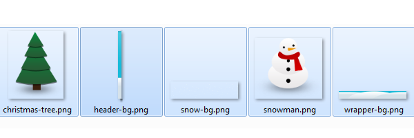
</div>Image resources
Below, you can find the images you will use in order to create the header:
The CSS
As you read at the beginning of this article, the @keyframes rule does all the magic. Also, to keep the following code as clean as possible, I will not add the prefixed versions too (-moz-, -webkit-, -ms-).
You can find the full CSS3 code when viewing page source for the demo.

To achieve the snow effect, you will need to animate the background-position property for the first .header background. As a quick note, for the browsers that do not support multiple backgrounds, the snow will not be visible for this example.
.header{
    margin: 0 0 30px;
    background: url(header-bg.png);
    background: url(snow-bg.png) repeat-y center, url(header-bg.png);
    animation: animate-snow 9s linear infinite;
}

@keyframes animate-snow
{
    0% { background-position: center 0, 0 0;}
    100% { background-position: center 885px, 0 0;}
}
The .wrapper element basically holds all our Christmas trees together with the snowman. Please note the position: relative declaration:
.wrapper{
    width: 960px;
    height: 315px;
    margin: auto;
    overflow: hidden;
    position: relative;
    background: url(wrapper-bg.png) no-repeat bottom;
}
For the Christmas trees, the animation-duration value was randomly changed in order to create a cool effect:
@keyframes animate-drop {
    0% {opacity:0;transform: translate(0, -315px);}
    100% {opacity:1;transform: translate(0, 0);}
}

.christmas-tree,
.snowman {
    position: absolute;
    animation: animate-drop 1s linear;
}

.christmas-tree {
    width: 112px;
    height: 137px;
    background: url(christmas-tree.png);
}

.snowman {
    width: 115px;
    height: 103px;
    top: 195px;
    left: 415px;
    background: url(snowman.png);
    animation-duration: .6s;
}

.tree1 {
    top: 165px;
    left: 35px;
    animation-duration: .6s;
}

.tree2 {
    left: 185px;
    top: 175px;
    animation-duration: .9s;
}

.tree3 {
    left: 340px;
    top: 125px;
    animation-duration: .7s;
}

.tree4 {
    left: 555px;
    top: 155px;
    animation-duration: .8s;
}

.tree5 {
    left: 710px;
    top: 170px;
    animation-duration: .7s;
}

.tree6 {
    left: 855px;
    top: 125px;
    animation-duration: .6s;
}
Browser support
Here’s the support at this time: Firefox 5+, IE 10+, Chrome 6+, Safari 5+. For non-supported browsers, you don’t have to worry, everything will be just fine as long as you provide decent fallbacks.
Why to use animations?
Simple answer: to draw the user’s attention. Get inspired by another example, here is one of my previous articles, where I also used CSS3 keyframes: Cool notification messages with CSS3 & jQuery.
Happy Holidays!
We’re getting close to New Year’s and, with this article, I want to wish you all the best and Happy Holidays. Thank you all for reading my articles!