For whatever reason, people seem to be passionate about removing the textarea resize handle using the CSS resize: none declaration. Also, GitHub says there are more than 3 million code results in the wild for textarea with CSS resize:none applied.

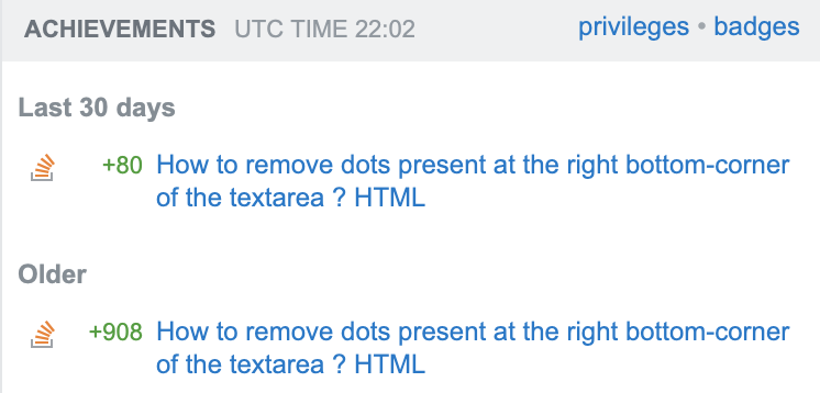
I’m on Stack Overflow and feel kind of embarrassed about building reputation on recommending other people in the past to use CSS resize: none on textareas. I’m not a power user but back in 2011, I did post an answer on Stack Overflow on removing the bottom-right corner dots in a textarea. Also, the thing is that I still keep getting Stack Overflow reputation on that answer.

Never start an answer with just and never recommend other people to use CSS resize: none in their stylesheets. You can do better than me!
CSS resize:none on textarea is bad UX
I think using the CSS resize:none declaration on a textarea is a bad decision when it comes to the user experience (UX) overall.
Very often, the textarea is limited to a number of rows and columns or it has fixed width and height defined via CSS. Based solely on my own experience, while answering to forums, writing contact forms on websites, filling live chat popups or even private messaging on Twitter this is very frustrating.
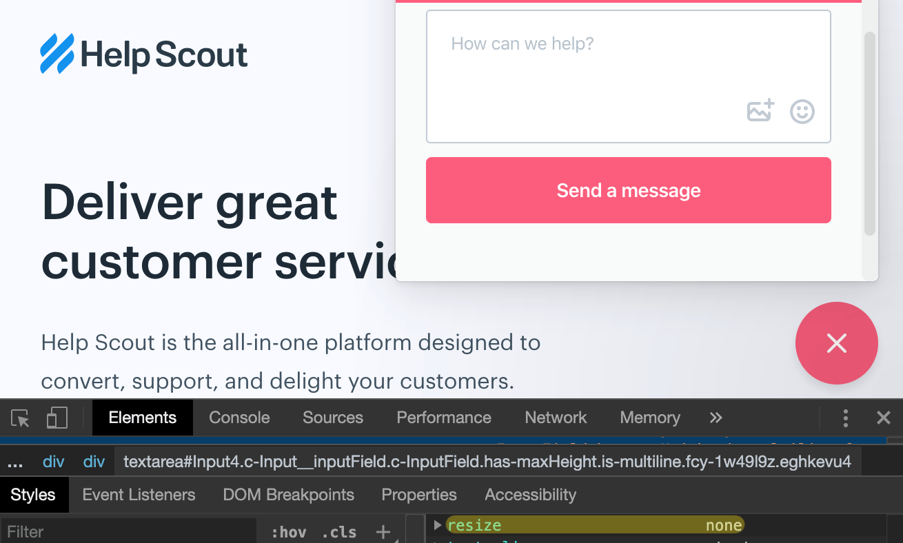
Sometimes you need to type a long reply that consists of many paragraphs and wrapping that text within a tiny textarea box makes it hard to understand and to follow as you type. There were many times when I had to write that text within Notepad++ for example and then just paste the whole reply in that small textarea. I admit I also opened the DevTools to override the resize: none declaration but that’s not really a productive way to do things.
The CSS resize
According to MDN, the resize CSS property sets whether an element is resizable, and if so, in which directions. Also, it’s important to keep in mind that the resize property does not apply to the inline elements and block elements for which the overflow property is set to visible.
The CSS resize property is often applied to textarea in order to disable its resizability and this is what this article is about. I felt like an inner contradiction considering the amount of reputation I keep getting on my above Stack Overflow answer while finding on my own this bad UX. Besides that, it looks like the number of GitHub code results on this matter is growing, from 2 millions in 2017 as found by @humphd to more than 3 millions two years later.
Auto height textareas
A common scenario is to have an auto-height textarea element which basically expands as you type new rows. On this matter, Chris Ferdinandi wrote a good article on how to expand a textarea as the user types.
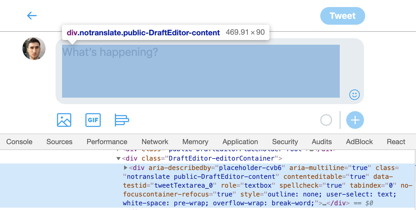
But besides the above, I’ve seen lots of JS hacks that involve using the CSS resize: none declaration. There are alternatives to simulate the ‘textarea’ behavior and a popular one is using the classic div with the boolean contentEditable attribute value set to true.
<div contentEditable="true"></div>Here’s a more detailed and hopefully accessible example using ARIA roles on Twitter’s mobile version:

Fancy live chats a.k.a resize: none everywhere
Because it’s a fancy new live chat widget and it’s a really high competition out there, everyone wants the most visually pleasing, catchy and cool box where to send a message from.
While most live chat apps use the classic HTML textarea element, the implementations mostly rely on having listeners and adjust the CSS height style based on the text contained within the box, with resize: none declaration remaining, unfortunately, a constant presence in the CSS.

So, why resize: none is so popular in this case?
To answer myself here, maybe if I’d have to write code for a popular live chat app, I wouldn’t want a textarea resize handle to ruin my beautiful component design freshly imported from Figma. Would I?
I guess I’d stick with resize: vertical at the least, instead of ruining everything with resize: none. Šime Vidas also tweeted that resize: vertical is robust enough, and it’s cross browser.
Conclusion
You must really hate your users if textarea {resize: none} is in your stylesheets. CSS resize none is bad for UX and you already know it:
Websites (@Uservoice) that add resize: none; to their textarea's. I don't want to deal with excessive word wrapping, getting 4 words per line on my 24 inch monitor. Why are you so worried about me doing that, that you add this CSS rule? @SuckyUX1
— Richard M Boos (@richboos) April 3, 2019
@AngelListCare can you remove resize: none and increase default height on textarea in /inbound messages when you are talking to candidates as a startup? It's TOO SMALL.
— Mev-Rael (@Mevrael) June 6, 2018
#css There's a website I use often that, for text boxes, has "resize: none" enabled for the TEXTAREA. Since the text box is really small, is there a way disable this on the domain entirely instead of doing it page by page? https://t.co/fh6ITQqdFp
— Dzmitry Radkevich (@gradar) May 16, 2018
next time I see a website with "resize: none" in their CSS for a textarea I expect a two page essay what the thought process behind it was
— Alexander Prinzhorn (@Prinzhorn) February 23, 2018
Dear @PeoplePerHour, if you're going to give me a really small textarea where I'm likely going to want to write a few paragraphs, at least remove the `resize:none` CSS so I can make it bigger myself. Cheers. 🤔 pic.twitter.com/iva97ezXQt
— Luke Harrison (@WebDevLuke) November 26, 2017
Putting `resize: none;` on a <textarea> is criminal behaviour. And yet "Showing 1,960,901 available code results" https://t.co/kCXhfz7MzM
— David Humphrey (@humphd) September 22, 2017
you can explain to the web department that a textarea should never have a "resize:none;" property :)
— Louis Hoebregts (@Mamboleoo) June 10, 2016