It happens pretty often to encounter situations when you don’t like a default style for an HTML element. The methodology that has proven to be reliable over time is to use the so-called CSS utility classes. Their purpose is to allow you to quickly make HTML class adjustments until the result looks just right.
In this article, we’ll try to walk through the naming conventions that various frameworks and design systems use when it comes to typography, especially headings sizing.
CSS utility classes
The utility classes, sometimes called helpers, are simple and reusable CSS class selectors that apply a certain and clear rule in your design system.
For example you may think about the well known .float-right, .list-unstyled, .clearfix or .visually-hidden utilities.
The .h1 to .h6 naming convention
I remember I had an Aha! moment the first time I ever saw the above naming convention. Ever since then, whenever it comes to typography for a new project, I often try to build my styles using utilities like .h1 to .h6.
  <h2 class="h1">
    Keep semantics but alter the visual appearance.
  </h2>
In other words, this translates to: I want a larger font size for the h2, please make it look like an h1. That’s actually a fair compromise between semantics, thus SEO and visual appearance requirements.
Origins
While trying to beat procrastination and start writing this article down, I was curious to find out the above naming convention origins.
The truth is I didn’t know for sure who came up first with this naming convention idea. So I asked on Twitter. This almost never disappoints. Sven correctly pointed out that it was OOCSS.
How did I not know or guessed that? Of course, it had to be OOCSS!
Object-oriented CSS or OOCSS is a methodology developed by Nicole Sullivan, that helps writing write fast, lightweight and maintainable CSS by treating HTML elements as objects, giving all these objects classes.
We now have ACSS, BEM, SMACSS or SUIT CSS but it all started with OOCSS at Web Directions North in 2009.
Regarding the above question I asked on Twitter, Nicole wrote a very interesting short story on how these heading naming conventions became a thing. You should go read it.
OOCSS
  h1, .h1 { ... }
  h2, .h2 { ... }
  h3, .h3 { ... }
  h4, .h4 { ... }
  h5, .h5 { ... }
  h6, .h6 { ... }
Getting back to this article’s topic, it seems that defining heading styles using the OOCSS methodology is widely adopted nowadays.
At the moment of this writing, many frameworks and design guides are using it:
Let’s go further and see other approaches (in random order) when it comes to typography and heading utilities.
inuitcss
  h1, .alpha { ... }
  h2, .beta { ... }
  h3, .gamma { ... }
  h4, .delta { ... }
  h5, .epsilon { ... }
  h6, .zeta { ... }
I’m not such a fan of the
.hNnotation, I much prefer a solution that I believe to have been suggested by Mr Jeremy Keith, and that is to use abstract classes made up of the first six letters of the Greek alphabetHarry Roberts on font sizing in CSS
Bulma
  .title.is-1 { ... }
  .title.is-2 { ... }
  .title.is-3 { ... }
  .title.is-4 { ... }
  .title.is-5 { ... }
  .title.is-6 { ... }
  .title.is-7 { ... }
As their documentation states, there are 2 types of headings: .title and .subtitle. But the interesting fact, in my opinion, is the seventh size available.
On a side note, in a recent HTML study I made, I did found 21,403 h7 HTML elements within 8 million web pages.
Lightning Design System
  .slds-text-heading_large { ... }
  .slds-text-heading_medium { ... }
  .slds-text-heading_small { ... }
All headings (h1–h6) are reset to the base (body text) size, with margins and padding reset to zero. When building an enterprise application, the heading level may vary depending on the context of the component or page. Using the correct heading level is important for accessibility.
Atomic CSS
  .Fz(18px) { font-size: 18px; }
  .Fz(20px) { font-size: 20px; }
  .Fz(24px) { font-size: 24px; }
  /* etc. */
Atomizer creates CSS style declarations based on Atomic classes it finds in your project.
When it comes to Atomic CSS, the Atomizer tool generates your style sheets based on how you’re writing the HTML classes.
BBC’s GEL
  .gel-canon { ... }
  .gel-trafalgar { ... }
  .gel-double-pica { ... }
  .gel-great-primer { ... }
  .gel-pica { ... }
  .gel-long-primer { ... }
  .gel-brevier { ... }
  .gel-minion { ... }
Each size is given a name derived from traditional type measuring techniques dating back to as early as 1582.
Shaun Bent on CSS at BBC
ALUX
  .gigantic { ... }
  .huge, h1 { ... }
  .large, h2 { ... }
  .bigger, h3 { ... }
  .big, h4 { ... }
  .normal, h5 { ... }
  .small, h6, small { ... }
Expressive CSS
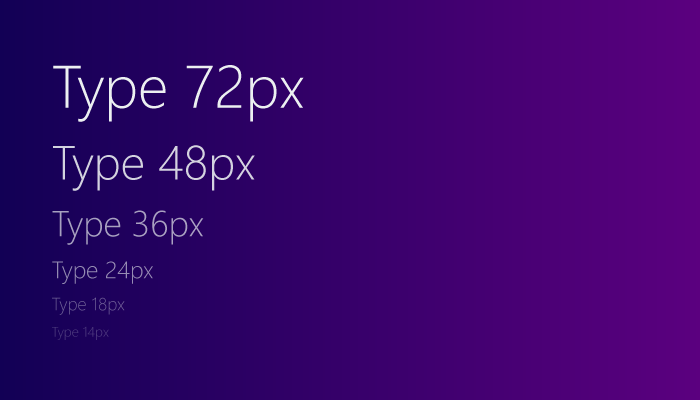
  .text-48 { ... }
  .text-36 { ... }
  .text-24 { ... }
  .text-18 { ... }
  .text-16 { ... }
  .text-14 { ... }
  .text-12 { ... }
  .text-11 { ... }
  .text-10 { ... }
Solid
  h1, .xs-text-1 { ... }
  h2, .xs-text-2 { ... }
  h3, .xs-text-3 { ... }
  h4, .xs-text-4 { ... }
  h5, .xs-text-5 { ... }
  h6, .xs-text-6 { ... }
Header sizes are defined from
h1toh6. Additionally, Solid provides responsive prefixed utility classes ranging from.xs-text-1to.xs-text-6for sizing blocks of text. For the same font size across devices, use the default.xs-text-nclass. Headers and text sizing classes have no margins or padding by default.
Tachyons
  .f-headline { ... }
  .f-subheadline { ... }
  .f1 { ... }
  .f2 { ... }
  .f3 { ... }
  .f4 { ... }
  .f5 { ... }
  .f6 { ... }
Marvel
  .fontSize-xxl { ... }
  .fontSize-xl { ... }
  .fontSize-m { ... }
  .fontSize-s { ... }
  .fontSize-xs { ... }
What about the others?
Other popular frameworks like Pure CSS, Milligram or Skeleton don’t use CSS utilities at all when it comes to headings sizes.
Puzzled about
While doing some research on this article, I stumbled upon some misleading or not so up to date style guides.
MailChimp
The MailChimp website headings and utilities seem to have nothing to do with their own typography style guide.
Instead, they seem to use the following convention in their style sheets.
  .super_title { ... }

  .title,
  .normalize h1,
  .normalize .title,
  .page-title { ... }

  .heading,
  .normalize h2,
  .normalize .heading,
  .page-subtitle { ... }

  .subheading,
  .normalize h3,
  .normalize h4,
  .normalize h5,
  .normalize h6,
  .normalize .subheading { ... }
GitHub’s Primer
The GitHub’s Primer uses .h1 – .h6 to change an elements font size and weight while relying on some typography SCSS variables:
  // Heading sizes - mobile
  $h00-size-mobile: 40px;
  $h0-size-mobile: 32px;
  $h1-size-mobile: 26px;
  $h2-size-mobile: 22px;
  $h3-size-mobile: 18px;

  // Heading sizes - desktop
  $h00-size: 48px;
  $h0-size: 40px;
  $h1-size: 32px;
  $h2-size: 24px;
  $h3-size: 20px;
  $h4-size: 16px;
  $h5-size: 14px;
  $h6-size: 12px;
Conclusion
Whilst this article is about sizing only, a comparison in terms of semantics and accessibility between let’s say grids, buttons or maybe form elements is something that would be interesting to see.