I didn’t know about this CSS property until a while ago, when I stumbled it upon it while reading Ire Aderinokun’s article on Localisation and Translation on the Web.
The demo
If you’re in a hurry, here’s the demo, make sure you resize the viewport in order to trigger the defined CSS media query.
The writing-mode property
The writing-mode CSS property defines whether lines of text are laid out horizontally or vertically, direction too. You can read more about it on MDN.
So, while thinking about a use case scenario, at that time Smashing Magazine’s latest website design went live. So I opened up DevTools to see how things were being crafted, we’re all curious by nature, aren’t we? While inspecting things around, I noticed the below section titles design:
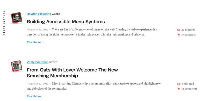 Take a look at the vertical popular posts title
CSS
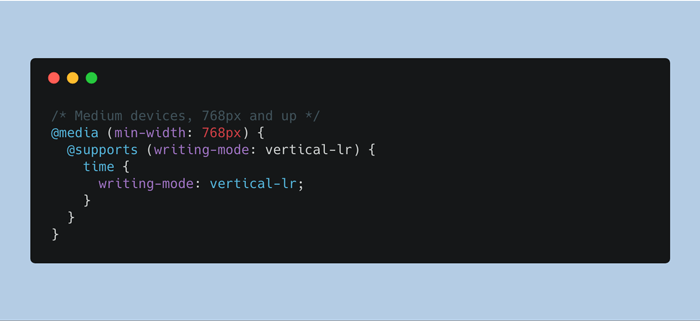
I was now having a use case scenario, so I made a CodePen demo that showcases it. Basically, the demo consists of a responsive time element that shifts by 90deg on medium and large resolutions and stacks otherwise.
/* 1 */
@media (min-width: 768px) {
  /* 2 */
  @supports (writing-mode: vertical-lr) {
    /* 3 */
    time {
      writing-mode: vertical-lr;
      float: left;
      margin-left: -2rem;
      white-space: nowrap;

      /* 4 */
      &::before {
        content: '';
        display: inline-block;
        width: 1ch;
        height: 3rem;
        margin: 10px 0;
        background: linear-gradient(currentColor, currentColor)
                    no-repeat center / 1px 100%;
      }
    }
  }
}- Apply styling on medium devices and up, when there’s enough space.
- Use CSS feature detection to avoid breaking up things in non-supporting browsers.
- Lay down vertically the
timeelement, add some whitespace too. - Add a subtle line using linear gradient.
If I’ll ever beat procrastination, anytime soon maybe, I will use this snippet in my future website redesign. Until then, make sure you check out the CodePen demo.