While this is still a working solution, I made an improved and animated version of this dropdown menu. Check out the CSS3 animated dropdown menu article!
Today you’ll learn how to create your own CSS3 dropdown menu, without any additional Javascript code. There are no images used and, as usual, minimal HTML markup. Let’s see how is made:
If you’re in a hurry, here’s the result:
HTML structure
As you can see in the following lines, the HTML structure does not contain more than we need, it’s a minimal one and easy to understand.
<ul id="menu">
    <li><a href="#">Home</a></li>
    <li>
        <a href="#">Categories</a>
        <ul>
            <li><a href="#">CSS</a></li>
            <li><a href="#">Graphic design</a></li>
            <li><a href="#">Development tools</a></li>
            <li><a href="#">Web design</a></li>
        </ul>
    </li>
    <li><a href="#">Work</a></li>
    <li><a href="#">About</a></li>
    <li><a href="#">Contact</a></li>
</ul>
One more thing, also very important, this is semantic HTML. It’s a logical structure and has a correct meaning, even if styling is totally missing at this point:
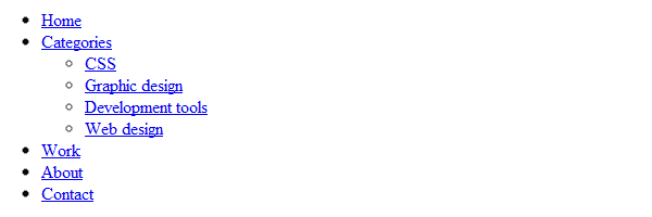
Clean and accessible HTML structure
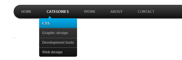
In my example, the “Categories” section is the only one who contains a sub-list, but you can easily add sub-lists to any item.
The CSS
/* Main */
#menu {
    width: 100%;
    margin: 0;
    padding: 10px 0 0 0;
    list-style: none;
    background-color: #111;
    background-image: linear-gradient(#444, #111);
    border-radius: 50px;
    box-shadow: 0 2px 1px #9c9c9c;
}

#menu li {
    float: left;
    padding: 0 0 10px 0;
    position: relative;
}

#menu a {
    float: left;
    height: 25px;
    padding: 0 25px;
    color: #999;
    text-transform: uppercase;
    font: bold 12px/25px Arial, Helvetica;
    text-decoration: none;
    text-shadow: 0 1px 0 #000;
}

#menu li:hover > a {
    color: #fafafa;
}

*html #menu li a:hover { /* IE6 */
    color: #fafafa;
}

#menu li:hover > ul {
    display: block;
}

/* Sub-menu */
#menu ul {
    list-style: none;
    margin: 0;
    padding: 0;
    display: none;
    position: absolute;
    top: 35px;
    left: 0;
    z-index: 99999;
    background-color: #444;
    background-image: linear-gradient(#444, #111);
    -moz-border-radius: 5px;
    border-radius: 5px;
}

#menu ul li {
    float: none;
    margin: 0;
    padding: 0;
    display: block;
    box-shadow: 0 1px 0 #111111,
                0 2px 0 #777777;
}

#menu ul li:last-child {
    box-shadow: none;
}

#menu ul a {
    padding: 10px;
    height: auto;
    line-height: 1;
    display: block;
    white-space: nowrap;
    float: none;
    text-transform: none;
}

*html #menu ul a { /* IE6 */
    height: 10px;
    width: 150px;
}

*:first-child+html #menu ul a { /* IE7 */
    height: 10px;
    width: 150px;
}

#menu ul a:hover {
    background-color: #0186ba;
    background-image: linear-gradient(#04acec, #0186ba);
}

#menu ul li:first-child a {
    border-radius: 5px 5px 0 0;
}

#menu ul li:first-child a:after {
    content: '';
    position: absolute;
    left: 30px;
    top: -8px;
    width: 0;
    height: 0;
    border-left: 5px solid transparent;
    border-right: 5px solid transparent;
    border-bottom: 8px solid #444;
}

#menu ul li:first-child a:hover:after {
    border-bottom-color: #04acec;
}

#menu ul li:last-child a {
    border-radius: 0 0 5px 5px;
}

/* Clear floated elements */
#menu:after {
    visibility: hidden;
    display: block;
    font-size: 0;
    content: " ";
    clear: both;
    height: 0;
}

* html #menu             { zoom: 1; } /* IE6 */
*:first-child+html #menu { zoom: 1; } /* IE7 */
Quite long list, huh? This is it…
CSS shape
You may have noticed the triangle shape that appears along with the sub-menu. That’s a CSS triangle shape and its purpose is to increase usability for this CSS3 dropdown menu.

It’s made using the ::after pseudo-element:
#menu ul li:first-child a:after {
    content: '';
    position: absolute;
    left: 30px;
    top: -8px;
    width: 0;
    height: 0;
    border-left: 5px solid transparent;
    border-right: 5px solid transparent;
    border-bottom: 8px solid #444;
}

#menu ul li:first-child a:hover:after {
    border-bottom-color: #04acec;
}
Taming the IE6 “beast”
The sub-menu is displayed when hovering on a li element. As you already know, IE6 doesn’t support hovering on a non-anchor element.
Although, at the beginning of this article I said “without any Javascript”, in order maintain accessibility also for IE6, please allow me to add some scripting code:
<script type="text/javascript" src="https://code.jquery.com/jquery-latest.min.js"></script>
<script type="text/javascript">
    $(function() {
      if ($.browser.msie && $.browser.version.substr(0,1)<7)
      {
        $('li').has('ul').mouseover(function(){
            $(this).children('ul').show();
            }).mouseout(function(){
            $(this).children('ul').hide();
            })
      }
    });
</script>
The above solution requires Jquery. Also, I think this shouldn’t be a problem at all, while, nowadays Jquery is almost “a default” when talking about modern websites.
Target IE6 & IE7 browsers
Besides this Jquery fallback, the above CSS includes some lines specifically for IE6 and IE7:
* html #menu             { zoom: 1; } /* IE6 */
*:first-child+html #menu { zoom: 1; } /* IE7 */
There are also other IE hacks that won’t pass CSS file validation… If you don’t like it this way, just use conditional comments!
That’s it
Hope you enjoyed this tutorial, don’t forget to leave a comment!
Later edit
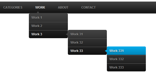
Just as I promised, the CSS3 dropdown menu is now a multi-level one. Please check the demo page to see the updated version:
Another update
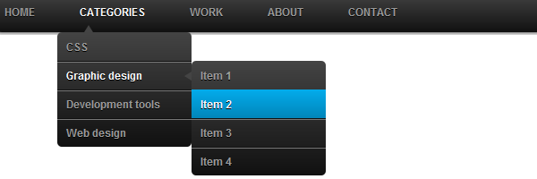
I took advantage of some free time and I updated the CSS3 dropdown menu demo: