While playing DIRT 3 - the video game, I’ve noticed a very cool triangle animation as part of their UI. Almost immediately, I thought about how to build a similar version of it using CSS3.
So, in this article, you’ll see an experiment about how to create a simple CSS3 loading animation.
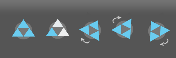
For this example, I’ll be using two CSS3 animations: one that fades the color for the triangles and one animation that rotates the whole design. These two animations, synchronized, will help to create a quite nice effect.
The HTML
Initially, I wanted to use pseudo-elements in order to have fewer markup elements. But, the thing is that generated content can’t be animated yet in other browsers than Mozilla Firefox.
Here’s how the markup looks like:
  <div class="loading-wrap">
    <div class="triangle1"></div>
    <div class="triangle2"></div>
    <div class="triangle3"></div>
  </div>
The CSS
There are some things you may find interesting here:
-
For a nice color fade across all three triangles, you need to increment the animation-delay.
-
Notice the gap between
20%and100%for the rotation keyframes. This helps to add a stop effect for the animation.
  .loading-wrap {
    width: 60px; height: 60px;
    position: absolute;
    top: 50%; left: 50%;
    margin: -30px 0 0 -30px;
    background: #777;
    animation: rotation ease-in-out 2s infinite;
    border-radius: 30px;
  }

  .triangle1,
  .triangle2,
  .triangle3 {
    border-width: 0 20px 30px 20px;
    border-style: solid;
    border-color: transparent;
    border-bottom-color: #67cbf0;
    height: 0; width: 0;
    position: absolute;
    left: 10px; top: -10px;
    animation: fadecolor 2s 1s infinite;
  }

  .triangle2,
  .triangle3 {
    content: '';
    top: 20px; left: 30px;
    animation-delay: 1.1s;
  }

  .triangle3 {
    left: -10px;
    animation-delay: 1.2s;
  }

  @keyframes rotation {
    0% {transform: rotate(0deg);}
    20% {transform: rotate(360deg);}
    100% {transform: rotate(360deg);}
  }

  @keyframes fadecolor {
    0% {border-bottom-color: #eee;}
    100%{border-bottom-color: #67cbf0;}
  }
Conclusion
This is an experiment and you must be aware of it. For now, I think an animated GIF will do the job better in most cases.
Also, this isn’t that example that advocates for using CSS3 stuff instead of images to save HTTP requests. It is not applicable here as limited browser support for CSS3 animations has something to say. Though, I hope you’ll find this example useful and inspiring for your future projects.