Styling ordered lists was always a tricky task and I’m not the only one who thinks that. To style numbers, you need to remove default browser styles and add hooks to your lists elements in order to target them and style accordingly.
In this article you’ll learn how to add some CSS3 fine-tuning to your ordered lists, using a semantic markup approach and CSS pseudo-elements.
The idea
When I first read Roger Johansson’s article about styling ordered list numbers, I must admit I seriously felt in love with that technique. Using that technique, I will try to go a bit further and show you two different styling possibilities for ordered lists.
The HTML
Below you’ll find nothing than a simple ordered list (ol) markup:
  <ol class="rounded-list">
    <li><a href="">List item</a></li>
    <li><a href="">List item</a></li>
    <li><a href="">List item</a>
      <ol>
        <li><a href="">List sub item</a></li>
        <li><a href="">List sub item</a></li>
        <li><a href="">List sub item</a></li>
      </ol>
    </li>
    <li><a href="">List item</a></li>
    <li><a href="">List item</a></li>
  </ol>
The CSS
Further, I’ll try to explain how this works in a few words.
This technique uses Automatic counters and numbering. Basically it’s about using two CSS 2.1 properties: counter-reset (this initiate a counter) and counter-increment (kinda self-explanatory, this increments the previous counter). As you will see below, the counter-increment will be used along with CSS generated content (pseudo-elements).
ol {
counter-reset: li; /* Initiate a counter */
list-style: none; /* Remove default numbering */
*list-style: decimal; /* Keep using default numbering for IE6/7 */
font: 15px 'trebuchet MS', 'lucida sans';
padding: 0;
margin-bottom: 4em;
text-shadow: 0 1px 0 rgba(255,255,255,.5);
}
ol ol {
margin: 0 0 0 2em; /* Add some left margin for inner lists */
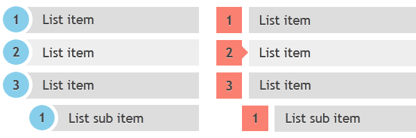
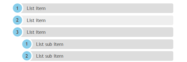
}Round-shaped numbers
.rounded-list a{
position: relative;
display: block;
padding: .4em .4em .4em 2em;
*padding: .4em;
margin: .5em 0;
background: #ddd;
color: #444;
text-decoration: none;
border-radius: .3em;
transition: all .3s ease-out;
}
.rounded-list a:hover{
background: #eee;
}
.rounded-list a:hover:before{
transform: rotate(360deg);
}
.rounded-list a:before{
content: counter(li);
counter-increment: li;
position: absolute;
left: -1.3em;
top: 50%;
margin-top: -1.3em;
background: #87ceeb;
height: 2em;
width: 2em;
line-height: 2em;
border: .3em solid #fff;
text-align: center;
font-weight: bold;
border-radius: 2em;
transition: all .3s ease-out;
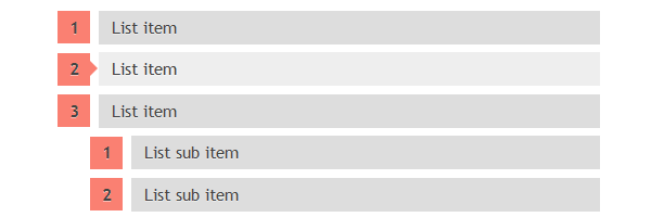
}Rectangle-shaped numbers
.rectangle-list a{
position: relative;
display: block;
padding: .4em .4em .4em .8em;
*padding: .4em;
margin: .5em 0 .5em 2.5em;
background: #ddd;
color: #444;
text-decoration: none;
transition: all .3s ease-out;
}
.rectangle-list a:hover{
background: #eee;
}
.rectangle-list a:before{
content: counter(li);
counter-increment: li;
position: absolute;
left: -2.5em;
top: 50%;
margin-top: -1em;
background: #fa8072;
height: 2em;
width: 2em;
line-height: 2em;
text-align: center;
font-weight: bold;
}
.rectangle-list a:after{
position: absolute;
content: '';
border: .5em solid transparent;
left: -1em;
top: 50%;
margin-top: -.5em;
transition: all .3s ease-out;
}
.rectangle-list a:hover:after{
left: -.5em;
border-left-color: #fa8072;
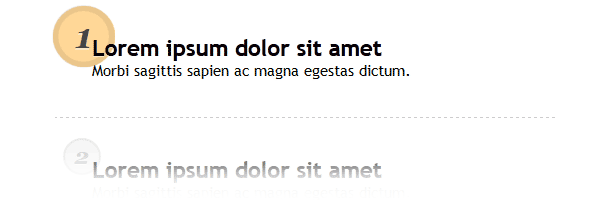
}Circle-shaped numbers
  .circle-list li{
    padding: 2.5em;
    border-bottom: 1px dashed #ccc;
  }

  .circle-list h2{
    position: relative;
    margin: 0;
  }

  .circle-list p{
    margin: 0;
  }

  .circle-list h2:before{
    content: counter(li);
    counter-increment: li;
    position: absolute;
    z-index: -1;
    left: -1.3em;
    top: -.8em;
    background: #f5f5f5;
    height: 1.5em;
    width: 1.5em;
    border: .1em solid rgba(0,0,0,.05);
    text-align: center;
    font: italic bold 1em/1.5em Georgia, Serif;
    color: #ccc;
    border-radius: 1.5em;
    transition: all .2s ease-out;
  }

  .circle-list li:hover h2:before{
    background-color: #ffd797;
    border-color: rgba(0,0,0,.08);
    border-width: .2em;
    color: #444;
    transform: scale(1.5);
  }
On pseudo-elements animation
Some CSS3 numbers animations are also included in this demo. Unfortunately, as far as I know, and at this time, Firefox is the only one who supports animated pseudo-elements. Let’s hope that will improve sooner or later.
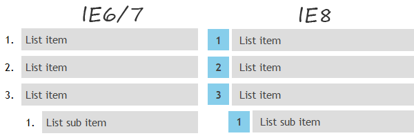
Browser support
These list looks well also on older browsers, as you can see below:
That’s all!
Thank you all for reading and I hope you enjoyed it. Feel free to share your thoughts!