One of the CSS properties people like to use nowadays is the CSS text-shadow property. The text-shadow property represents a comma-separated list of shadow effects to be applied to the text of the element.
The times when you had to use the CSS image replacement technique for a simple text shadow effect are gone.
CSS text-shadow
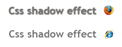
CSS text-shadow property is CSS level 3. Accordingly, this property will work only on Webkit (from Safari 3+), Opera 9.5, Firefox 3.1(pre-Alpha), Konqueror or iCab browsers and above. Notice there is no problem using this CSS3 property with browsers like Internet Explorer, this property simply will not work on IE so the layout won’t be affected anyhow.
The definition
Unlike box-shadow, text shadows are not clipped to the shadowed shape and may show through if the text is partially-transparent. Like box-shadow, text shadows do not influence layout, and do not trigger scrolling or increase the size of the scrollable overflow region.
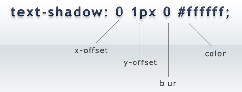
The first two values are the X and Y axis offsets, the third is the blur radius value which is an optional value and the last value in image above is the proper color of the cast shadow.
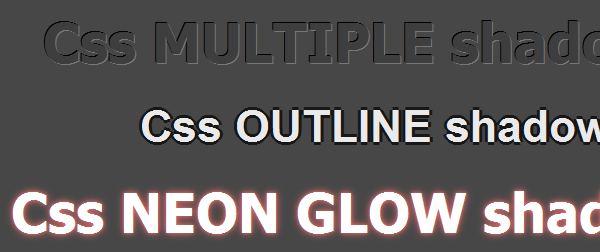
The cool thing about these values is that depending on how you combine these value you can achieve great shadow effects like letterpress or outlines.
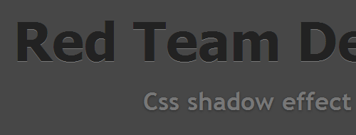
For the following CSS code:
  h1 {
    color: #777777;
    margin: 0;
    font-family: Trebuchet MS;
    font-size: 35px;
    text-align:center;
    text-shadow: 1px 1px 3px #323232;
  }
here is what you achieve:
Thanks for reading, I hope you like this effect as much as I do. It’s simple, easy to add and there are no problems with browsers that does not support CSS3.