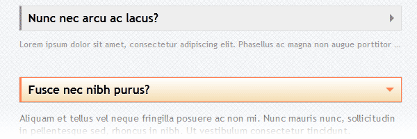
Usually, an FAQ page is that long page with lots of questions and answers, the one we are searching for when we need some extra info regarding a subject. So, for example, if you own a website that sells stuff, then you will need a FAQ page or a FAQ section.
In this article, you will learn how to create a fancy FAQ design using CSS only, no JavaScript.

The FAQ page idea
I visited Facebook’s Help Center section - their FAQ’s page - and I noticed a cool effect for the answers previews. So they were showing a small, faded and clipped text preview for the answer, and then, when the question was clicked, the complete answer was revealed.
After seeing it, I immediately thought about how can I create a similar effect using CSS only.
The FAQ markup
We will start as usual with the markup structure:
  <section class="faq-section">
    <input type="checkbox" id="q1">
    <label for="q1">Question?</label>

    <p>Clipped intro paragraph</p>
    <p>Other paragraph</p>
  </section>
-
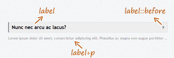
In the above image, the
labelis the proper heading of the section. But, if you want to use better semantic, you can wrap thelabelinto ah1for example. -
Using the
label::beforepseudo-elements selector allow us to create the right triangle shape design. As a rule, using double colon (::) for the CSS pseudo-elements is used instead of single colon (:) to distinguish CSS pseudo-classes from pseudo-elements. -
The first paragraph for each section is the intro paragraph for the complete answer. For this example, I used the CSS adjacent sibling combinator to target it.
How it works?
There’s no rocket science here. The technique we will use today is called the checkbox hack and it relies on the ability of toggling an <input> using the adjacent <label>. Also, in the same time, the checkbox input will be hidden.
I played before with this cool technique, but never had the opportunity to create a practical example actually. But if you want to read more about this technique, Chris Coyier wrote a while ago an article where he shows some cool stuff you can do with the checkbox hack.
The CSS
Below you have the styles, I commented some lines for a better understanding:
  /*Add some spacing*/
  .faq-section{
    margin: 40px 0;
    position: relative;
  }

  /*Hide the paragraphs*/
  .faq-section p{
    display: none;
  }

  /*Hide the checkboxes */
  .faq-section input{
    position: absolute;
    z-index: 2;
    cursor: pointer;
    opacity: 0;
    display: none\9; /* IE8 and below */
    margin: 0;
    width: 100%;
    height: 36px;
  }

  /*Show only the clipped intro */
  .faq-section label+p{
    display: block;
    color: #999;
    font-size: .85em;
    transition: all .15s ease-out;
    /* Clipping text */
    text-overflow: ellipsis;
    white-space: nowrap;
    overflow: hidden;
  }

  /*If the checkbox is checked, show all paragraphs*/
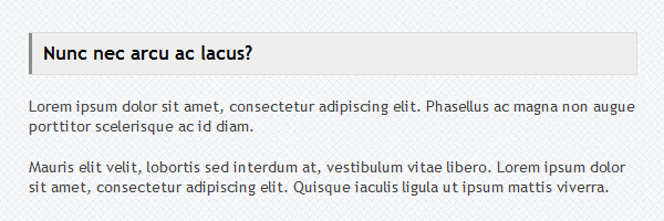
  .faq-section input[type=checkbox]:checked~p{
    display: block;
    color: #444;
    font-size: 1em;
    /* restore clipping defaults */
    text-overflow: clip;
    white-space: normal;
    overflow: visible;
  }

  /*Style the label*/
  .faq-section label{
    font-size: 1.2em;
    background: #eee;
    display: block;
    position: relative;
    height: 20px;
    padding: 7px 10px;
    font-weight: bold;
    border: 1px solid #ddd;
    border-left: 3px solid #888;
    text-shadow: 0 1px 0 rgba(255,255,255,.5);
    transition: all .15s ease-out;
  }

  /*Remove text selection when toggle-ing*/
  .faq-section label::selection{
    background: none;
  }

  .faq-section label:hover{
    background: #f5f5f5;
  }

  /*If the checkbox is checked, style the label accordingly*/
  .faq-section input[type=checkbox]:checked~label{
    border-color: #ff7f50;
    background: #f5deb4;
    background-image: linear-gradient(to bottom, #fff, #f5deb4);
    box-shadow: 0 0 1px rgba(0,0,0,.4);
  }

  /*Label's arrow - default state */
  .faq-section label::before{
    content: '';
    position: absolute;
    right: 4px;
    top: 50%;
    margin-top: -6px;
    border: 6px solid transparent;
    border-left-color: inherit;
  }

  /*Update the right arrow*/
  .faq-section input[type=checkbox]:checked~label::before{
    border: 6px solid transparent;
    border-top-color: inherit;
    margin-top: -3px;
    right: 10px;
  }
Browser support
What about the older browsers? That’s a normal question, and the answer is graceful degradation:

Using the following snippet, we’re targeting browsers like IE8 and below. So, we’ll enable the HTML5 elements like section and then add some custom styles in order to keep the FAQ’s content readable.
  <!--[if lt IE 9]>
      <script src="http://html5shim.googlecode.com/svn/trunk/html5.js"></script>
      <style>
          .faq-section label,
          .faq-section label:hover{
              cursor: default;
              background: #eee;
          }
          body .faq-section p{ /* Increase specificity */
              display: block;
              color: #444;
              font-size: 1em;
              text-overflow: clip;
              white-space: normal;
              overflow: visible;
          }
      </style>
  <![endif]-->
Update: i0S support
You asked for it, now you have it: iOS browser support. I had some time to think about it and I made updates regarding hiding the checkbox.
Here’s my fix, tested on iPhone and iPad using the latest iOS versions:
.faq-section input{
  position: absolute;
  z-index: 2;
  cursor: pointer;
  opacity: 0;
  display: none\9; /* IE8 and below */
  margin: 0;
  width: 100%;
  height: 36px;
}-
position: absolute- While.faq-sectionwrapper is relative positioned, we’ll need this to visually place our checkbox above the label. -
z-index: 2- Make sure it will be above section content, including label. -
cursor: pointer- Optionally, this will add a pointer cursor when you hover on it. -
opacity: 0anddisplay: none\9- Visually hide the checbox, while on browsers like Internet Explorer 8 and below will be hidden. -
margin: 0- Remove default margin. -
width: 100%andheight: 36px- The checkbox height value matches the height of the label. Also, using 100% for the width will expand the checkbox in order to fully cover the label.
That’s it!
I hope you found this article useful, so feel free to to share your thoughts and ideas with me about the result.