Because CSS currentColor value and pseudo elements make a damn good team.
Well, I didn’t know about CSS currentColor keyword until a while ago. I’ve started playing around with it and yeah, this is extremely powerful. Some really say that this is the first CSS variable that ever existed, sounds pretty interesting huh?
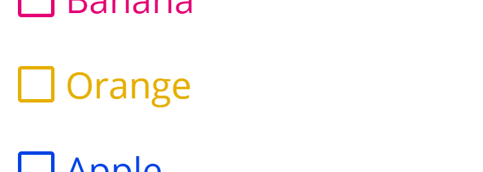
So, I thought that making some nice custom form controls with pseudo elements and currentColor might be the best possible scenario. With that in mind, I chose to style some radios and checkboxes.
Markup
The markup for a custom radio or checkbook consist of a label that wraps both the input and the proper text. As you already know, wrapping everything together this way, will allow you to improve the usability for it, without needing to rely on the for and id pair.
<label class="form-group">
  <input type="checkbox">
  <span class="form-control checkbox">
    Orange
  </span>
</label>
The radio markup is similar to above.
Styles
Further, I will try to explain a bit almost every single rule of CSS used for this demo. It’s not rocket science but I hope you will find it useful.
General
box-sizing: border-box is very useful and demos like the current one are way easier to build with this piece of CSS magic.
*,
*:before,
*:after {
  box-sizing: border-box;
}
The .form-group is applied to the HTML label that wraps both checkbox or radio and text respectively. It has a pointer style because you may want to add a small usability touch by showing the user that this element is actionable.
Also, in case you were wondering about the user-select: none; declaration, unfortunately that’s not a standard CSS3 feature and its behavior might change in the future. For now, it’s just a cool method of preventing text selection using CSS.
.form-group {
  cursor: pointer;
  line-height: 1;
  user-select: none;
}
In this case, we’ll customize the radios and checkboxes appearances using pseudo elements, so we’ll have to somehow hide the native form controls. The following is one of the most appropriate solution because it avoids using stuff like display: none or visibility: hidden, stuff that might affect the accessibility.
.form-group > [type="checkbox"],
.form-group > [type="radio"] {
  position: absolute;
  overflow: hidden;
  clip: rect(0 0 0 0);
  height: 1px; width: 1px;
  margin: -1px; padding: 0; border: 0;
}
Now, the following CSS rules are basically preparing the ground for what’s going to happen next. The .form-control has a relative positioning because its pseudo elements will be absolute positioned.
You might note the em units too. Well, using these units allow the form controls to be scaled up and down, based on your font-size preferences. And that’s pretty cool.
.form-control {
  display: inline-block;
  position: relative;
  padding-left: 1.3em;
}

.form-control::before,
.form-control::after {
  content: '';
  position: absolute;
  left: 0;
}

.form-control::before {
  width: 1em;
  height: 1em;
  border: .1em solid;
}

.form-control::after {
  top: .1em; left: .1em;
  width: .8em; height: .8em;
}
Update
Thanks to Thierry, who wrote me on Twitter about the redundant currentColor value in this case border: .1em solid currentColor;. After all, the border-color is inherited from the parent. Doh! :)
Checkbox
The main trick here is to use the already well known “check” HTML entity, represented by Unicode U+2714. Also, for both checkboxes and radios, we’re using adjacent sibling selectors in order to get the toggling behavior.
Everything else is just CSS poetry.
.form-control.checkbox::before {
  border-radius: .1em;
}

.form-control.checkbox::after {
  text-align: center;
  content: "\2714";
  line-height: .8em;
  opacity: 0;
  transform: scale(.5);
  transition: transform .1s ease;
}

.form-group > .form-control.checkbox:hover::after {
  opacity: .4;
}

.form-group > input:checked + .form-control.checkbox::after {
  opacity: 1;
  transform: scale(1);
}
Radio
When it comes to the radio form element, we rely heavily on the border property to achieve the desired effect. A bit of border-radius for roundness, some background-clip to prevent the background expanding underneath its border and we’re almost there.
Still, the CSS VIP in here is the currentColor keyword value, that represents the calculated value of the element’s color property. We’ll be using later a JavaScript snippet to randomize some colors, just for fun and to see how every form control color is randomly changing.
.form-control.radio::before,
.form-control.radio::after {
  border-radius: 50%;
}

.form-control.radio::after {
  background-color: currentColor;
  background-clip: padding-box;
  border: .2em solid transparent;
  opacity: 0;
  transition: border .1s ease;
}

.form-group >.form-control.radio:hover::after {
  opacity: .4;
}

.form-group > input:checked + .form-control.radio::after {
  border-width: .1em;
  opacity: 1;
}
A small JS snippet
To have some fun with colors, I used PleaseJS, a JavaScript library for creating random pleasing colors. Just make sure you keep refreshing the demo in order to see some random colored form controls.
var formControl       = document.querySelectorAll('.form-group'),
    formControlLength = formControl.length,
    pleaseColor       = Please.make_color({
      colors_returned: formControlLength,
      saturation: 1,
      value: .9
    });

for (var i = 0; i < formControlLength; i++) {
  formControl[i].style.color = pleaseColor[i];
};
Browser support limitations
This does not work on older browsers like IE8 and below, but a decent fallback for IE8 can easily be made with a bit of effort.
Otherwise, it works just fine on other modern devices and browsers, as far as I tested. Just hit me up if you noticed something weird.
That’s pretty much it
Let me know your thoughts, thanks for reading!