In this new article, you’ll learn how to create a cool and usable CSS search box using the HTML placeholder attribute. For the browsers that don’t support this new HTML5 attribute, a fallback is created using Modernizr’s feature detection.
HTML search form structure
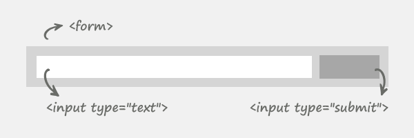
The form element is used as the wrapper, while the two inputs are used as a search field and search button respectively.
The code
<form id="searchbox" action="">
  <input id="search" type="text" placeholder="Type here">
  <input id="submit" type="submit" value="Search">
</form>
You may notice the placeholder attribute, but just ignore it for now, as we will talk later about it. The reason why there are so many id’s (instead of CSS3 advanced selectors as input[type="text"] or input[type="submit"]) is that I wanted this to degrade gracefully for older browsers.
Form wrapper styles
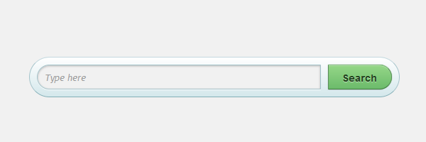
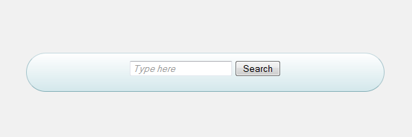
#searchbox {
background-color: #eaf8fc;
background-image: linear-gradient(#fff, #d4e8ec);
border-radius: 35px;
border-width: 1px;
border-style: solid;
border-color: #c4d9df #a4c3ca #83afb7;
width: 500px;
height: 35px;
padding: 10px;
margin: 100px auto 50px;
overflow: hidden; /* Clear floats */
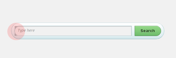
}Below you can see the current result:
Inputs styles
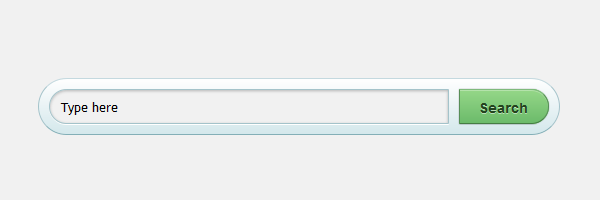
  #search,
  #submit {
    float: left;
  }

  #search {
    padding: 5px 9px;
    height: 23px;
    width: 380px;
    border: 1px solid #a4c3ca;
    font: normal 13px 'trebuchet MS', arial, helvetica;
    background: #f1f1f1;
    border-radius: 50px 3px 3px 50px;
    box-shadow: 0 1px 3px rgba(0, 0, 0, 0.25) inset, 0 1px 0 rgba(255, 255, 255, 1);
  }

  #submit
  {
    background-color: #6cbb6b;
    background-image: linear-gradient(#95d788, #6cbb6b);
    border-radius: 3px 50px 50px 3px;
    border-width: 1px;
    border-style: solid;
    border-color: #7eba7c #578e57 #447d43;
    box-shadow: 0 0 1px rgba(0, 0, 0, 0.3),
                0 1px 0 rgba(255, 255, 255, 0.3) inset;
    height: 35px;
    margin: 0 0 0 10px;
    padding: 0;
    width: 90px;
    cursor: pointer;
    font: bold 14px Arial, Helvetica;
    color: #23441e;
    text-shadow: 0 1px 0 rgba(255,255,255,0.5);
  }

  #submit:hover {
    background-color: #95d788;
    background-image: linear-gradient(#6cbb6b, #95d788);
  }

  #submit:active {
    background: #95d788;
    box-shadow: 0 1px 4px rgba(0, 0, 0, 0.5) inset;
  }

  #submit::-moz-focus-inner {
    border: 0;  /* Small centering fix for Firefox */
  }
Quick tip:
When adding float: left to an element, there’s no need to add also display: block. The last one it’s implied.
HTML5 placeholder attribute
This new HTML5 placeholder attribute shows a text in a field as long as the field is empty and not focused, then hides the text. You surely have seen this technique before with JavaScript!
Browser support:
- Firefox 3.7+
- Safari 4.0+
- Chrome 4.0+
- Opera 11+
- IE10+
  #search::-webkit-input-placeholder {
    color: #9c9c9c;
    font-style: italic;
  }

  #search:-moz-placeholder {
    color: #9c9c9c;
    font-style: italic;
  }

  #search:-ms-placeholder {
    color: #9c9c9c;
    font-style: italic;
  }
Fallback support
For web browsers that are not supporting the new HTML5 attribute, I made a fallback.
I used Modernizr to detect native support for the HTML5 placeholder attribute. Even if this could have been done by writing a short function, I love Modernizr as it also enables you to use more semantic elements from the HTML5 specs.
  #search.placeholder {
    color: #9c9c9c !important;
    font-style: italic;
}$(document).ready(function() {
if (!Modernizr.input.placeholder)
{
var placeholderText = $('#search').attr('placeholder');
$('#search').attr('value',placeholderText);
$('#search').addClass('placeholder');
$('#search').focus(function() {
if( ($('#search').val() == placeholderText) )
{
$('#search').attr('value','');
$('#search').removeClass('placeholder');
}
});
$('#search').blur(function() {
if ( ($('#search').val() == placeholderText) || (($('#search').val() == '')) )
{
$('#search').addClass('placeholder');
$('#search').attr('value',placeholderText);
}
});
}
});Chrome’s inset box-shadow bug
There is a bug on Chrome when both CSS border-radius and inset box-shadow properties are used. Anyway, there is good news about that. Paul Irish announced last month that Chrome’s inset box-shadow bug is fixed.
Later update
The demo was updated, thanks for pointing this out Atul.
So, if you’re using Chrome beta 10.0.648.119 or a greater version, this should work just perfect!
Conclusion
This example is mostly about progressive enhancement.
Regarding the CSS, as you will notice, this example will degrade gracefully for other old browsers. Now, regarding the HTML5 placeholder attribute, if native support is missing, then the Javascript code will do it for you.