Last updated on
The CSS box-shadow property allows you to add multiple shadows, outer (often called drop shadows) or inner, on the HTML elements. To do that you must specify values as horizontal and vertical offsets, blur radius, spread distance, inset and color.
The CSS box-shadow syntax
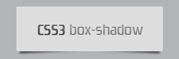
<shadow> = inset? && [ <length>{2,4} && <color>? ]Rocket science? Not at all, here’s a quick example:
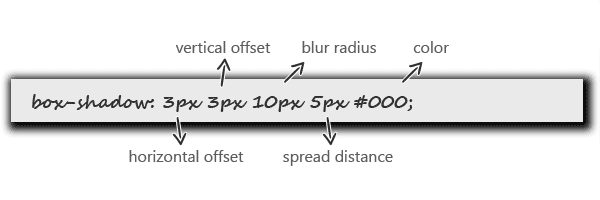
box-shadow: 3px 3px 10px 5px #000;The above CSS declaration will generate the following shadow effect:
-
A positive value for the horizontal offset draws a shadow that is offset to the right of the box, a negative length to the left.
-
The second length is the vertical offset. A positive value for the vertical offset basically offsets the shadow down, a negative one up.
-
You’re not allowed to use negative values for blur radius. The larger the value, the more the shadow’s edge is blurred, as it can be seen above.
-
Spread distance positive values cause the shadow shape to expand in all directions by the specified radius. Negative ones cause the shadow shape to contract.
-
The
coloris the color of the cast shadow. -
The
insetkeyword, missing in the image above, if present, changes the drop shadow from an outer shadow to an inner shadow
The above theory it’s just a small amount, if you want to read more, then check out the full W3C specs.
CSS box-shadow examples
Enough theory, let’s see how can you take advantage of this wonderful CSS box-shadow feature. Below I’ll show you how to enhance your designs with the coolest CSS box-shadow techniques!
Add depth to your body
  body::before {
    content: "";
    position: fixed;
    top: -10px;
    left: 0;
    width: 100%;
    height: 10px;
    z-index: 100;
    box-shadow: 0px 0px 10px rgba(0,0,0,.8);
  }
Simple drop shadows with pseudo-elements
  #box {
    position: relative;
    width: 60%;
    background: #ddd;
    border-radius: 4px;
    padding: 2em 1.5em;
    color: rgba(0,0,0, .8);
    text-shadow: 0 1px 0 #fff;
    line-height: 1.5;
    margin: 60px auto;
  }

  #box::before,
  #box::after {
    z-index: -1;
    position: absolute;
    content: "";
    bottom: 15px;
    left: 10px;
    width: 50%;
    top: 80%;
    max-width:300px;
    background: rgba(0, 0, 0, 0.7);
    box-shadow: 0 15px 10px rgba(0, 0, 0, 0.7);
    transform: rotate(-3deg);
  }

  #box::after {
    transform: rotate(3deg);
    right: 10px;
    left: auto;
  }
Use the RGBA color model
Try spicing up shadows using the RGBA color model. The box-shadow property can be used using RGBA colors to create shadows with differing levels of opacity. If your browsers support the box-shadow property, then it will definitively support the RGBA color model.
Add multiple effects separated by commas
Also, you can use multiple shadow effects in one CSS declaration, as seen below:
  box-shadow: 3px 3px 10px 5px #000,
              0 0 4px rgba(0, 0, 0, .5) inset;
Browser Support
The CSS box-shadow property that helps to display an inner or outer shadow effect to elements has great browser support that includes:
- Internet Explorer 9 and above
- Firefox 3.5 and above
- Safari & Chrome
- Opera 10.1 and above
- and more