Have you noticed how often you see an image and a paragraph next to it, with the text wrapped around the image?
That is something easy to do. Just add float:left to the image and the text will wrap around that image.
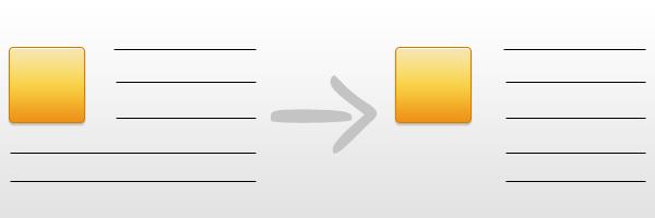
But what happens when you want the paragraph to look like a block next to the image? Without wrapping it under the image. Here comes the tricky part.
However, with this article, I will show you a quick solution to this issue. Actually, a very simple and fast trick, but very useful in these cases.
Understanding the problem
A tricky issue, when dealing with floated elements, is stopping text from wrapping underneath a floated element. This happens when the height of the floated element is lower than the text’s height.
But, how every problem has a solution, in this article you will learn how to fix it.
Solution
Just use the CSS code below for your paragraph.
  .no-wrap-text {
    overflow: hidden;
  }
You will be fine using this piece of code and here you can see the pros and cons of using it.
Pros
- Very simple
- No extra markup
- No floated element dependency - so you can always use the paragraph without the floated element
Cons
You must be aware that this won’t work for IE6, if you assure this won’t “break” your website layout then feel free to use this.
What about overflow property?
The overflow property specifies what happens if content overflows an element’s box.
View the demonstration
If you are still wondering how this solution can help, bellow you have a detailed demo example with it:
Conclusion
Let me know your thoughts about this method!