Customizing form elements was always pretty frustrating and the select element is one of those elements who can make you want to pull your remaining hair out while trying to style it. As you may already know, when talking about its customization, there isn’t too much CSS stuff you can apply to it, just properties like color, background, font or border.
In this article, in order to customize the look of the native HTML dropdown select, we’ll be using a different approach based on some cutting edge techniques like CSS @supports, pointer-events and appearance.
The need for custom dropdown selects
The browser defaults were never enough, that’s why web developers are constantly trying to push the limits and possibilities when it comes to customizing native HTML elements. Lately, we’ve seen so many custom checkboxes and radios, custom progress bars and many more but nothing new related to dropdowns or file inputs for example.
Having this in mind, and inspired by Lea Verou’s technique, I decided to share with you my take on customizing an HTML dropdown. Just as a disclaimer, I’m aware there are a lot of awesome jQuery plugins in the wild that can help you build beautiful and sophisticated dropdowns, but sometimes it feels like it is just too much for a dropdown.
The markup
To get started, below is the markup needed for a custom HTML dropdown.
  <span class="custom-dropdown custom-dropdown--white">
    <select class="custom-dropdown__select custom-dropdown__select--white">
      <option>The Shawshank Redemption</option>
      <option>The Godfather</option>
      <option>Pulp Fiction</option>
      <option>The Good, the Bad and the Ugly</option>
      <option>12 Angry Men</option>
    </select>
  </span>
You may wonder why I chose a span as a wrapper and not a label which might seem more appropriate. The reason is that we don’t want to waste the label’s functionality for this customization only. Also, this way you can still wrap everything inside a label to improve usability like so:
  <label>
    IMDB Top Movies:
    <span class="custom-dropdown custom-dropdown--white">
      <select class="custom-dropdown__select custom-dropdown__select--white">
        <option>The Shawshank Redemption</option>
        <option>The Godfather</option>
        <option>Pulp Fiction</option>
        <option>The Good, the Bad and the Ugly</option>
        <option>12 Angry Men</option>
      </select>
    </span>
  </label>
BEM naming convention
In case you noticed the namespacing, I’m using the BEM naming convention which I’m sure you’ve seen before. Needless to say, this rocks!
  (Block) .custom-dropdown            = The main component
  (Element) .custom-dropdown__select  = Descendant of .custom-dropdown
  (Modifier) .custom-dropdown--*      = Different state of .custom-dropdown
The CSS

Check the styles below to see how everything works. The CSS @supports rule does all the magic:
.custom-dropdown--large {
font-size: 1.5em;
}
.custom-dropdown--small {
font-size: .7em;
}
.custom-dropdown__select{
font-size: inherit; /* inherit size from .custom-dropdown */
padding: .5em; /* add some space*/
margin: 0; /* remove default margins */
}
.custom-dropdown__select--white {
background-color: #fff;
color: #444;
}
@supports (pointer-events: none) and (appearance: none) {
.custom-dropdown {
position: relative;
display: inline-block;
vertical-align: middle;
}
.custom-dropdown__select {
padding-right: 2.5em; /* accommodate with the pseudo elements for the dropdown arrow */
border: 0;
border-radius: 3px;
appearance: none;
}
.custom-dropdown::before,
.custom-dropdown::after {
content: "";
position: absolute;
pointer-events: none;
}
.custom-dropdown::after { /* Custom dropdown arrow */
content: "\25BC";
height: 1em;
font-size: .625em;
line-height: 1;
right: 1.2em;
top: 50%; margin-top: -.5em;
}
.custom-dropdown::before { /* Custom dropdown arrow cover */
width: 2em;
right: 0; top: 0; bottom: 0;
border-radius: 0 3px 3px 0;
}
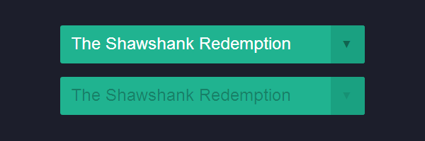
.custom-dropdown__select[disabled] {
color: rgba(0,0,0,.3);
}
.custom-dropdown.custom-dropdown--disabled::after {
color: rgba(0,0,0,.1);
}
/* White dropdown style */
.custom-dropdown--white::before {
background-color: #fff;
border-left: 1px solid rgba(0,0,0,.1);
}
.custom-dropdown--white::after {
color: rgba(0,0,0,.9);
}
}Summary
At first sight, the CSS might seem a bit too overwhelming, so let’s deconstruct it.
The CSS appearance property
The appearance: none declaration is used here to reset the default look for the native dropdown. The appearance property is very useful when you want to add a specific styling to an element that doesn’t have it by default or to remove the specific styling entirely, as in this case.
The ::before & ::after pseudo-elements
Having applied the above declaration which clears the default look, the dropdown triangle is made using CSS pseudo-elements. There isn’t too much to say here, you know pseudos, they are everywhere.
The CSS pointer-events
If you aren’t familiar with pointer-events, you should know that with pointer-events: none, which is the most encountered declaration, you can remove mouse events for current page navigation for example. In this case, we removed mouse events for the right triangle CSS pseudo-element to avoid accessibility issues.
As a side effect, if an element has pointer-events: none applied to, its hover state can’t be styled anymore.
The CSS @supports at-rule
Last but not least, the latest CSS @supports at-rule helps with CSS feature detection. Feature detection using JavaScript isn’t something new and Modernizr is the best example here. So, if you already heard about Modernizr, then think about the @supports rule as its CSS equivalent.
To prevent browsers inconsistencies, the following rule allows you to target only browsers that have support for both pointer-events and appearance. The best examples here are the IE9 and IE10 browsers, both support a lot of CSS3 stuff from the above code but do not support (yet) cutting edge stuff like pointer-events or appearance which makes the technique inefficient.
  @supports (pointer-events: none) and (appearance: none) {
    ...
}Some JavaScript
The truth is that you may use the CSS only keyword to name this styling solution. But, to cover also the case when a select is disabled, you’ll need some JS to target the parent node for it and apply an HTML class like custom-dropdown--disabled.
  <script>
  (function(){
    /*1*/var customSelects = document.querySelectorAll(".custom-dropdown__select");
    /*2*/for(var i=0; i<customSelects.length; i++){
      if (customSelects[i].hasAttribute("disabled")){
        customSelects[i].parentNode.className += " custom-dropdown--disabled";
      }
    }
  })()
</script>- Returns the list of the elements within the document that match
.custom-dropdown__select. - For each disabled select, go to its parent node and append the
custom-dropdown--disabledHTML class. This way, we’ll be able to use CSS in order to customize the arrow when a select is disabled.
Of course, none of the above will be necessary if the select element, which is a replaced element, would have allowed pseudo-elements on it or if a CSS parent selector would have existed. But that’s another story. :)
On browser support
As far as I tested, the demo is working on Firefox Nightly/Aurora, Chrome Canary and Opera Next. Also, this means that very soon you’ll be able to see this working also in the release versions, considering how often new browser versions are launched. Check the compatibility table for support of CSS Feature Queries in desktop and mobile browsers.
Besides the above browsers versions, while preparing to publish this article, Firefox 22 just launched as well. And guess what? Support for CSS Conditionals (@supports and CSS.supports) has been enabled by default. So, we’re on the right track! :)