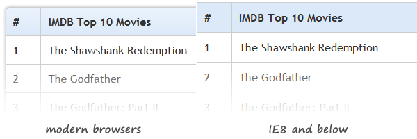
There has been some discussion in the past about how or when to use tables in web development. Though, the conclusion is the same: when you’re dealing with tabular data, tables are absolutely required.
Designing a table is a challenge - and here I’m not talking only about the way it looks. It’s mostly about how easy is your table to read. If your table isn’t easy to scan, usually users get annoyed as they lose focus when trying to find the right column and row.
Having said that, today we’re going to create beautiful and practical tables styled using CSS. Also, jQuery will be used to create fallbacks for older browsers.

What’s so cool about these tables?
In this article, you’ll see how CSS3 and tables can work together to create some cool and usable results.
- Rounded corners with no images
- Very easy to update - there are no extra CSS id’s or classes added
- User-friendly and easy to read
Rounded table corners
Here’s the trick: while border-collapse’s default value is separate, we need also to set the border-spacing to 0.
  table {
    *border-collapse: collapse; /* IE7 and lower */
    border-spacing: 0;
  }
For IE7 and lower, we need to add a specific line, in order to create a good fallback for the tables.
Then, we just need to round some corners:
  th:first-child {
    border-radius: 6px 0 0 0;
  }

  th:last-child {
    border-radius: 0 6px 0 0;
  }

  th:only-child{
    border-radius: 6px 6px 0 0;
  }
jQuery hover fallback
You may already know that when it comes about IE6, :hover does not actually work on non-anchor elements.
So, to make it work, instead of the CSS solution we’ve used:
  .bordered tr:hover {
    background: #fbf8e9;
    transition: all 0.1s ease-in-out;
  }
… you could use some jQuery code to simulate the hover effect:
  $('.bordered tr').mouseover(function(){
      $(this).addClass('highlight');
  }).mouseout(function(){
      $(this).removeClass('highlight');
  });
… and here are also the styles for the CSS highlight class:
  .highlight {
    background: #fbf8e9;
    transition: all 0.1s ease-in-out;
  }
The above is basically the .bordered tr:hover duplicate.
jQuery zebra fallback
To create the zebra effect, using CSS3, we’ve selected the even rows within the tbody:
  .zebra tbody tr:nth-child(even) {
    background: #f5f5f5;
    box-shadow: 0 1px 0 rgba(255,255,255,.8) inset;
  }
Now, the above selector is a CSS3 one - so no support for older browsers. Below you’ll see how we may target and style the even rows for all browsers:
$(".zebra tbody tr:even").addClass('alternate'); .alternate {
background: #f5f5f5;
box-shadow: 0 1px 0 rgba(255,255,255,.8) inset;
}Browser support
The tables already degrade very nice on older browsers, so it’s up to you if you want to use also the above jQuery solutions. It’s all about the visitors’ audience you’re targeting.

That’s pretty much it!
Thanks for reading this article!