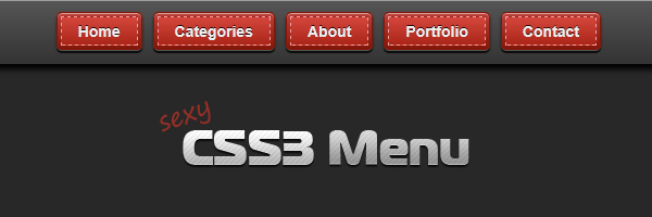
One of the most common elements when talking about a website or an application design is definitely the menu navigation. No matter if vertical or horizontal, simple or complex, a menu is essential and it has to look that way.
In today’s article, you’ll learn how to create a good looking menu using some CSS3 magic.
The idea
If you are a web developer you may have heard of tools called CSS pre-processors. Less is probably the most well known CSS preprocessor, but that is another story.
While visiting LESS’s site, I noticed their download button, which is an image, and I thought to myself: I can do it using CSS only.

LESS download button - at this time
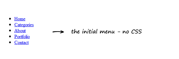
The HTML
<nav>
    <ul>
        <li><a href="#"><span>Home</span></a></li>
        <li><a href="#"><span>Categories</span></a></li>
        <li><a href="#"><span>About</span></a></li>
        <li><a href="#"><span>Portfolio</span></a></li>
        <li><a href="#"><span>Contact</span></a></li>
    </ul>
</nav>
Pretty clean, except for the span element. You’ll see further why we need that span.
The CSS
The demo example contains also a header and a logo (so, extra styles), but I’ll list here only the styles used for this menu.
Removing the default list styles
nav ul {
    padding: 0;
    margin: 0;
    list-style: none;
}

nav li {
    float: left;
}
Style the proper links
nav a {
float: left;
color: #eee;
margin: 0 5px;
padding: 3px;
text-decoration: none;
border: 1px solid #831608;
font: bold 14px Arial, Helvetica;
background-color: #831608;
background-image: linear-gradient(#bb413b, #831608);
border-radius: 5px;
text-shadow: 0 -1px 0 rgba(0,0,0,.8);
box-shadow: 0 1px 0 rgba(255, 255, 255, 0.3), 0 3px 0 rgba(0, 0, 0, 0.7), 0 2px 2px rgba(0, 0, 0, 0.5), 0 1px 0 rgba(255, 255, 255, 0.5) inset;
}
nav a:hover {
background-color: #bb413b;
background-image: linear-gradient(#831608, #bb413b);
}
nav a:active {
background: #bb413b;
position: relative;
top: 2px;
box-shadow: 0 0 3px rgba(0, 0, 0, 0.7) inset;
}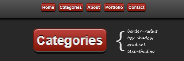 Multiple CSS3 properties were used to create the above.
Style the inner span element
nav span {
    border: 1px dashed #eba1a3;
    display: inline-block;
    padding: 4px 15px;
    cursor: pointer;
    background-color: #bb413b;
    background-image: linear-gradient(#d4463c, #aa2618);
}

nav a:hover span {
    background-color: #bb413b;
    background-image: linear-gradient(#aa2618, #d4463c);
}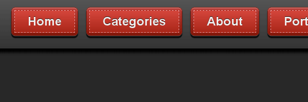
Browser support
If above you have seen how the menu looks in modern browsers, here’s how the menu look in older browsers:
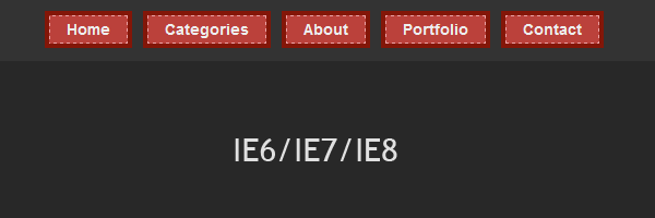 Fallback styles for older browsers
Advantages
- Scalability
You can simply adjust its size by updating the link’s font-size:
font: bold 14px Arial, Helvetica;-
No images, so there are less HTTP image requests, also easy to maintain and update.
-
You could easily transform this menu into a nice dropdown menu.
Conclusion
The menu we created using this tutorial isn’t a Sci-Fi one or a super mega complex one. The main purpose is to see how CSS3 can help us achieve interesting effects without needing images anymore.
I hope you enjoyed this tutorial, thanks for reading it!