HTML5 is certainly one of the latest buzzwords in the web community. It isn’t something new anymore and we’ve already seen how cool it is. Features like simplified doctype, more semantic markup, input types and placeholders are just some of the reasons you’d like to use a HTML5 template.
So, today we’re going to build a HTML5 template using the full power of CSS3.
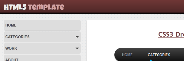
The HTML5 template design
Here’s a screenshot with the HTML5 template layout we’re going to code:
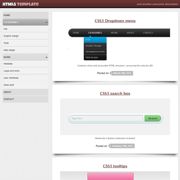
As you may notice, the above HTML5 template is simple, minimal and stylish - thanks to the CSS3 awesome features. Long live the CSS3!
The not-so-secret ingredients:
- Simple logo using Google Font API
- Nice CSS drop shadow effects.
- Pattern background using data URI scheme.
- Vertical drop down menu animated with jQuery.
- Arrow shapes made with pseudo-elements.
- CSS3 gradients.
A word on data URIs
I wanted to create this HTML5 template demo without using any images and I made it. So, for the website background, instead of linking to an external image I just embedded that image with data URIs.
So the result is something like that:
body {
  background: #eee url(data:image/png;base64,iVBORw0KGgo[...]ElFTkSuQmCC);
}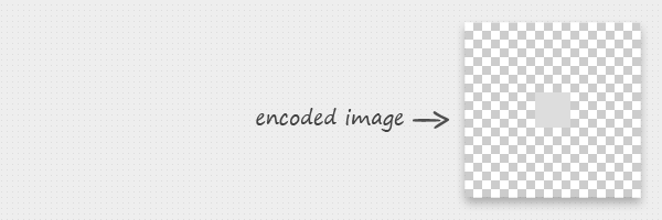
The encoded image is basically a pattern.
Not so beautiful, huh? Yet, this is very effective. The pros: no extra HTTP image request. The cons: IE6/IE7 lack of support (but there’s a solution also for that).
I could have used a CSS3 pattern instead this solution, but the above has its own advantages: one is the fact it works on IE8.
You just need an encoder for that, here’s an online encoding tool to play with.
The HTML code
Basic structure for the HTML5 template.
The new HTML5 doctype
The Document Type Declaration, a.k.a doctype was always an ugly and hard-to-remember thing. Not anymore.
Check out the new doctype declaration, that tells a browser or other parsers that they are looking at a HTML5 document:
<!DOCTYPE html>The HTML5 header
<header>
<hgroup class="clearfix">
<h1><a href="#">HTML5 <span>template</span></a></h1>
<h2>Just another awesome description</h2>
</hgroup>
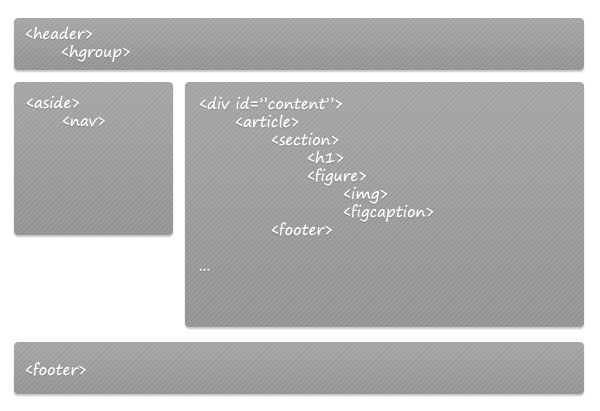
</header>The body
The template’s body consists of two blocks:
<aside>- who wraps the navigation<div id="content">- who wraps the<article>elements.
Keep in mind that now that we have these new HTML elements, we should not forget entirely about the <div> element as some jobs are still available for it.
<div id="main" class="clearfix">
<aside>
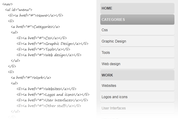
<nav>
<ul id="menu">
<li><a href="#">Home</a></li>
<li>
<a href="#">Categories</a>
<ul>
<li><a href="#">Css</a></li>
<li><a href="#">Graphic Design</a></li>
<li><a href="#">Tools</a></li>
<li><a href="#">Web design</a></li>
</ul>
</li>
<li>
<a href="#">Work</a>
<ul>
<li><a href="#">Websites</a></li>
<li><a href="#">Logos and icons</a></li>
<li><a href="#">User Interfaces</a></li>
<li><a href="#">Other stuff</a></li>
</ul>
</li>
<li><a href="#">About</a></li>
<li><a href="#">Contact</a></li>
</ul>
</nav>
</aside>
<div id="content">
<article>
<section>
<h1><a href="/css3-dropdown-menu">CSS3 Dropdown menu</a></h1>
<figure>
<img src="/dist/uploads/2011/03/css-menu.png" width="600" height="200" alt="CSS3 Dropdown menu">
<figcaption>Contains clean and accessible HTML structure. Javascript fix only for IE6.</figcaption>
</figure>
</section>
<footer>Posted on <span>March 18th, 2011</span></footer>
</article>
<article>
<section>
<h1><a href="/how-to-create-a-cool-and-usable-css3-search-box">CSS3 search box</a></h1>
<figure>
<img src="/dist/uploads/2011/02/css3-searchbox.png" width="600" height="200" alt="CSS3 search box">
<figcaption>Modernizr's feature detection included.</figcaption>
</figure>
</section>
<footer>Posted on <span>February 18th, 2011</span></footer>
</article>
<article>
<section>
<h1><a href="/css3-tooltips">CSS3 tooltips</a></h1>
<figure>
<img src="/dist/uploads/2011/04/css3-tooltips.png" width="600" height="200" alt="CSS3 tooltips">
<figcaption>CSS3 gradients, box shadows, pseudo-elements.</figcaption>
</figure>
</section>
<footer>Posted on <span>April 28th, 2011</span></footer>
</article>
</div>
</div>The animated menu
 Pretty semantic code.
The jQuery code who animates this menu:
<script>
    function initMenu() {
      $('#menu ul').hide(); // Hide the submenu
      if ($('#menu li').has('ul')) $('#menu ul').prev().addClass('expandable'); // Expand/collapse a submenu when it exists
      $('.expandable').click(
        function() {
            $(this).next().slideToggle();
            $(this).toggleClass('expanded');
          }
        );
      }

    // When document ready, call initMenu() function
    $(document).ready(function() {initMenu();});
</script>
The main HTML5 footer
<footer>
    Footer design
</footer>
The CSS
Below you can find the styles used to build this HTML5 template layout. Prefixed properties are excluded, you’ll find them in the demo page source.
/* Small reset */
article,aside,details,figcaption,figure,
footer,header,hgroup,menu,nav,section {
    display:block;
}

ul{
    list-style: none;
    margin: 0;
    padding: 0;
}

a{
  color: #6F3736;
}

/* Clear floats */
.clearfix:after {
  visibility: hidden;
  display: block;
  font-size: 0;
  content: " ";
  clear: both;
  height: 0;
}

.clearfix{
  *zoom: 1;
}

/* Layout styles */
body{
    background: #eee url(data:image/png;base64,iVBORw0KGgoAA[...]kSuQmCC);
    margin: 0;
    font-family: 'Lucida sans', Arial, Helvetica;
    font-size: small;
}

header{
    padding: 10px 0;
    background-color: #4c2626;
    background-image: linear-gradient(top, #6f3736, #4c2626);
    box-shadow: 0 1px 0 #fff, 0 -3px 3px #000 inset;
}

header hgroup{
    margin: 0 auto;
    width: 960px;
}

header h1{
    margin: 0;
    font: 25px/1 'Luckiest Guy', cursive; /* Google font API */
    float: left;
    text-shadow: 0 1px 0 rgba(0,0,0,.9);
}

header h2{
    color: #D2A4A4;
    margin: 0;
    float: right;
    font: italic normal 15px/25px Arial, Helvetica;
}

header a{
    color: #eee;
    text-decoration: none;
}

header a span{
    color: #d2a4a4;
}

/* --------------------------------------------------- */

footer{
    text-align: right;
    width: 960px;
    margin: 0 auto;
    padding: 10px 0;
}

#tw, #fb{
    float: right;
    width: 130px;
    margin: 10px 0 0 0;
    overflow: hidden;
}

/* --------------------------------------------------- */

#main{
    margin: 20px auto 0 auto;
    width: 960px;
}

aside{
    float: left;
    width: 250px;
    margin-right: 20px;
}

#content{
    float: left;
    width: 690px;
}

article{
    position: relative;
    padding: 20px;
    margin: 0 0 20px 0;
    text-align: center;
    background: #fff;
    box-shadow: 0 1px 1px #999;
    border-radius:5px;
}

article:before, article:after{
  z-index: -1;
  position: absolute;
  content: "";
  bottom: 15px;
  left: 10px;
  width: 50%;
  top: 80%;
  max-width:300px;
  background: rgba(0, 0, 0, 0.7);
  box-shadow: 0 15px 10px rgba(0, 0, 0, 0.7);
  transform: rotate(-3deg);
}

article:after{
  transform: rotate(3deg);
  right: 10px;
  left: auto;
}

article footer{
    text-align: center;
    width: auto;
}

article footer span{
  padding: 0 10px 0 12px;
  margin: 0 0 0 12px;
  background: #bbb;
  color: #fff;
  font: bold 12px/24px arial, helvetica;
  display: inline-block;
  position: relative;
  text-shadow: 0 1px 0 #999;
  border-radius: 0 4px 4px 0;
  box-shadow: 0 1px 0 #fff, 0 1px 0 #999 inset;
}

article footer span:before{
  content: "";
  position: absolute;
  top: 0;
  left: -12px;
  width: 0;
  height: 0;
  border-color: transparent #bbb transparent transparent;
  border-style: solid;
  border-width: 12px 12px 12px 0;
}

article footer span:after{
  content: "";
  position: absolute;
  top: 10px;
  left: 0;
  width: 4px;
  height: 4px;
  border-radius: 2px;
  background: #fff;
  box-shadow: -1px -1px 2px #777;
}

figure{
    margin: 1em 0;
}

figcaption{
    margin: 0.5em 0;
    font-style: italic;
    font-size: 0.9em;
    color: #777;
}

/* Vertical menu */
#menu li{
  margin: 0 0 3px 0;
}

#menu a{
  display: block;
  *display: inline-block;
  *width: 240px;
  text-decoration: none;
  background: #ddd;
  color: #444;
  padding: 10px 5px;
  text-transform: uppercase;
  font: bold 12px Arial,Helvetica;
  border-radius:5px;
  box-shadow: 0 1px 0 #ccc;
}

#menu a:hover{
  color: #eee;
  background: #9c9c9c;
  background: linear-gradient(top, #bbb, #999);
}

#menu .expandable{
  position: relative;
}

#menu .expandable:before,
#menu .expandable:after{
  content: '';
  position: absolute;
  right: 5px;
  margin-top: 5px;
  border-top: 6px solid #444;
  border-right: 6px solid transparent;
  border-left: 6px solid transparent;
}

#menu .expandable:before{
   border-top-color: #fff;
   margin-top: 6px;
}

#menu .expanded:after{
  border-top: 0;
  border-bottom: 6px solid #444;
}

#menu .expanded:before{
    border-top: 0;
    border-bottom: 6px solid #fff;
}

#menu ul a{
    background: #f2f2f2;
    text-transform: none;
    font-weight: normal;
}

#menu ul a:hover{
    background: #fafafa;
    color: #444;
}
Browser support
This is a cross browser HTML5 template which use graceful degradation. So, you don’t have to worry for older browsers like the IE trident - they render the layout in a good way thanks to the HTML5 shiv:
<!--[if lt IE 9]>
  <script src="http://html5shim.googlecode.com/svn/trunk/html5.js"></script>
<![endif]-->
Conclusion
Browsers are evolving, web technologies are constantly being updated so we have no time to rest. We need to stay up to date with latest specifications and the best way to learn is by actually doing it.
The purpose of articles like this one is to encourage you to use these new web technologies. And yes, you can use this HTML5 template right now!
If you liked this article, and I hope you did, please spread the word!