Due some performance issues, I don’t recommend using these buttons anymore. You may try instead my latest CSS3 patterned buttons.
Recently I talked about CSS cross-browser gradients and last week I wrote again about CSS3 gradients. So what I’m going to do today? I will show you how to put the CSS gradient feature in practical use.
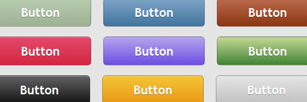
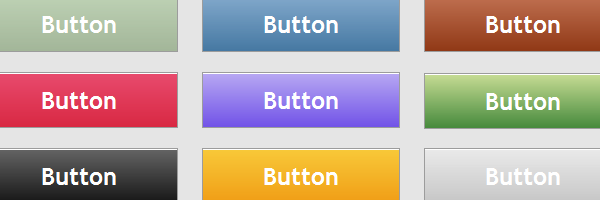
In this article you will see how you can create a set of gradient buttons just with CSS (no images).
Oh no! Not another CSS3 buttons!
That’s what you may say but, oh yes :) … This is another buttons set, powered by almighty CSS3 (and IE gradient filters).
Features
- Scalability - Scale the buttons using font-size.
- Adjustability - Change padding and font-size and there you go.
- Flexibility - Apply the styles to any HTML elements.
- Fallback styles - Graceful degradation for other browsers.
- Usability - Normal, hover and active states are available.
“How it’s made”
- RGBA color mode
- CSS box shadow
- CSS text shadow
- Rounded corners
- Gradient patterns thanks to @leaverou for its enlightening article about CSS3 gradients techniques
HTML structure
Let’s see how the HTML looks for the blue button for example:
<a href="#" class="button button-blue">
    <span>Button</span>
</a>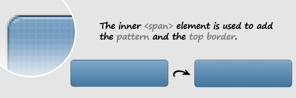
Multiple classes are used in order to have minimal HTML and CSS files.
The top border could have been achieved with an inset box-shadow but, this way the CSS3 buttons will degrade graceful, as you will see later in this article.
The CSS
.button {
    margin: 10px;
    text-decoration: none;
    font: bold 1.5em 'Trebuchet MS',Arial, Helvetica; /*Change the em value to scale the button*/
    display: inline-block;
    text-align: center;
    color: #fff;
    border: 1px solid #9c9c9c; /* Fallback style */
    border: 1px solid rgba(0, 0, 0, 0.3);
    text-shadow: 0 1px 0 rgba(0,0,0,0.4);
    box-shadow: 0 0 .05em rgba(0,0,0,0.4);
}

.button,
.button span {
    -moz-border-radius: .3em;
    border-radius: .3em;
}

.button span {
    border-top: 1px solid #fff; /* Fallback style */
    border-top: 1px solid rgba(255, 255, 255, 0.5);
    display: block;
    padding: 0.5em 2.5em;
    /* The background pattern */
    background-image: linear-gradient(45deg, rgba(0, 0, 0, 0.05) 25%, transparent 25%, transparent),
                      linear-gradient(-45deg, rgba(0, 0, 0, 0.05) 25%, transparent 25%, transparent),
                      linear-gradient(45deg, transparent 75%, rgba(0, 0, 0, 0.05) 75%),
                      linear-gradient(-45deg, transparent 75%, rgba(0, 0, 0, 0.05) 75%);

    /* Pattern settings */
    background-size: 3px 3px;
}

.button:hover {
    box-shadow: 0 0 .1em rgba(0,0,0,0.4);
}

.button:active {
    /* When pressed, move it down 1px */
    position: relative;
    top: 1px;
}
Blue button:
.button-blue {
    background: #4477a1;
    background: -webkit-gradient(linear, left top, left bottom, from(#81a8cb), to(#4477a1) );
    background: -moz-linear-gradient(-90deg, #81a8cb, #4477a1);
    filter:  progid:DXImageTransform.Microsoft.gradient(GradientType=0,startColorstr='#81a8cb', endColorstr='#4477a1');
}

.button-blue:hover {
    background: #81a8cb;
    background: -webkit-gradient(linear, left top, left bottom, from(#4477a1), to(#81a8cb) );
    background: -moz-linear-gradient(-90deg, #4477a1, #81a8cb);
    filter:  progid:DXImageTransform.Microsoft.gradient(GradientType=0,startColorstr='#4477a1', endColorstr='#81a8cb');
}

.button-blue:active {
    background: #4477a1;
}
And so on for the other buttons…
On browser support
Mozilla 3.6+
Full support, including CSS3 gradient patterns (though I noticed some performance issues when page is rendered).
Webkit (Safari, Chrome)
The buttons are rendered very nice on Webkit browsers.

Opera 11
Unfortunately, Opera lacks any support for CSS gradients, still the buttons render very nice as other CSS3 features are not missing here.
IE6, IE7, IE8
With filters, CSS gradients are possible also when talking about IE6 or IE7.
IE9
Besides the other IE browsers, IE9 supports rounded corners and box shadows, although the corners don’t look perfect as you can see below.

That’s all!
It would be recommended to use conditional comments when using filters. This way your CSS file will be cleaner and you will avoid performance issues.
Having said that, I hope you enjoyed this article and if you did don’t forget to follow me on Twitter or to leave a comment below!