Nowadays, using subtle patterns is kinda cool so I thought why not using them also on buttons? The idea was to create some nice CSS3 patterned buttons and in this article you’ll see what I’ve been working on lately.
View demo or download the .zip from GitHub
This project is a bit special to me as being pretty new to GitHub, my first commit there was related to these CSS3 patterned buttons.
I wrote before about CSS3 buttons, so you may want to check also these articles:
CSS3 patterned buttons features
- Easy-to-use.
- Contain the transitions on gradients hack.
- As you may have expected, no images used here. Instead, an base64 string is used to create the patterned effect.
- Stilish pressed behavior when grouped.
Buttons
Basically, to create a button, the only thing you have to do is this:
<a href="" class="button">Button</a>or
<button class="button">Button</button>You could also use something like <input type="submit"> but for best cross-browser rendering, just stick to the above.
The CSS
.button{
display: inline-block;
*display: inline;
zoom: 1;
padding: 6px 20px;
margin: 0;
cursor: pointer;
border: 1px solid #bbb;
overflow: visible;
font: bold 13px arial, helvetica, sans-serif;
text-decoration: none;
white-space: nowrap;
color: #555;
background-color: #ddd;
background-image: linear-gradient(top, rgba(255,255,255,1),
rgba(255,255,255,0)),
url(data:image/png;base64,iVBORw0KGg[...]QmCC);
transition: background-color .2s ease-out;
background-clip: padding-box; /* Fix bleeding */
border-radius: 3px;
box-shadow: 0 1px 0 rgba(0, 0, 0, .3),
0 2px 2px -1px rgba(0, 0, 0, .5),
0 1px 0 rgba(255, 255, 255, .3) inset;
text-shadow: 0 1px 0 rgba(255,255,255, .9);
}
.button:hover{
background-color: #eee;
color: #555;
}
.button:active{
background: #e9e9e9;
position: relative;
top: 1px;
text-shadow: none;
box-shadow: 0 1px 1px rgba(0, 0, 0, .3) inset;
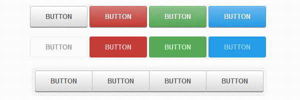
}Different buttons sizes
If you want to make a more prominent or a less prominent call-to-action button, you have options:
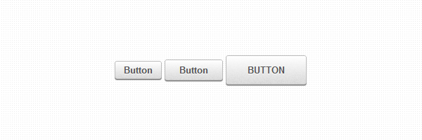
<button class="small button">Button</button>or
<button class="large button">Button</button>The CSS
/* Smaller buttons styles */
.button.small{
  padding: 4px 12px;
}

/* Larger buttons styles */
.button.large{
  padding: 12px 30px;
  text-transform: uppercase;
}

.button.large:active{
  top: 2px;
}
Various buttons colors
You’ll need custom colors for successful actions or negative ones as delete:
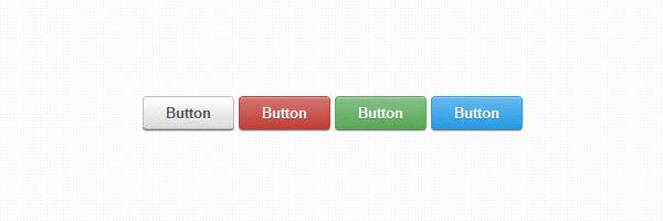
<button class="button">Button</button>
<button class="color red button">Button</button>
<button class="color green button">Button</button>
<button class="color blue button">Button</button>
The CSS
.button.color{
  color: #fff;
  text-shadow: 0 1px 0 rgba(0,0,0,.2);
  background-image: linear-gradient(top, rgba(255,255,255,.3),
             rgba(255,255,255,0)),
                    url(data:image/png;base64,iVBORw0KGg[...]QmCC);
}

/* */

.button.green{
  background-color: #57a957;
  border-color: #57a957;
}

.button.green:hover{
  background-color: #62c462;
}

.button.green:active{
  background: #57a957;
}

/* */

.button.red{
  background-color: #c43c35;
  border-color: #c43c35;
}

.button.red:hover{
  background-color: #ee5f5b;
}

.button.red:active{
  background: #c43c35;
}

/* */

.button.blue{
  background-color: #269CE9;
  border-color: #269CE9;
}

.button.blue:hover{
  background-color: #70B9E8;
}

.button.blue:active{
  background: #269CE9;
}
Disabled states
In case you’re using buttons or inputs, in some cases you’ll need them to be disabled until a certain task is triggered:
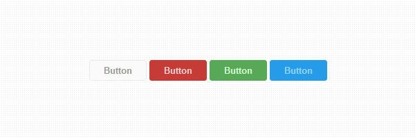
<button class="button" disabled>Button</button>
<button class="color red button" disabled>Button</button>
<button class="color green button" disabled>Button</button>
<button class="color blue button" disabled>Button</button>
The CSS
.button[disabled], .button[disabled]:hover, .button[disabled]:active{
  border-color: #eaeaea;
  background: #fafafa;
  cursor: default;
  position: static;
  color: #999;
  /* Usually, !important should be avoided but here it's really needed :) */
  box-shadow: none !important;
  text-shadow: none !important;
}

.green[disabled], .green[disabled]:hover, .green[disabled]:active{
  border-color: #57A957;
  background: #57A957;
  color: #D2FFD2;
}

.red[disabled], .red[disabled]:hover, .red[disabled]:active{
  border-color: #C43C35;
  background: #C43C35;
  color: #FFD3D3;
}

.blue[disabled], .blue[disabled]:hover, .blue[disabled]:active{
  border-color: #269CE9;
  background: #269CE9;
  color: #93D5FF;
}
Grouped buttons
There will be cases when you’ll need to group similar call-to-action buttons:
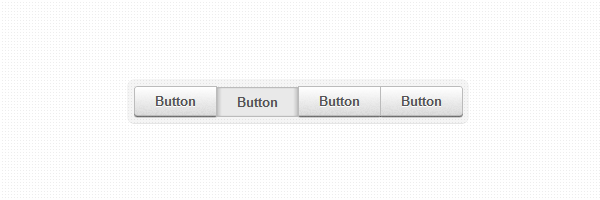
<ul class="button-group">
  <li><button class="button">Button</button></li>
  <li><button class="button">Button</button></li>
  <li><button class="button">Button</button></li>
  <li><button class="button">Button</button></li>
</ul>
The CSS
.button-group,
.button-group li{
  display: inline-block;
  *display: inline;
  zoom: 1;
}

.button-group{
  font-size: 0; /* Inline block elements gap - fix */
  margin: 0;
  padding: 0;
  background: rgba(0, 0, 0, .04);
  border-bottom: 1px solid rgba(0, 0, 0, .07);
  padding: 7px;
  border-radius: 7px;
}

.button-group li{
  margin-right: -1px; /* Overlap each right button border */
}

.button-group .button{
  font-size: 13px; /* Set the font size, different from inherited 0 */
  border-radius: 0;
}

.button-group .button:active{
  box-shadow: 0 0 1px rgba(0, 0, 0, .2) inset,
              5px 0 5px -3px rgba(0, 0, 0, .2) inset,
              -5px 0 5px -3px rgba(0, 0, 0, .2) inset;
}

.button-group li:first-child .button{
  border-radius: 3px 0 0 3px;
}

.button-group li:first-child .button:active{
  box-shadow: 0 0 1px rgba(0, 0, 0, .2) inset,
              -5px 0 5px -3px rgba(0, 0, 0, .2) inset;
}

.button-group li:last-child .button{
  border-radius: 0 3px 3px 0;
}

.button-group li:last-child .button:active{
  box-shadow: 0 0 1px rgba(0, 0, 0, .2) inset,
              5px 0 5px -3px rgba(0, 0, 0, .2) inset;
}
Browser compatibility
CSS3 patterned buttons works in all major browsers. But of course CSS3 features used here do not work in oder browsers like IE8 and below.
This is it!
There are so many CSS3 buttons in the wild and I know it. Yet I’m confident that my CSS3 patterned buttons might inspire you and I hope you’ll find it useful for your future projects.
If you found a bug or have suggestions, don’t forget to fill an issue on GitHub.