Organizing content was always an important task for web designers. Just like accordions, using CSS tabbed navigation can help you structuring similar groups of content.
Besides so many rounded corners tabs in the wild, today you’ll learn how to create some CSS tabs with beveled or slanted corners using a clever CSS gradients technique.
There are a lot of articles in the wild that show you how to create tabs with CSS3 and jQuery. Yet, I decided to create my own CSS tabs as well and I hope you’ll like my result.
The idea
A while ago I read this article article by Lea Verou about how to create beveled corners using CSS gradients. I found that very clever and we will use that technique in order to create our tabs.
The HTML
The purpose here, as usual, is to write clean and semantic markup: unordered list for the tabbed navigation and simple div’s for wrapping content.
So, check the HTML below:
  <ul id="tabs">
    <li><a href="#" title="tab1">One</a></li>
    <li><a href="#" title="tab2">Two</a></li>
    <li><a href="#" title="tab3">Three</a></li>
    <li><a href="#" title="tab4">Four</a></li>
  </ul>

  <div id="content">
    <div id="tab1">One - content</div>
    <div id="tab2">Two - content</div>
    <div id="tab3">Three - content</div>
    <div id="tab4">Four - content</div>
  </div>
The CSS
Minimal and easy to update styles, also no images were used here:
  #tabs {
  overflow: auto;
  width: 100%;
  list-style: none;
  margin: 0;
  padding: 0;
  }

  #tabs li {
    margin: 0;
    padding: 0;
    float: left;
  }

  #tabs a {
    box-shadow: -4px 0 0 rgba(0, 0, 0, .2);
    background: #ad1c1c;
    background: linear-gradient(220deg, transparent 10px, #ad1c1c 10px);
    text-shadow: 0 1px 0 rgba(0,0,0,.5);
    color: #fff;
    float: left;
    font: bold 12px/35px 'Lucida sans', Arial, Helvetica;
    height: 35px;
    padding: 0 30px;
    text-decoration: none;
  }

  #tabs a:hover {
    background: #c93434;
    background: linear-gradient(220deg, transparent 10px, #c93434 10px);
  }

  #tabs a:focus {
    outline: 0;
  }

  #tabs #current a {
    background: #fff;
    background: linear-gradient(220deg, transparent 10px, #fff 10px);
    text-shadow: none;
    color: #333;
  }

  #content {
    background-color: #fff;
    background-image: linear-gradient(top, #fff, #ddd);
    border-radius: 0 2px 2px 2px;
    box-shadow: 0 2px 2px #000, 0 -1px 0 #fff inset;
    padding: 30px;
  }

  /* Remove the rule below if you want the content to be "organic" */
  #content div {
    height: 220px;
  }
The jQuery
The code below it may not be the best possible, but I think it’s pretty decent :)
  $(document).ready(function() {
    $("#content div").hide(); // Initially hide all content
    $("#tabs li:first").attr("id","current"); // Activate first tab
    $("#content div:first").fadeIn(); // Show first tab content

    $('#tabs a').click(function(e) {
      e.preventDefault();
      $("#content div").hide(); //Hide all content
      $("#tabs li").attr("id",""); //Reset id's
      $(this).parent().attr("id","current"); // Activate this
      $('#' + $(this).attr('title')).fadeIn(); // Show content for current tab
    });
  })();
The result
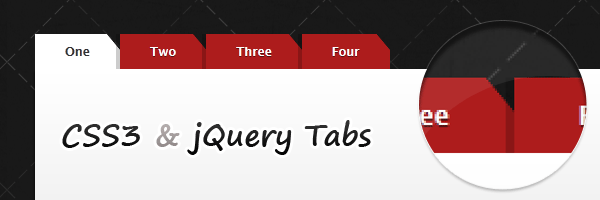
Check out the transparent corners! You can use the tabs with any background image. No side effects, no overlapping colors to match or something else.
Also, the left CSS shadow helps creating the effect of overlapping tabs.

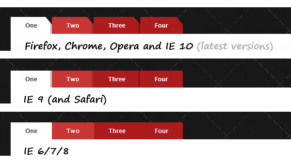
Browser support
If you read my previous articles, then you already know that I like to do stuff that works (even if it just degrades gracefully) also on older browsers like the IE (Trident).
Having said that, this demo is working also for older browsers. Obviously, it just looks slightly different, as no CSS3 support is available:
Such a gradient for Safari (lower than 5.1) would be quite complex. So, I decided to skip it (for now).