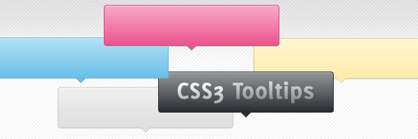
If your icon or button has insufficient text or none at all, or it just needs some additional explanation, then you surely need a CSS3 tooltip for it. Why’s that? Because, as they have proved till now, they can help you improve your website usability.
Having said that, in this article you’ll learn how to create your own CSS3 tooltips: no images, no javascript.
“Do I really need them?”
The HTML title attribute is the default additional info you can use. But, the default title’s can’t be styled. So, if you want something cool, that you can style it as you wish, then a custom CSS3 tooltip is the solution.
How it’s made
The method might be familiar to you, a relative positioned element who wraps an absolute positioned one. With this article I’m not trying to reinvent the wheel, I’m just showing you how to create some cool CSS3 tooltips.
Below you can see the proper structure, note the two pointers (made using :before and :after pseudo-elements ) who overlap:
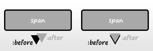 How the “bordered” pointer is made
Here are the **ingredients **that were used to create them:
HTML
<a href="#" class="tooltip">
  your text
  <span>Your custom description</span>
</a>
Why an anchor?
Just for compatibility reasons. IE6 has a problem with the :hover pseudo-class used with other elements than anchor.
If you want to use them, and anchors are not an option for you, then you can use this to trigger the tooltips for IE6:
<script type="text/javascript" src="http://code.jquery.com/jquery-latest.min.js"></script>
<script type="text/javascript">
  $(function() {
    if ($.browser.msie && $.browser.version.substr(0,1)<7)
    {
      $('.tooltip').mouseover(function(){
            $(this).children('span').show();
          }).mouseout(function(){
            $(this).children('span').hide();
          })
    }
  });
</script>
CSS
.tooltip {
  position: relative;
  background: #eaeaea;
  cursor: help;
  display: inline-block;
  text-decoration: none;
  color: #222;
  outline: none;
}

.tooltip span {
  visibility: hidden;
  position: absolute;
  bottom: 30px;
  left: 50%;
  z-index: 999;
  width: 230px;
  margin-left: -127px;
  padding: 10px;
  border: 2px solid #ccc;
  opacity: .9;
  background-color: #ddd;
  background-image: linear-gradient(rgba(255,255,255,.5), rgba(255,255,255,0));
  border-radius: 4px;
  box-shadow: 0 1px 2px rgba(0,0,0,.4), 0 1px 0 rgba(255,255,255,.5) inset;
  text-shadow: 0 1px 0 rgba(255,255,255,.4);
}

.tooltip:hover {
  border: 0; /* IE6 fix */
}

.tooltip:hover span {
  visibility: visible;
}

.tooltip span:before,
.tooltip span:after {
  content: "";
  position: absolute;
  z-index: 1000;
  bottom: -7px;
  left: 50%;
  margin-left: -8px;
  border-top: 8px solid #ddd;
  border-left: 8px solid transparent;
  border-right: 8px solid transparent;
  border-bottom: 0;
}

.tooltip span:before {
  border-top-color: #ccc;
  bottom: -8px;
}
Browser support
This is a cross-browser solution, it works also on browsers like IE6 and IE7. Although, it looks quite different as we’re talking here about progressive enhancement.