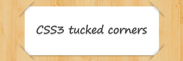
I had one of those moments this week when I remembered I saw a while ago a tucked corners effect made by Joshua Hibbert. That was cool. While thinking about it, one of my first thoughts was to try finding an alternative solution that can allow you to use a pattern as a background for the containing block.
For this alternative CSS3 tucked corners effect, I used the beveled corners technique by Lea Verou, a technique you’ve seen implemented before for my CSS tabs with beveled corners.
The HTML
The following markup is pretty similar to Joshua Hibbert’s solution. There’s nothing to change or to improve here. At first sight, you may think there’s some extra markup in there but we’ll actually need everything below in order to be able to create four corners using CSS pseudo-elements.
  <div class="tucked-corners-top">
    <div class="tucked-corners-bottom">
      <!--  content here -->
    </div>
  </div>
The CSS
The [class*='tucked-corners-'] advanced selector will select only the elements that have the string tucked-corners- anywhere within the class attribute value.
  .tucked-corners-top {
    position: relative;
    width: 500px; min-height: 200px;
    margin: 100px auto; padding: 20px;
    background-color: #fff; /* Fallback */
    background: linear-gradient(45deg,  transparent 10px, #fff 10px),
                linear-gradient(135deg, transparent 10px, #fff 10px),
                linear-gradient(225deg, transparent 10px, #fff 10px),
                linear-gradient(315deg, transparent 10px, #fff 10px);
    background-position: bottom left, bottom right, top right, top left;
    background-size: 50% 50%;
    background-repeat: no-repeat;
    box-shadow: 0 20px 10px -20px rgba(0, 0, 0, .5);
  }

  [class*='tucked-corners-']::before, /* All the four corners */
  [class*='tucked-corners-']::after {
    content: '';
    position: absolute;
    height: 20px; width: 80px;
    box-shadow: 0 8px 15px -7px rgba(0, 0, 0, .5);
    box-shadow: none\9; /* Do not show on IE9 #needed */
  }

  .tucked-corners-top::before, /* Top left & top right */
  .tucked-corners-top::after {
    top: -10px;
  }

  .tucked-corners-bottom::before, /* Bottom left & bottom right */
  .tucked-corners-bottom::after {
    bottom: -10px;
  }

  .tucked-corners-top::before, /* Top left & bottom left */
  .tucked-corners-bottom::before {
    left: -42px;
  }

  .tucked-corners-top::after, /* Top right & bottom right */
  .tucked-corners-bottom::after {
    right: -42px;
  }

  .tucked-corners-top::before { /* Top left */
    transform: rotate(-45deg);
  }

  .tucked-corners-top::after { /* Top right */
    transform: rotate(45deg);
  }

  .tucked-corners-bottom::before { /* Bottom left */
    transform: rotate(-135deg);
  }

  .tucked-corners-bottom::after { /* Bottom right */
    transform: rotate(135deg);
  }
IE9 case
As you already know, IE9 doesn’t support CSS gradients but it does supports the CSS box-shadow property. This caused the situation below:
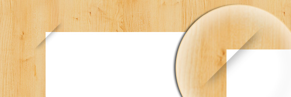
My “workaround” was to use the following IE9 CSS hack to hide the pseudos shadows. So, unfortunately, you will not see any tucked corner on IE9.
  [class*='tucked-corners-']::before,
  [class*='tucked-corners-']::after {
    box-shadow: none\9; /* Do not show on IE9 #needed */
  }
That’s it
With pros and cons, this is a solution to keep in mind when you’re using tucked corners boxes for your web designs. The solution I showed you in this article will allow you to use this effect even when you’re using a pattern as background for the containing block.