Having an effective pricing table can help you a lot to increase the conversion rate for your product sales page. It’s very important to make things clear from the beginning because this way you’ll help your visitors to take the best decision for choosing the plan that suits them.
The pricing table’s design also plays an important role here. So, in today’s article you’ll learn how to create a nice and effective pricing table using CSS3.
Before going further, in case you missed it, you may want to check also my previous CSS3 pricing table design.
The HTML
Below you can find a markup excerpt. As usual, there is nothing complicated here, just clean and minimal markup.
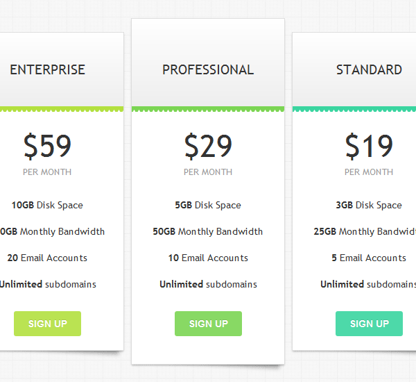
<div id="pricing-table">
<div class="plan plan1">
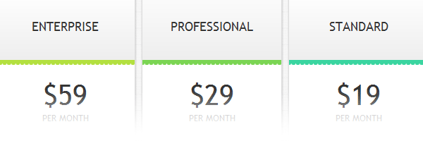
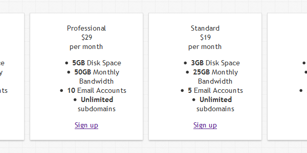
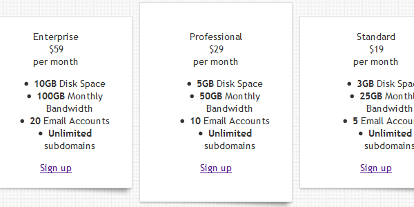
<div class="header">Enterprise</div>
<div class="price">$59</div>
<div class="monthly">per month</div>
<ul>
<li><b>10GB</b> Disk Space</li>
<li><b>100GB</b> Monthly Bandwidth</li>
<li><b>20</b> Email Accounts</li>
<li><b>Unlimited</b> subdomains</li>
</ul>
<a class="signup" href="">Sign up</a>
</div>
<div class="plan plan2 popular-plan">
...
</div>
<div class="plan plan3">
...
</div>
<div class="plan plan4">
...
</div>
</div>Starting structure
The snippet below contains the initial styles for our pricing table layout:
#pricing-table {
    margin: 100px auto;
    text-align: center;
    width: 928px; /* total computed width */
    zoom: 1;
}

#pricing-table:before, #pricing-table:after {
    content: "";
    display: table
}

#pricing-table:after {
    clear: both
}

#pricing-table .plan {
    font: 13px 'Lucida Sans', 'trebuchet MS', Arial, Helvetica;
    background: #fff;
    border: 1px solid #ddd;
    color: #333;
    padding: 20px;
    width: 180px;
    float: left;
    _display: inline; /* IE6 double margin fix */
    position: relative;
    margin: 0 5px;
    box-shadow: 0 2px 2px -1px rgba(0,0,0,.3);
}
Slick bottom shadow

To add some depth to our pricing plans, we’ll add a cool CSS drop shadow for each plan.
#pricing-table .plan:after {
    z-index: -1;
    position: absolute;
    content: "";
    bottom: 10px;
    right: 4px;
    width: 80%;
    top: 80%;
    box-shadow: 0 12px 5px rgba(0, 0, 0, .3);
    transform: rotate(3deg);
}
Highlighting a preferred plan
The plans are already relative positioned and that’s why we can elevate the .popular-plan block using a negative top value.
#pricing-table .popular-plan {
    top: -20px;
    padding: 40px 20px;
}
The headers design
For the jagged effect, you can use an encoded white triangle image and repeat it above the bottom borders.
#pricing-table .header {
    position: relative;
    font-size: 20px;
    font-weight: normal;
    text-transform: uppercase;
    padding: 40px;
    margin: -20px -20px 20px -20px;
    border-bottom: 8px solid;
    background-color: #eee;
    background-image: linear-gradient(#fff, #eee);
}

#pricing-table .header:after {
    position: absolute;
    bottom: -8px; left: 0;
    height: 3px; width: 100%;
    content: '';
    background-image: url(data:image/png;base64,iVBO[...]);
}

#pricing-table .popular-plan .header {
    margin-top: -40px;
    padding-top: 60px;
}

#pricing-table .plan1 .header {
    border-bottom-color: #B3E03F;
}

#pricing-table .plan2 .header {
    border-bottom-color: #7BD553;
}

#pricing-table .plan3 .header {
    border-bottom-color: #3AD5A0;
}

#pricing-table .plan4 .header {
    border-bottom-color: #45D0DA;
}
Price, feats and sign up styles
With these last styles, our pricing table is ready for action.
#pricing-table .price{
    font-size: 45px;
}

#pricing-table .monthly{
    font-size: 13px;
    margin-bottom: 20px;
    text-transform: uppercase;
    color: #999;
}

/* --------------- */

#pricing-table ul {
    margin: 20px 0;
    padding: 0;
    list-style: none;
}

#pricing-table li {
    padding: 10px 0;
}

/* --------------- */

#pricing-table .signup {
    position: relative;
    padding: 10px 20px;
    color: #fff;
    font: bold 14px Arial, Helvetica;
    text-transform: uppercase;
    text-decoration: none;
    display: inline-block;
    background-color: #72ce3f;
    border-radius: 3px;
    text-shadow: 0 -1px 0 rgba(0,0,0,.15);
    opacity: .9;
}

#pricing-table .signup:hover {
    opacity: 1;
}

#pricing-table .signup:active {
    box-shadow: 0 2px 2px rgba(0,0,0,.3) inset;
}

#pricing-table .plan1 .signup{
    background: #B3E03F;
}

#pricing-table .plan2 .signup{
    background: #7BD553;
}

#pricing-table .plan3 .signup{
    background: #3AD5A0;
}

#pricing-table .plan4 .signup{
    background: #45D0DA;
}
That’s all!
I hope you liked this tutorial. It’s simple, easy to use, it degrades gracefully for older browsers and it looks nice.
Thanks for reading and please don’t hesitate to share your thoughts with us!