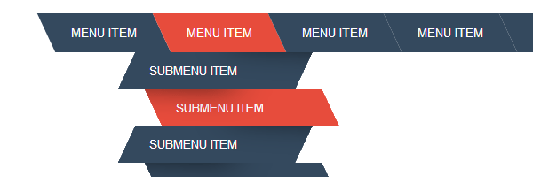
I found this two years old Dribbble shot by Ignacio Giri. Don’t ask me how, I just don’t remember how did I stumble upon it but one thing is clear: I bookmarked this dropdown menu concept, stared at it a bit and then I thought about making something similar with CSS.
The markup
The code below does not need any explanation, so I’ll just paste here the raw version so you can take a quick look at it. The HTML submenu class is here to avoid using .menu ul later on. For better and shorter CSS selectors.
<ul class="menu cf">
	<li><a href="">Menu item</a></li>
	<li>
		<a href="">Menu item</a>
		<ul class="submenu">
			<li><a href="">Submenu item</a></li>
			<li><a href="">Submenu item</a></li>
			<li><a href="">Submenu item</a></li>
			<li><a href="">Submenu item</a></li>
		</ul>
	</li>
	<li><a href="">Menu item</a></li>
	<li><a href="">Menu item</a></li>
	<li><a href="">Menu item</a></li>
</ul>
Also, the cf does exactly what you’ve been thinking it would do: it clears floats.
The CSS
Because we need to clear floats:
.cf:before,
.cf:after {
    content: " ";
    display: table;
}

.cf:after {
    clear: both;
}

.cf {
    *zoom: 1;
}
… and we don’t need any browser defaults for none of the below:
    .menu,
    .submenu {
    	margin: 0;
    	padding: 0;
    	list-style: none;
    }
Check the following lines for the rest of the styles, the experimental width: fit-content may be familiar to you if you read my last articles.
/* Main level */
.menu {
	margin: 50px auto;
	width: 800px;
	width: fit-content;
}

.menu > li {
	background: #34495e;
	float: left;
	position: relative;
	transform: skewX(25deg);
}

.menu a {
	display: block;
	color: #fff;
	text-transform: uppercase;
	text-decoration: none;
	font-family: Arial, Helvetica;
	font-size: 14px;
}

.menu li:hover {
	background: #e74c3c;
}

.menu > li > a {
	transform: skewX(-25deg);
	padding: 1em 2em;
}

/* Dropdown level*/
.submenu {
	position: absolute;
	width: 200px;
	left: 50%; margin-left: -100px;
	transform: skewX(-25deg);
	transform-origin: left top;
}

.submenu li {
	background-color: #34495e;
	position: relative;
	overflow: hidden;
}

.submenu > li > a {
	padding: 1em 2em;
}

.submenu > li::after {
	content: '';
	position: absolute;
	top: -125%;
	height: 100%;
	width: 100%;
	box-shadow: 0 0 50px rgba(0, 0, 0, .9);
}

/* Odd stuff */
.submenu > li:nth-child(odd){
	transform: skewX(-25deg) translateX(0);
}

.submenu > li:nth-child(odd) > a {
	transform: skewX(25deg);
}

.submenu > li:nth-child(odd)::after {
	right: -50%;
	transform: skewX(-25deg) rotate(3deg);
}

/* Even stuff */
.submenu > li:nth-child(even){
	transform: skewX(25deg) translateX(0);
}

.submenu > li:nth-child(even) > a {
	transform: skewX(-25deg);
}

.submenu > li:nth-child(even)::after {
	left: -50%;
	transform: skewX(25deg) rotate(3deg);
}

/* Show dropdown */
.submenu,
.submenu li {
	opacity: 0;
	visibility: hidden;
}

.submenu li {
	transition: .2s ease-out transform;
}

.menu > li:hover .submenu,
.menu > li:hover .submenu li {
	opacity: 1;
	visibility: visible;
}

.menu > li:hover .submenu li:nth-child(even){
	transform: skewX(25deg) translateX(15px);
}

.menu > li:hover .submenu li:nth-child(odd){
	transform: skewX(-25deg) translateX(-15px);
}
On RWD
Don’t try to resize the window, this menu demo is not responsive because that’s not the point of this article and I didn’t wanted to bloat the CSS for that. But I made a kinda responsive dropdown menu in the past, so feel free to check it.
Small bug
I tried to add backface-visibility: hidden on the transformed elements to prevent the existing flicker effect but I wasn’t pretty satisfied with the results. Maybe because there are so many elements with transformations applied to?
That’s all!
That would be all folks, check the demo above and let me know your thoughts and feedback on how to improve this. Thanks for reading!