Check out the Animenu GitHub repository for the updated version of this dropdown navigation concept.
I’ve been pretty happy lately to see I’m still receiving a lot of positive feedback on my animated dropdown menu. I found that quite encouraging and I decided to start working on an improved version of it using SASS & Compass. The new version is responsive, has no JavaScript dependency and it’s hosted on GitHub too.
View demo or download the .zip from GitHub
Some words on this project
Some of the decisions I had to take on this new improved dropdown navigation were on the browser support and number of levels this menu will support. All these, considering that my previous versions support IE6 and until three levels of dropdown navigation.
But, this time the accent is put on responsiveness.
Browser support
The browser support for this dropdown navigation is IE8+, so it uses the new box model triggered by box-sizing: border-box and a minimal clearfix method. With less effort, I know this could be updated to work on IE7 too, but at this time I think that if you still need support for IE7 and below, you should try my previous versions.
One dropdown level
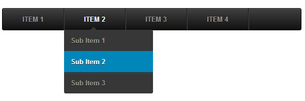
For a better user experience and to avoid usability issues, in my opinion one dropdown level is more than enough for a navigation menu. If you theoretically would need more levels, you may try considering another implementation of that content or/and other navigation techniques like tabs and breadcrumbs.
Also, an important factor on choosing just one dropdown level was the ability of using this type of navigation on touch devices like iPad, while on iPhone for example, the navigation dropdowns rearrange into a stack.
The markup
As you may have guessed, there’s nothing complicated here. The only thing worth mentioning is the advanced checkbox hack by Tim Pietrusky, which is used to simulate the toggle effect.
<nav class="animenu">
    <input type="checkbox" id="button">
    <label for="button" onclick>Menu</label>
    <ul>
        <li>
            <a href="#">Item 1</a>
            <ul>
                <li><a href="">Sub Item 1</a></li>
                <li><a href="">Sub Item 2</a></li>
                <li><a href="">Sub Item 3</a></li>
            </ul>
        </li>
        <li> ... </li>
        <li> ... </li>
        <li> ... </li>
    </ul>
</nav>
SASS and Compass
I must admit at the beginning I was a bit reluctant on using SASS for writing CSS but in the end it turned out to be a real pleasure to do so. Having programming stuff like variables and functions at your reach is pretty satisfying. Also, I like how nesting rules helps you organize the code. Last but not least, I enjoy using single-line comments, just like in JavaScript or PHP. As a side note, I’m using SCSS here, which is the latest syntax of SASS.
With all these being said, here are some quick thoughts on how I SASSified my animated dropdown menu:
Variables
$subMenuItemWidth: 175px;           // Minimum width for submenus' items
$baseMenuBackground: #111;          // Base color theme
$secondaryMenuBackground: #0186ba;  // Secondary color (highlights, triangles...)
$baseMenuColor: #999;               // Proper menu items color
$gutter: 1em;                       // Base gutter
$input: "input[type=checkbox]";     // Checkbox hack selector
For a better look and consistency, I use $subMenuItemWidth as a minimum width for the dropdown lists. The reason why this value is stored into a variable is so that in the future to be easily updated without having to search for it too much.
The above lines contain some pretty self explanatory stuff like basic colors that will be used to style this dropdown navigation, a default gutter that will help building paddings and margins and a selector shortcut for the checkbox input.
On customization
The Animenu SASS code uses functions like darken() and lighten() with the above variables as parameters so it’s quite easy to customize the entire appearance by just changing the variable’s values. Also, most of included CSS3 stuff like text-shadow and box-shadow is based on the above predefined variables.
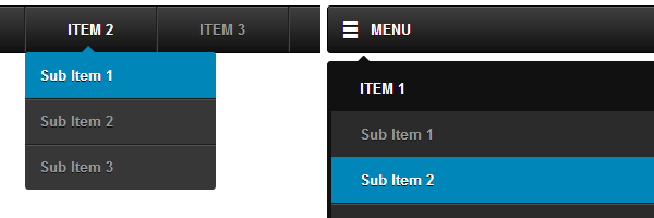
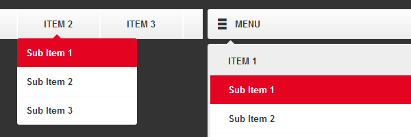 Animenu customization example
Mixins and silent classes
Beside the above variables, I’m using helpers like mixins and silent classes as well.
In the following mixin, when $menu-gradient argument value is equal to false, the background will contain no gradient. This is helpful when defining both main menu and dropdowns backgrounds using the $baseMenuBackground as parameter.
@mixin menu-background($color, $menu-gradient: true) {
    background-color: $color;
    @if $menu-gradient == true {
        @include background-image(linear-gradient(rgba(255, 255, 255, .2),
                              rgba(255, 255, 255, 0)));
    }
    @else {
        background-image: none;
    }
}
Silent classes like the next one, differentiated by the percent sign, will not be generated in the resulted CSS output. Their purpose is to be used with @extend whenever needed.
%cf:after {
    content:"";
    display:table;
    clear:both;
}
Animenu breakpoint
@media screen and (max-width: 480px) {
  ...
}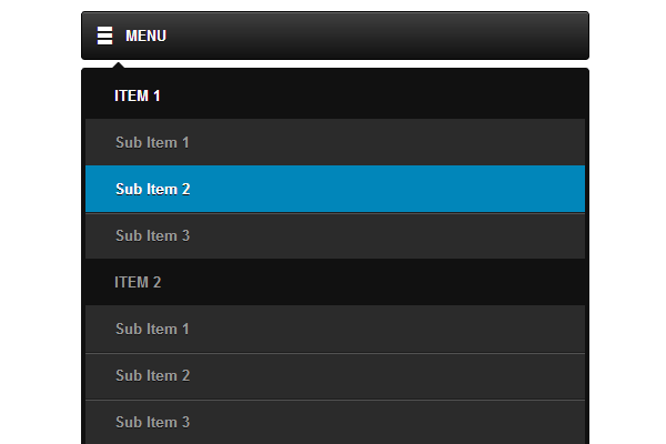
On iPhone, with using the checkbox hack, the whole navigation becomes stacked and is triggered once the checkbox’s state is checked.
On large displays, the dropdowns lists reveal on hover by using a smooth transition but we all know the hover event is not available on touch devices. Still, to make it work on tablets, the trick is to use <a href="#"> for the navigation elements that trigger the adjacent dropdowns.
Final words
In the past, I experimented it with writing SASS just on quick demos. Basically, this is my first SASS project I’m showing to the world so be gentle with me if you’re spotting things that could have been made much better. :)
This is it, also I hope you dig the “Animenu” name I chose for this new responsive navigation and I’m looking forward to read your thoughts. Thanks for reading!