It’s a sure thing that CSS3 features like transitions, animations and transforms can add extra spice to your designs. In this article, you will see how you can build a CSS3 dropdown menu that appears using a small animation when the user hovers over an element with the cursor.
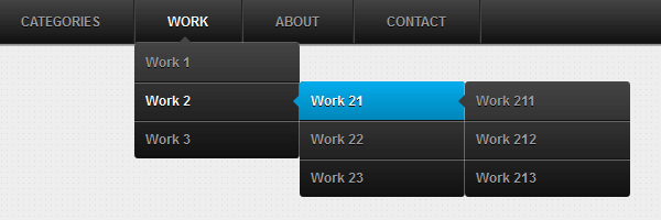
Here’s a quick preview for the CSS3 animated dropdown menu that we’re going to create today:

Remember the previous CSS3 dropdown menu? That menu is awesome, and thanks to you is the most popular tutorial around here (at this time).
Perhaps the best title for this article would have been: CSS3 dropdown menu - Revisited. The reason I’m saying that is because in this article you’ll learn how to create an animated CSS3 dropdown menu based on our previous example.
The markup is based on an unordered list
The HTML structure hasn’t changed at all, simple and minimal. Here’s an excerpt:
  <ul id="menu">
    <li><a href="#">Home</a></li>
    <li>
      <a href="#">Categories</a>
      <ul>
        <li><a href="#">CSS</a></li>
        <li><a href="#">Graphic design</a></li>
        <li><a href="#">Development tools</a></li>
        <li><a href="#">Web design</a></li>
      </ul>
    </li>
    <li><a href="#">Work</a></li>
    <li><a href="#">About</a></li>
    <li><a href="#">Contact</a></li>
  </ul>
The CSS
I revised and improved the styles in order to create this unique CSS3 animated dropdown menu. So, below you can find the commented pieces of styles:
Mini CSS reset
Reset the default ul styles.
  #menu,
  #menu ul {
    margin: 0;
    padding: 0;
    list-style: none;
  }
The main level ul
The #menu is basically the main ul for this menu. CSS3 things like gradients, shadows and rounded corners help us to create the below:

  #menu {
    width: 960px;
    margin: 60px auto;
    border: 1px solid #222;
    background-color: #111;
    background-image: linear-gradient(#444, #111);
    border-radius: 6px;
    box-shadow: 0 1px 1px #777;
  }
Clear floats
Here is Nicolas Gallagher’s clearing method I’ve been using lately:
  #menu:before,
  #menu:after {
    content: "";
    display: table;
  }

  #menu:after {
    clear: both;
  }

  #menu {
    zoom:1;
  }
List elements
Please notice the #menu li:hover > a selector. This is perhaps the most important CSS trick for this CSS3 dropdown menu.
So, this is how this works: Select an “a” element that is child of a “li” ; the “li” element must be a descendant of the “#menu”. Read more about CSS selectors.
  #menu li {
    float: left;
    border-right: 1px solid #222;
    box-shadow: 1px 0 0 #444;
    position: relative;
  }

  #menu a {
    float: left;
    padding: 12px 30px;
    color: #999;
    text-transform: uppercase;
    font: bold 12px Arial, Helvetica;
    text-decoration: none;
    text-shadow: 0 1px 0 #000;
  }

  #menu li:hover > a {
    color: #fafafa;
  }

  *html #menu li a:hover { /* IE6 only */
    color: #fafafa;
  }
Dropdown menu animation
With CSS3 transitions we can animate changes to CSS properties like margin or opacity. This is very cool and I’ve used this for animating the CSS3 sub-menus. The result is great if you ask me:
  #menu ul {
    margin: 20px 0 0 0;
    _margin: 0; /*IE6 only*/
    opacity: 0;
    visibility: hidden;
    position: absolute;
    top: 38px;
    left: 0;
    z-index: 1;
    background: #444;
    background: linear-gradient(#444, #111);
    box-shadow: 0 -1px 0 rgba(255,255,255,.3);
    border-radius: 3px;
    transition: all .2s ease-in-out;
  }

  #menu li:hover > ul {
    opacity: 1;
    visibility: visible;
    margin: 0;
  }

  #menu ul ul {
    top: 0;
    left: 150px;
    margin: 0 0 0 20px;
    _margin: 0; /*IE6 only*/
    box-shadow: -1px 0 0 rgba(255,255,255,.3);
  }

  #menu ul li {
    float: none;
    display: block;
    border: 0;
    _line-height: 0; /*IE6 only*/
    box-shadow: 0 1px 0 #111, 0 2px 0 #666;
  }

  #menu ul li:last-child {
    box-shadow: none;
  }

  #menu ul a {
    padding: 10px;
    width: 130px;
    _height: 10px; /*IE6 only*/
    display: block;
    white-space: nowrap;
    float: none;
    text-transform: none;
  }

  #menu ul a:hover {
    background-color: #0186ba;
    background-image: linear-gradient(#04acec, #0186ba);
  }
First and last elements styles
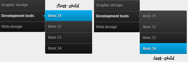
  #menu ul li:first-child > a {
    border-radius: 3px 3px 0 0;
  }

  #menu ul li:first-child > a:after {
    content: '';
    position: absolute;
    left: 40px;
    top: -6px;
    border-left: 6px solid transparent;
    border-right: 6px solid transparent;
    border-bottom: 6px solid #444;
  }

  #menu ul ul li:first-child a:after {
    left: -6px;
    top: 50%;
    margin-top: -6px;
    border-left: 0;
    border-bottom: 6px solid transparent;
    border-top: 6px solid transparent;
    border-right: 6px solid #3b3b3b;
  }

  #menu ul li:first-child a:hover:after {
    border-bottom-color: #04acec;
  }

  #menu ul ul li:first-child a:hover:after {
    border-right-color: #0299d3;
    border-bottom-color: transparent;
  }

  #menu ul li:last-child > a {
    border-radius: 0 0 3px 3px;
  }
The jQuery code
As you already get used to, IE6 gets some extra attention:
  $(function() {
    if ($.browser.msie && $.browser.version.substr(0,1)<7) {
      $('li').has('ul')
      .mouseover(function(){
        $(this).children('ul').css('visibility','visible');
      })
      .mouseout(function(){
        $(this).children('ul').css('visibility','hidden');
      })
    }
  });
While the :hover pseudo-class does not work for other elements than anchor, we just need to add this small jQuery snippet to fix it. It’s pretty self-explanatory.
Mobile navigation support
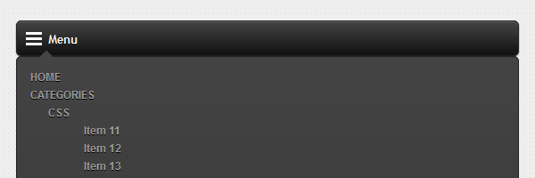
This is something I wished to do for a while and I finally made it. I just added support for mobile devices and fixed the navigation for the iPad.
You know how much I love CSS only solutions, but this time we’ll be using some jQuery to enhance this menu. To view the result, you can narrow your browser window or browse it with your smartphone.
The viewport meta tag
To maintain everything at the correct scale, the first thing added is the viewport meta tag:
<meta name="viewport" content="width=device-width">Small markup update
You need to wrap the above HTML structure using something like: <nav id="menu-wrap">. This will be our relative holder for the mobile navigation.
The jQuery add
After page loads, we’ll add the #menu-trigger element which does exactly what you think: will trigger the mobile menu when it will be clicked. Further, in the CSS, you’ll see that this element is displayed using CSS3 media queries.
Another thing here is the iPad device detection. As you can see below, we’ll remove the fancy transition effect and stick to toggling display: none/block. This way, the functionality will be maintained also on the iPad.
  /* Mobile */
  $('#menu-wrap').prepend('<div id="menu-trigger">Menu</div>');
  $("#menu-trigger").on("click", function(){
      $("#menu").slideToggle();
  });

  // iPad
  var isiPad = navigator.userAgent.match(/iPad/i) != null;
  if (isiPad) $('#menu ul').addClass('no-transition');
The mobile CSS
Here, the CSS3 media queries do the trick. We’ll add CSS rules to override the initial styles:
  #menu-trigger { /* Hide it initially */
    display: none;
  }

  @media screen and (max-width: 600px) {
    #menu-wrap {
      position: relative;
    }

    #menu-wrap * {
      box-sizing: border-box;
    }

    #menu-trigger {
      display: block; /* Show it now */
      height: 40px;
      line-height: 40px;
      cursor: pointer;
      padding: 0 0 0 35px;
      border: 1px solid #222;
      color: #fafafa;
      font-weight: bold;
      background-color: #111;
      /* Multiple backgrounds here, the first is base64 encoded */
      background: url(data:image/png;base64,iVBOR...) no-repeat 10px center, linear-gradient(#444, #111);
      border-radius: 6px;
      box-shadow: 0 1px 1px #777, 0 1px 0 #666 inset;
    }

    #menu {
      margin: 0; padding: 10px;
      position: absolute;
      top: 40px;
      width: 100%;
      z-index: 1;
      display: none;
      box-shadow: none;
    }

    #menu:after {
      content: '';
      position: absolute;
      left: 25px;
      top: -8px;
      border-left: 8px solid transparent;
      border-right: 8px solid transparent;
      border-bottom: 8px solid #444;
    }

    #menu ul {
      position: static;
      visibility: visible;
      opacity: 1;
      margin: 0;
      background: none;
      box-shadow: none;
    }

    #menu ul ul {
      margin: 0 0 0 20px !important;
      box-shadow: none;
    }

    #menu li {
      position: static;
      display: block;
      float: none;
      border: 0;
      margin: 5px;
      box-shadow: none;
    }

    #menu ul li{
      margin-left: 20px;
      box-shadow: none;
    }

    #menu a{
      display: block;
      float: none;
      padding: 0;
      color: #999;
    }

    #menu a:hover{
      color: #fafafa;
    }

    #menu ul a{
      padding: 0;
      width: auto;
    }

    #menu ul a:hover{
      background: none;
    }

    #menu ul li:first-child a:after,
    #menu ul ul li:first-child a:after {
      border: 0;
    }
  }

  @media screen and (min-width: 600px) {
    #menu {
      display: block !important;
    }
  }

  /* iPad */
  .no-transition {
    transition: none;
    opacity: 1;
    visibility: visible;
    display: none;
  }

  #menu li:hover > .no-transition {
    display: block;
  }
That’s it
I hope you enjoyed this article and the plethora of CSS techniques used above!