A breadcrumb navigation or breadcrumbs allows users to know where they are in a hierarchical structure and navigate back to higher-level pages in the hierarchy. Also, the breadcrumb navigation can reduce the number of actions a user needs to perform in order to navigate back.
To keep it simple, if you have a website with a lot of pages and sub-levels, in order to increase the usability for your content, you need to use breadcrumbs.
Having said that, in this article, you will learn how to create a CSS breadcrumb navigation with CSS pseudo-elements.
The HTML
Tha markup is simple and minimal, based on an unordered list.
  <ul id="breadcrumbs-one">
    <li><a href="">Lorem ipsum</a></li>
    <li><a href="">Vivamus nisi eros</a></li>
    <li><a href="">Nulla sed lorem risus</a></li>
    <li><a href="">Nam iaculis commodo</a></li>
    <li><a href="" class="current">Current crumb</a></li>
  </ul>
The CSS
First, let’s add a mini CSS reset for our unordered lists:
  ul{
    margin: 0;
    padding: 0;
    list-style: none;
  }
Secondly, I’d like to add that all the breadcrumbs I made for this tutorial are using CSS pseudo-elements. I bet there’s no need to specify what pseudo-elements are and how cool they are.
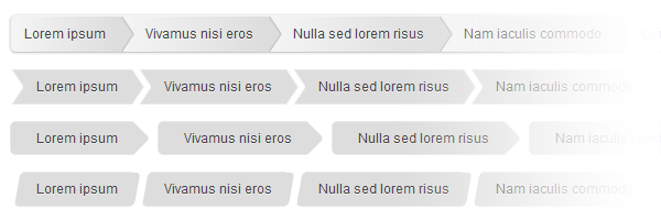
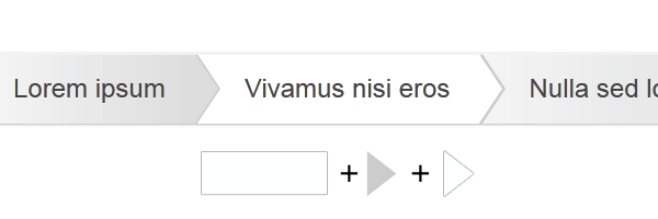
First example
Here I used a similar technique to the one I used for creating these CSS3 tooltips. Basically, to create a right-bordered triangle effect, the triangles created with pseudo-elements are placed one above another. The darker triangle will be shifted a bit in order to achieve the border.
#breadcrumbs-one{
background: #eee;
border-width: 1px;
border-style: solid;
border-color: #f5f5f5 #e5e5e5 #ccc;
border-radius: 5px;
box-shadow: 0 0 2px rgba(0,0,0,.2);
overflow: hidden;
width: 100%;
}
#breadcrumbs-one li{
float: left;
}
#breadcrumbs-one a{
padding: .7em 1em .7em 2em;
float: left;
text-decoration: none;
color: #444;
position: relative;
text-shadow: 0 1px 0 rgba(255,255,255,.5);
background-color: #ddd;
background-image: linear-gradient(to right, #f5f5f5, #ddd);
}
#breadcrumbs-one li:first-child a{
padding-left: 1em;
border-radius: 5px 0 0 5px;
}
#breadcrumbs-one a:hover{
background: #fff;
}
#breadcrumbs-one a::after,
#breadcrumbs-one a::before{
content: "";
position: absolute;
top: 50%;
margin-top: -1.5em;
border-top: 1.5em solid transparent;
border-bottom: 1.5em solid transparent;
border-left: 1em solid;
right: -1em;
}
#breadcrumbs-one a::after{
z-index: 2;
border-left-color: #ddd;
}
#breadcrumbs-one a::before{
border-left-color: #ccc;
right: -1.1em;
z-index: 1;
}
#breadcrumbs-one a:hover::after{
border-left-color: #fff;
}
#breadcrumbs-one .current,
#breadcrumbs-one .current:hover{
font-weight: bold;
background: none;
}
#breadcrumbs-one .current::after,
#breadcrumbs-one .current::before{
content: normal;
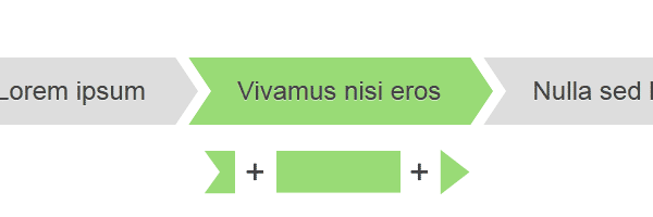
}Second example
The CSS shapes built with the pseudo-elements are placed before, respectively after.
#breadcrumbs-two{
overflow: hidden;
width: 100%;
}
#breadcrumbs-two li{
float: left;
margin: 0 .5em 0 1em;
}
#breadcrumbs-two a{
background: #ddd;
padding: .7em 1em;
float: left;
text-decoration: none;
color: #444;
text-shadow: 0 1px 0 rgba(255,255,255,.5);
position: relative;
}
#breadcrumbs-two a:hover{
background: #99db76;
}
#breadcrumbs-two a::before{
content: "";
position: absolute;
top: 50%;
margin-top: -1.5em;
border-width: 1.5em 0 1.5em 1em;
border-style: solid;
border-color: #ddd #ddd #ddd transparent;
left: -1em;
}
#breadcrumbs-two a:hover::before{
border-color: #99db76 #99db76 #99db76 transparent;
}
#breadcrumbs-two a::after{
content: "";
position: absolute;
top: 50%;
margin-top: -1.5em;
border-top: 1.5em solid transparent;
border-bottom: 1.5em solid transparent;
border-left: 1em solid #ddd;
right: -1em;
}
#breadcrumbs-two a:hover::after{
border-left-color: #99db76;
}
#breadcrumbs-two .current,
#breadcrumbs-two .current:hover{
font-weight: bold;
background: none;
}
#breadcrumbs-two .current::after,
#breadcrumbs-two .current::before{
content: normal;
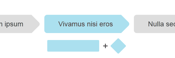
}Third example
Using border-radius we will round the corners for our rectangle and square shapes. The square will be rotated, in order to achieve a rounded diamond.
#breadcrumbs-three{
overflow: hidden;
width: 100%;
}
#breadcrumbs-three li{
float: left;
margin: 0 2em 0 0;
}
#breadcrumbs-three a{
padding: .7em 1em .7em 2em;
float: left;
text-decoration: none;
color: #444;
background: #ddd;
position: relative;
z-index: 1;
text-shadow: 0 1px 0 rgba(255,255,255,.5);
border-radius: .4em 0 0 .4em;
}
#breadcrumbs-three a:hover{
background: #abe0ef;
}
#breadcrumbs-three a::after{
background: #ddd;
content: "";
height: 2.5em;
margin-top: -1.25em;
position: absolute;
right: -1em;
top: 50%;
width: 2.5em;
z-index: -1;
transform: rotate(45deg);
border-radius: .4em;
}
#breadcrumbs-three a:hover::after{
background: #abe0ef;
}
#breadcrumbs-three .current,
#breadcrumbs-three .current:hover{
font-weight: bold;
background: none;
}
#breadcrumbs-three .current::after{
content: normal;
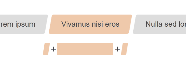
}Fourth example
Again, with the CSS pseudo-elements, you’ll add two rectangles before and after the element. Then you’ll round the outer sides for each one. The rest is nothing but poetry. :)
  #breadcrumbs-four{
    overflow: hidden;
    width: 100%;
  }

  #breadcrumbs-four li{
    float: left;
    margin: 0 .5em 0 1em;
  }

  #breadcrumbs-four a{
    background: #ddd;
    padding: .7em 1em;
    float: left;
    text-decoration: none;
    color: #444;
    text-shadow: 0 1px 0 rgba(255,255,255,.5);
    position: relative;
  }

  #breadcrumbs-four a:hover{
    background: #efc9ab;
  }

  #breadcrumbs-four a::before,
  #breadcrumbs-four a::after{
    content:'';
    position:absolute;
    top: 0;
    bottom: 0;
    width: 1em;
    background: #ddd;
    transform: skew(-10deg);
  }

  #breadcrumbs-four a::before{

    left: -.5em;
    border-radius: 5px 0 0 5px;
  }

  #breadcrumbs-four a:hover::before{
    background: #efc9ab;
  }

  #breadcrumbs-four a::after{
    right: -.5em;
    border-radius: 0 5px 5px 0;
  }

  #breadcrumbs-four a:hover::after{
    background: #efc9ab;
  }

  #breadcrumbs-four .current,
  #breadcrumbs-four .current:hover{
    font-weight: bold;
    background: none;
  }

  #breadcrumbs-four .current::after,
  #breadcrumbs-four .current::before{
    content: normal;
  }
CSS breadcrumbs advantages
- No images, so it’s easy to update and maintain.
- Everything is scalable,
emfont sizing based. - Has fallbacks for older browsers.
Conclusion
I didn’t merged the common styles for the above breadcrumbs with a purpose. I thought that if you need a certain breadcrumbs style, just copy and paste that, without other CSS inheritances issues.
Thank you for reading and I hope you liked this tutorial. Have any questions or just want to share your thoughts? Feel free to get in touch!