Whether you’re designing a website or a web application, you’ll need buttons for it. Now, with CSS3’s help, it was never easier to create nice looking buttons.
In this article you’ll learn how to create some cool CSS3 buttons in just a few steps.
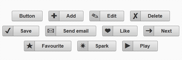
While last time we’ve created simple CSS3 gradient buttons, this time we’ll build some nice CSS3 buttons with icons.
In order to create the icons, this set of CSS3 buttons uses HTML entities. Also, gradients, shadows and many other CSS3 features do not miss.
Minimal markup
<a href="" class="button">Button</a>Simple button, with no icon.
<a href="" class="button add">Add</a>Note the add class who adds the plus icon.
CSS
Below you can find the styles used to create the buttons and icons:
.button {
    display: inline-block;
    white-space: nowrap;
    background-color: #ccc;
    background-image: linear-gradient(top, #eee, #ccc);
    filter: progid:DXImageTransform.Microsoft.gradient(startColorStr='#eeeeee', EndColorStr='#cccccc');
    border: 1px solid #777;
    padding: 0 1.5em;
    margin: 0.5em;
    font: bold 1em/2em Arial, Helvetica;
    text-decoration: none;
    color: #333;
    text-shadow: 0 1px 0 rgba(255,255,255,.8);
    border-radius: .2em;
    box-shadow: 0 0 1px 1px rgba(255,255,255,.8) inset, 0 1px 0 rgba(0,0,0,.3);
}

.button:hover {
    background-color: #ddd;
    background-image: linear-gradient(top, #fafafa, #ddd);
    filter: progid:DXImageTransform.Microsoft.gradient(startColorStr='#fafafa', EndColorStr='#dddddd');
}

.button:active {
    box-shadow: 0 0 4px 2px rgba(0,0,0,.3) inset;
    position: relative;
    top: 1px;
}

.button:focus {
    outline: 0;
    background: #fafafa;
}

.button:before {
    background: #ccc;
    background: rgba(0,0,0,.1);
    float: left;
    width: 1em;
    text-align: center;
    font-size: 1.5em;
    margin: 0 1em 0 -1em;
    padding: 0 .2em;
    box-shadow: 1px 0 0 rgba(0,0,0,.5), 2px 0 0 rgba(255,255,255,.5);
    border-radius: .15em 0 0 .15em;
    pointer-events: none;
}

/* Hexadecimal entities for the icons */

.add:before {
    content: "\271A";
}

.edit:before {
    content: "\270E";
}

.delete:before {
    content: "\2718";
}

.save:before {
    content: "\2714";
}

.email:before {
    content: "\2709";
}

.like:before {
    content: "\2764";
}

.next:before {
    content: "\279C";
}

.star:before {
    content: "\2605";
}

.spark:before {
    content: "\2737";
}

.play:before {
    content: "\25B6";
}
Why use entities rather than images?
- Faster loading, because we’re talking about text here.
- Scalable, depending on font size.
- Styles as color and background are easy to update via CSS.
Speed
The above buttons do not use any image, automatically there’s no extra HTTP image request. No image to load means faster rendering.
Scalability
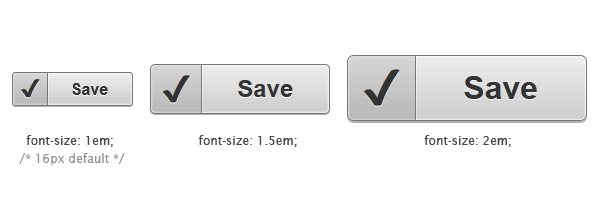
You just need to change the font-size value from the following shorthand declaration:
font: bold 1em/2em Arial, Helvetica;There you go, you’ve just increased/decreased the button’s size!
Rendering & browsers support
The icons are added using the :before pseudo-element. Therefore, you won’t see any icons in browsers like IE7 and below, but the buttons will look good yet.
Different operating systems and different browsers means different rendering for the HTML entities we used as icons.
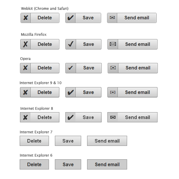
Screenshots made using latest versions for the modern browsers and Windows 7 as OS.
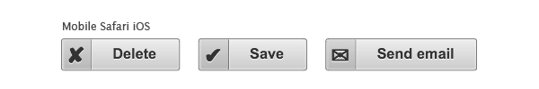
Screenshot made using an iPhone 3GS.
Update
You asked it and now you have it! I added support for the button, input type="button" and input type="submit" elements. Additionally, now they can be disabled by adding the HTML disabled attribute or by adding CSS .disabled class.
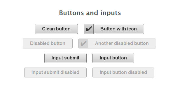
A Chrome screenshot.
/* Buttons and inputs */
button.button,
input.button {
    cursor: pointer;
    overflow: visible; /* removes extra side spacing in IE */
}

/* removes extra inner spacing in Firefox */
button::-moz-focus-inner {
  border: 0;
  padding: 0;
}

/* If line-height can't be modified, then fix Firefox spacing with padding */
 input::-moz-focus-inner {
  padding: .4em;
}

/* The disabled styles */
.button[disabled],
.button[disabled]:hover,
.button.disabled,
.button.disabled:hover {
    background: #eee;
    color: #aaa;
    border-color: #aaa;
    cursor: default;
    text-shadow: none;
    position: static;
    box-shadow: none;
}
A word on inputs spacing
Firefox has taken a decision to limit line-height on buttons as they have defined something like that:
line-height: normal !important;Also, Opera does exactly the same thing. The thing is that browser-defined !important rules cannot be over-ruled by author-defined !important rules. Automatically there’s nothing we can do about line-height.
So, the solution I found is to use some padding for Mozilla Firefox specifically and just leave Opera alone for now. Apparently, the inputs and buttons look as they should only for versions greater than Firefox 5.
Also, Roger Johansson has a potential solution for this matter, but does not quite match for our example.
Inputs and CSS generated content
Using pseudo-elements like :before and :after helps you specifying which content should be inserted before (or after) the content of that element. The input elements have no content, therefore, in our example the :before will not render any icon for the input elements.
Yet, on Opera 11.51 this worked!!! On Opera, if you use CSS generated content for inputs, it works! Strange, huh? :)
Another update
Just added some color to the buttons. To make them even more useful, I chose to create Twitter and Facebook buttons:

I hope you like them, the same technique as above is used. View the demo page source for the styles.
That’s all!
I hope you enjoyed this tutorial! Looking forward for your feedback, feel free to add your comment. Thanks for reading!