I mean I literally inspected the mastodon.social website and I wrote down some random findings and first impressions on HTML, CSS and more.
So, mostly due to curiosity and after seeing a lot of people mentioning Mastodon, the social network, I decided to join the hype.
I went ahead and decided to create a new account for Mastodon. With this in mind, I thought it would be a good idea to write down some of my first impressions, both as a user and web developer.
What is Mastodon
Mastodon is a free, open-source social network server based on open web protocols like ActivityPub and OStatus.
There are a lot of things I read and liked about Mastodon: the aim for a good user interface or the desire to create clean REST API for 3rd party apps. But what remained in my head is the focus on robust anti-abuse tools, which is something that Twitter is blamed for.
And it looks like Mastodon is an open source alternative to Twitter.
So I encourage you to read more about this project on Patreon and GitHub:
- Gargron/Eugen Rochko is creating Mastodon on Patreon
- Everything related to Mastodon is on GitHub
mastodon.social 👍
Now, what first caught my attention was the cool name and top-level domain (TLD) they came up with: mastodon.social. It’s short and easy to remember, also note that the .social TLD is available since 2014.
I appreciate the research behind this and I also like new cool TLDs too: see the current .red one in the address bar. Still, I’m curious about the long-term plans, considering the mastodon.com domain appears to be on sale now. What a coincidence!
So I guess someone will Get Rich or Die Tryin’.
Signing up 👍
So I signed up for a new account and got a beautiful verification email. Also, while trying to sign up, I learned that Chrome has a built-in password generator that can be useful when signing up for a new account. Didn’t know that before.
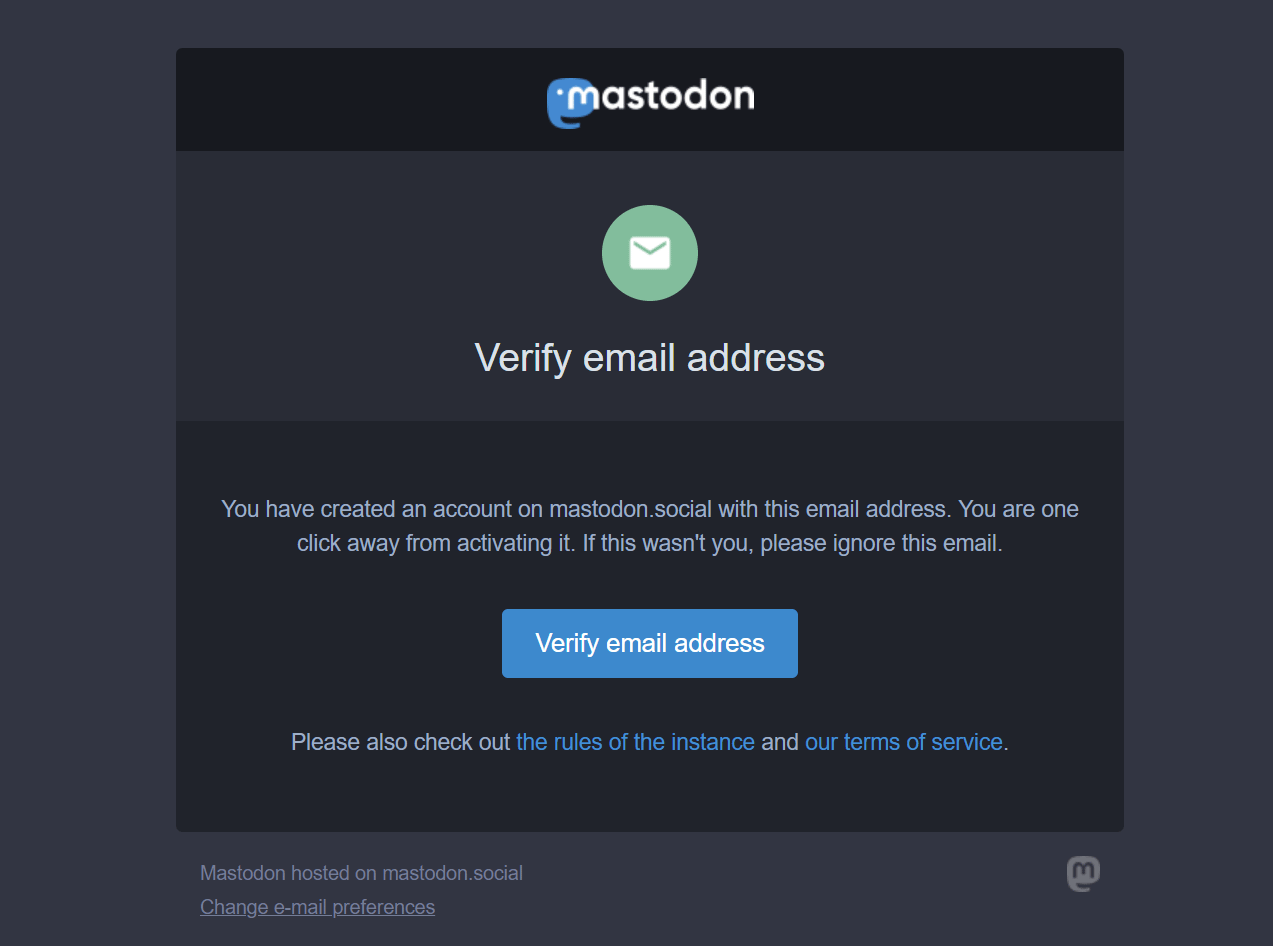
I have been doing some email design & coding recently and I was able to recognize a well-designed email, with a nice logo and a clear call-to-action button.
First sign in 👎
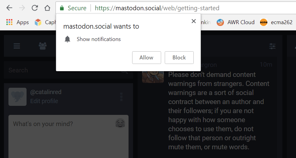
I’ve verified my email address but I certainly didn’t enjoy the browser notification popup shown just after couple seconds I’ve signed in. It’s intrusive and I’d have expected a notification like that only later on after the first sign in.
Missing meta name=description 👎
The page has no meta name=description which is kind of surprising, therefore Google takes the first important text found on the page as a replacement instead.

The thing is there is an existing og:description but the best practice is to have both, for both search engines and social sharing.
No type=text/css or type=text/javascript 👍
I liked the fact that the markup contains a clean doctype, a specified language for the html tag along with no redundant type=text/css or type=text/javascript attributes and values.
I’m still thinking what is the reason for modern websites like slack.com to keep using the above type=text/... stuff in the source. It’s redundancy.
You may hit view-source:https://slack.com/, it’s same situation since last time I checked, in October 2017.
HTTP2 👍
While checking out the network panel, noticed the websites resources are served via HTTP2. The GZIP compression is enabled too.
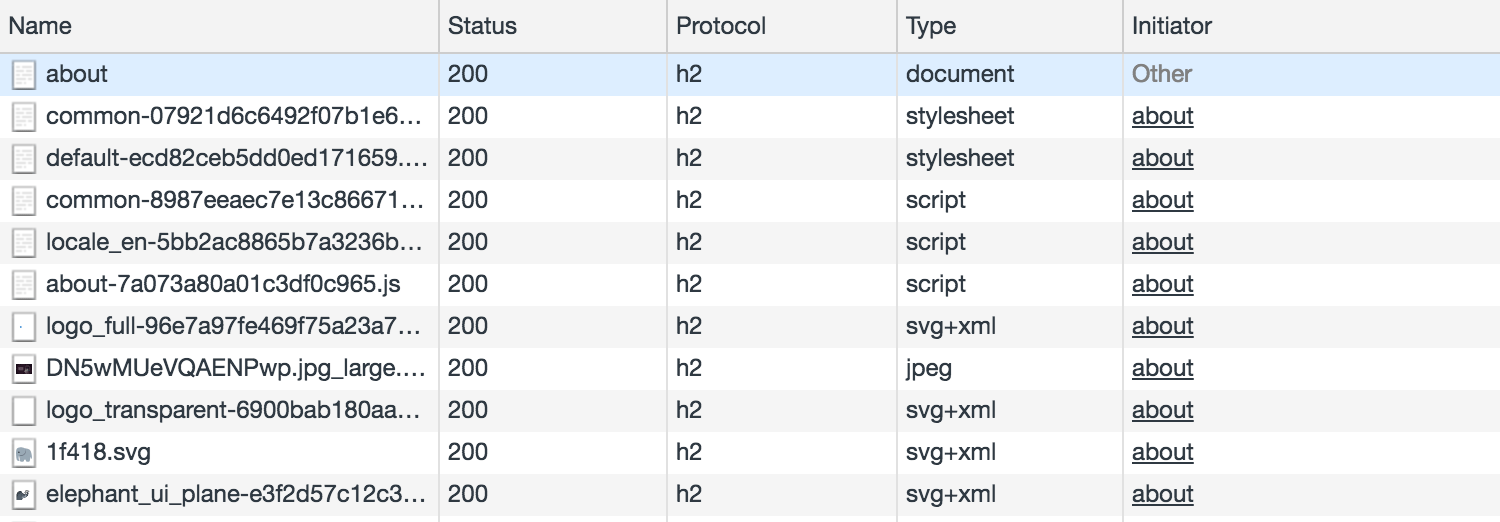
Overall, the website is super-fast, it uses Webpack to bundle the JS and the right sidebar feed is powered by React.
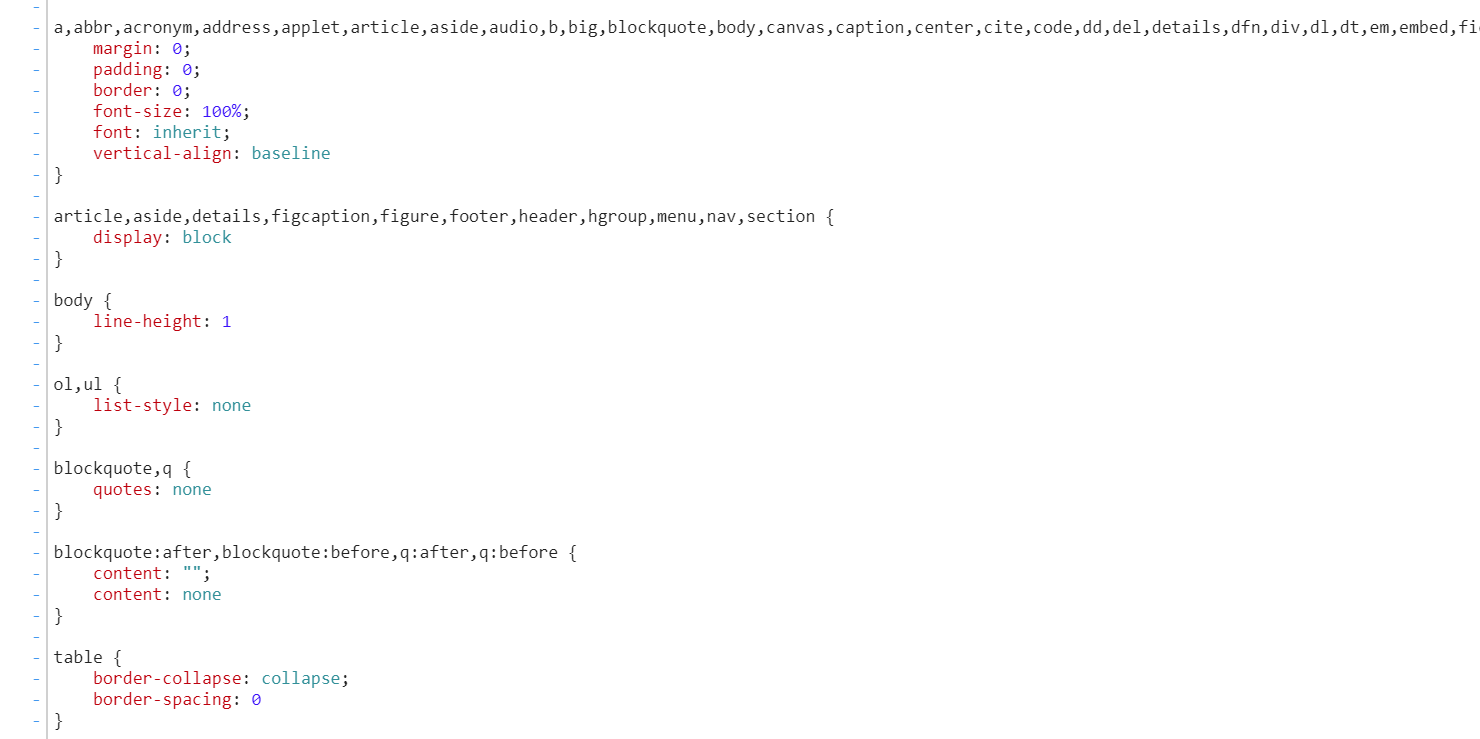
CSS Reset 👎
Personally, I like to preserve useful defaults instead of clearing everything with a CSS Reset. A tool like normalize.css, comparing to the classic CSS Reset helps to learn how elements are meant to display actually.
CSS selectors 👎
This is what Sass files do to your CSS files if you abuse nesting:
.public-layout .public-account-header__tabs__tabs .counter .counter-label {
  ...
}

.public-layout .public-account-header__extra .public-account-bio .account__header__fields {
  ...
}

.reply-indicator__content.status__content--with-spoiler .status__content__text {
  ...
}

.regeneration-indicator.missing-indicator .regeneration-indicator__figure {
  ...
}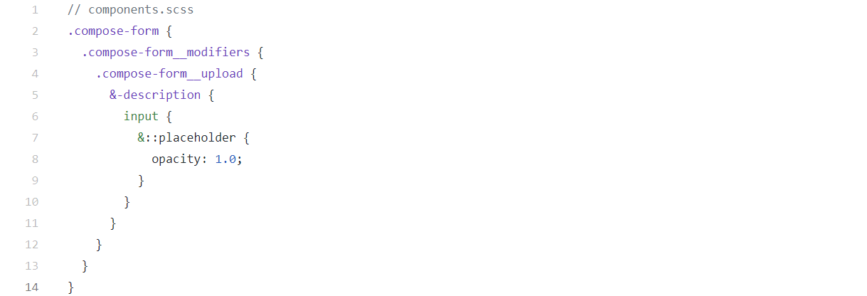
An example of deep Sass nesting from Mastodon’s .scss files.
Flexbox & Grid 👍
I browsed the styles and it was nice to see Flexbox and CSS Grid Layout are used mostly everywhere.
FontAwesome 👎
Not a big fan of the FontAwesome icon font as a solution for icons, not anymore. But I guess an SVG icon system will replace those very soon. SVG icon fonts are so much easier to work with.
<!-- FontAwesome icon  -->
<i class="fa fa-fw fa-leaf"></i>
Also, too many fonts maybe?

Missing alt 👎
Both Tenon and Lighthouse accessibility audits are failing because there’s a missing alt attribute for the bottom mastodon image.

A cute mastodon launching a paper airplane.
target=_blank 👎
When your page links to another page using target=”_blank”, the new page runs on the same process as your page. If the new page is executing expensive JavaScript, your page’s performance may also suffer. from Ligthouse docs
There are some missing rel=noopener or rel=noreferrer attributes when using target=_blank in order to open links in new tabs. Not sure about the potential risks here though because the linking is basic internally to say so, between the Mastodon website and app.
I also wrote about the findings on this subject a while ago, feel free to check out the (not so up-to-date) numbers on this matter on CSS-Tricks.
More
-
The Google Pagespeed scores are kind of low due to missing enabled compression, 64/100 on Mobile and 85/100 for Desktop. Why it matters? One reason is that website speed has been an SEO ranking factor for years.
-
It looks like the HTML
<h2>tag is missing completely, while there’s a unique<h1>and multiple<h3>tags on the page. -
The
<bdi>element is not supported in all browsers and I’m curious if there’s a polyfill used for that. -
When it comes to SEO and content best practices, the audits warn about uninformative link texts:
Do not use generic text in links. Use text in the link that accurately and concisely conveys where the link goes.
<a class="button button-alternative" href="/about/more">Learn more</a>
<a class="button button-alternative" href="https://joinmastodon.org/">Learn more</a>
The social me
I left Facebook a while ago and never looked back. I didn’t like the interaction with the people in there and like many others, I didn’t like the company for sure.
I have lots of concerns on Twitter as a company, I agree with most things @kizmarh tweeted, but I definitely love the people on Twitter. Today Twitter is the place where I search and get validation from, the place where I interact and learn things from some awesome people I follow.
For everything else, there’s the Unfollow button.
Why Mastodon
I like to dig into web page sources from time to time to see how others are writing markup and stuff. I’m a bit like Everyday I’m hustl… inspectin’.
Mastodon was the choice for this article as the new guy in town always gets all the attention. And because I’ve seen @kizmarh’s tweet of course 🙂