I’ve had this example in mind for a while now and seeing something similar in the wild, made me want to write this article down.
So, in this article you’ll learn how to create an interactive menu using CSS3 goodness and jQuery’s power.
The idea
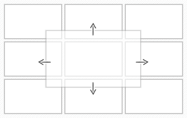
The idea behind this example was to have some nicely arranged blocks and once you click on one of them, the block will start showing its hidden content starting at its current position.
Besides being a menu, this example can also serve as a perfect single page website. For example, just think that a block can be named “Contact” and could contain a nice contact form.
The HTML
Nothing too complicated here, each block has a title that is hidden once its adjacent content will be triggered. Regarding tabindex will discuss a little later.
<ul class="menu">
  <li tabindex="1">
    <span class="title">One</span>
    <div class="content">Lorem ipsum dolor sit amet...</div>
  </li>
...
  <li tabindex="1">
    <span class="title">Nine</span>
    <div class="content">Lorem ipsum dolor sit amet...</div>
  </li>
</ul>
The CSS
In the following rows I’ll try to explain a bit the styles that were used to create this example.
Wrapper
First of all we’re going to add some basic styles for our list wrapper including clearing floats. Also, you may have noticed the counter-reset: li; declaration, you’ve seen it before and we’ll use it further again to create a nice counter effect.
.menu{
  width: 620px;
  margin: 100px auto; padding: 15px;
  list-style: none;
  counter-reset: li;
  background: #eee;
  box-shadow: 0 1px 2px rgba(0,0,0,.1) inset;
  border-radius: 10px;
}

.menu:before,
.menu:after {
  content: "";
  display: table;
}

.menu:after {
  clear: both;
}

.menu {
  zoom:1;
}
List element
Below you can find the CSS rules used in order to add some basic styles for list elements.
Things to note:
-
On
:focuswe’ll use the same styling as on:hover. This is necessary when using keyboard’s tab key. -
The CSS
.coverclass is dynamically added (with jQuery) to anlielement when it’s triggered. -
If the trigger is made through ENTER key, using
outline: 0;declaration will help removing focus styling. -
Numbering system, similar to CSS3 ordered lists.
.menu li {
  position: relative;
  float: left;
  cursor: pointer;
  height: 120px; width: 200px;
  margin: 10px 0 0 10px;
  color: #fff;
}

.menu li:hover, .menu li:focus{
  background-image: linear-gradient(top, rgba(255,255,255,.2), rgba(255,255,255,0));
}

.menu .cover{
  z-index: 2;
}

.menu .cover:focus{
  outline: 0;
}

/* -------------------------------- */

.menu li::after{
  content: counter(li);
  counter-increment: li;
  font: italic bold 10px serif, georgia;
  position: absolute;
  color: rgba(255,255,255,.1);
  opacity: 0;
  transition: all .2s ease-out;
}

.menu li:hover::after, .menu li:focus::after{
  font-size: 100px;
  opacity: 1;
}

.menu .cover::after{
  z-index: -1;
}
Clean li’s margins and colorize them
Above we’re using margin: 10px 0 0 10px; to add spacing between elements, now we have to clean some of them. Also we’ll colorize the li elements along with its content window and close button.
In this case, to colorize .content and .close for each li, it would have been great to just use background: inherit; declaration. But, due browser inconsistency we’re going to use the “hard” way, as you can see below:
.menu li:nth-child(1),
.menu li:nth-child(2),
.menu li:nth-child(3){
  margin-top: 0;
}

.menu li:nth-child(1),
.menu li:nth-child(4),
.menu li:nth-child(7){
  margin-left: 0;
}

/* -------------------------------- */

.menu li:nth-child(1),
.menu li:nth-child(1) .content,
.menu li:nth-child(1) .close{
  background-color: #2c618f;
}

.menu li:nth-child(2),
.menu li:nth-child(2) .content,
.menu li:nth-child(2) .close{
  background-color: #91ab31;
}

.menu li:nth-child(3),
.menu li:nth-child(3) .content,
.menu li:nth-child(3) .close{
  background-color: #714a28;
}

.menu li:nth-child(4),
.menu li:nth-child(4) .content,
.menu li:nth-child(4) .close{
  background-color: #e58600;
}

.menu li:nth-child(5),
.menu li:nth-child(5) .content,
.menu li:nth-child(5) .close{
  background-color: #c33a00;
}

.menu li:nth-child(6),
.menu li:nth-child(6) .content,
.menu li:nth-child(6) .close{
  background-color: #7f5dac;
}

.menu li:nth-child(7),
.menu li:nth-child(7) .content,
.menu li:nth-child(7) .close{
  background-color: #5672b7;
}

.menu li:nth-child(8),
.menu li:nth-child(8) .content,
.menu li:nth-child(8) .close{
  background-color: #69003f;
}

.menu li:nth-child(9),
.menu li:nth-child(9) .content,
.menu li:nth-child(9) .close{
  background-color: #393043;
}
Title, Content and Close
Regarding the styles for .content window:
-
When the
.expandedclass is added to it, its height and width are transitioned to cover the entire list. -
Please notice the comments to see how the elements in the grid “respond” once they’ll be triggered.
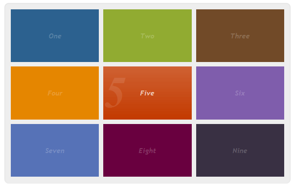
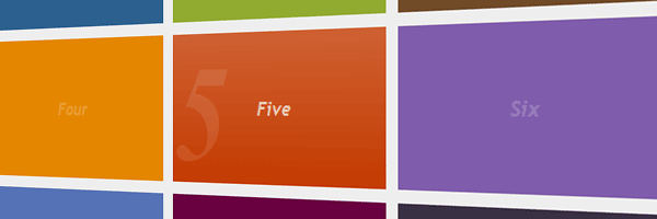
In this screenshot, you can see the fifth block hovered.
.menu .content{
  opacity: 0; display: none\9;
  overflow: hidden;
  font: 12px Arial, Helvetica;
  position: absolute;
  height: 120px; width: 200px;
  transition: all .3s ease-out;
}

.menu .expanded{
  opacity: .95; display: block\9;
  overflow: visible;
  padding: 40px;
  height: 300px; width: 540px; /* Cover the entire area */
}

.menu li:nth-child(3n) .content{ /* 3,6,9 */
  right: 0;
}

.menu li:nth-child(3n-1) .expanded{ /* 2,5,8 */
  left: 50%;
  margin-left: -310px;
}

.menu li:nth-child(7) .content, /* 7,8,9 */
.menu li:nth-child(8) .content,
.menu li:nth-child(9) .content{
  bottom: 0;
}

.menu li:nth-child(4) .expanded, /* 4,5,6 */
.menu li:nth-child(5) .expanded,
.menu li:nth-child(6) .expanded{
  margin-top: -190px;
  top: 50%;
}

/* -------------------------------- */

.menu .title{
  position: absolute;
  height: 100%; width: 100%;
  text-align: center;
  font: italic bold 1em/120px 'trebuchet MS', Arial, helvetica;
  opacity: .2;
}

.menu li:hover .title{
  opacity: .7;
}

/* -------------------------------- */

.menu .close {
  /*background: inherit;*/
  display: none;
  border: 5px solid #fff;
  color: #fff;
  cursor: pointer;
  height: 40px; width: 40px;
  font: bold 20px/40px arial, helvetica;
  position: absolute;
  text-align: center;
  top: -20px; right: -20px;
  border-radius: 40px;
}

.menu .cover .close{
  display: block;
}
The jQuery
Below you have the jQuery code, I think it’s quite easy to follow and understand:
(function(){

// Append a close trigger for each block
$('.menu .content').append('<span class="close">x</span>');

// Show window
function showContent(elem){
        hideContent();
  elem.find('.content').addClass('expanded');
  elem.addClass('cover');
}

// Reset all
function hideContent(){
  $('.menu .content').removeClass('expanded');
  $('.menu li').removeClass('cover');
}

// When a li is clicked, show its content window and position it above all
$('.menu li').click(function() {
  showContent($(this));
});

// When tabbing, show its content window using ENTER key
$('.menu li').keypress(function(e) {
  if (e.keyCode == 13) {
    showContent($(this));
  }
});

// When right upper close element is clicked  - reset all
$('.menu .close').click(function(e) {
  e.stopPropagation();
  hideContent();
});

// Also, when ESC key is pressed - reset all
$(document).keyup(function(e) {
  if (e.keyCode == 27) {
    hideContent();
  }
});

})();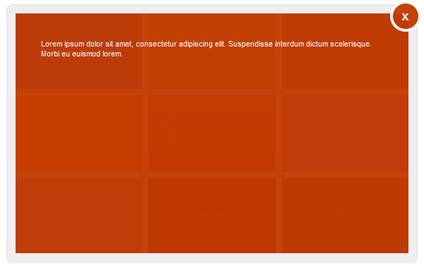
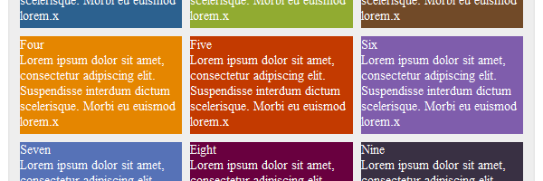
Visible content window for the fifth element.
Graceful degradation
Regarding opacity, due its lack of support for older browsers, you’ll need to use the display toggleing for IE Trident:
opacity: 0; display: none\9;      /* Initially hidden */
opacity: .95; display: block\9;   /* Expanded */
Other existing CSS3 stuff like transitions and gradients and just play nice where the support allows it.
Selectors
As you already noticed, we’ve used some CSS3 selectors that older browsers like IE8 and below do not support.
So, we need a solution that fixes the example for those browsers. In my opinion, the best solution in this case is to use the Selectivizr tool, as we’ve already included jQuery in our project. That’s because Selectivzr requires one of those JavaScript libraries: jQuery, MooTools, Prototype etc. in order to work.
<!--[if (gte IE 6)&(lte IE 8)]>
  <script src="selectivizr.js"></script>
<![endif]-->
Thoughts on accessibility
The cool part is that along with HTML5, the tabindex attribute can be used on any HTML element. We’ll be using that in our example to enable tabbing navigation: <li tabindex="1">.
I really wanted this example to be accessible via keyboard and I made it. When tabbing, you have the possibility to trigger a window by pressing the ENTER key and then close it by pressing the ESC key:
// ENTER
$('.menu li').keypress(function(e) {
  if (e.keyCode == 13) {
    showContent($(this));
  }
});

// ESC
$(document).keyup(function(e) {
  if (e.keyCode == 27) {
    hideContent();
  }
});
That’s it!
I hope you liked this article and I’m looking forward to read your thoughts about it. Thanks for reading!