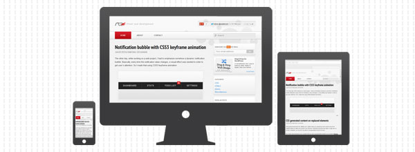
It’s been almost a month already since I launched this new responsive design and unfortunately I didn’t had much time to properly introduce it to you. This improved design is something I wanted to do for a long time and I’m glad I finally managed it. It’s simpler, minimal, responsive and I like to think that now the content is much easier to read (scan).
Characteristics
Below you can find some characteristics of the new responsive design:
-
This new HTML5 theme is based on Twenty Eleven from WordPress.
-
The search bar is now more visible and accessible, across all devices. Currently I use the default WordPress search but in the future I’m planning to use Google custom search for more accurate results.
-
In the upper right corner you can now find some social stuff. It’s kinda easier now for you to follow me on Twitter, like my Facebook page or +1 on Google+. For these, I’d recommend you Optimised async loading of cross-domain scripts.
-
I finally added a “phat” footer here which contains info about the articles and tutorials you may find here. Also, there’s a short list with places where you can find me on the web.
-
For the headings font, I’m using “PT Sans Narrow” from Google Web Fonts.
-
Last but not least, if you’re using Wordpress too, you should check W3 Total Cache. It does miracles.
Development tools
For sketching the layout I used the classic Photoshop from Adobe. Also, Adobe Shadow is another cool tool I used for testing the new layout.
When it comes about writing code editors, I think Sublime Text 2 and Notepad++ are simply the best.
Some of my goals
Next, I’m planning maybe to retinafy this website. I also need to chose a code syntax highlighter. I think Prettify will be my choice after all.
P.S. If you have spotted any bug or inconsistency, please let me know! :)