The other day, while working on a web project, I had to emphasize somehow a dynamic notification bubble. Basically, every time the notification value changes, a visual effect was needed in order to get user’s attention. So I made that using CSS3 keyframe animation.
The HTML
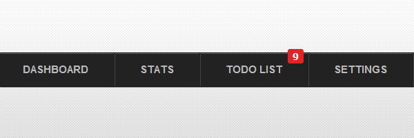
For this example, we’ll borrow the markup structure and look from my CSS3 dropdown menu.
<ul class="menu">
    <li><a href="">Dashboard</a></li>
    <li><a href="">Stats</a></li>
    <li>
        <a href="">
            Todo list
            <span class="bubble">9</span>
        </a>
    </li>
    <li><a href="">Settings</a></li>
</ul>
The focus will be on the <span class="bubble">, which is the notification bubble that will be animated.
The CSS
The .animating class represents an CSS3 animation that uses a bezier curve.
.animating{
    animation: animate 1s cubic-bezier(0,1,1,0);
}

@keyframes animate{
    from {
       transform: scale(1);
    }
    to {
       transform: scale(1.7);
    }
}
The jQuery
It’s not as easy as you might think to restart an animation and Chris Coyier wrote a good article about it.
The method I chose for this example involves using JavaScript’s setTimeout() method. So, every time the notification value changes, the .animating class is removed after a second (exactly how long the proper animation lasts).
In production, you will not need the counterValue variable. This is used just for our working example in order to be able to increment and decrement the notification value.
var counterValue = parseInt($('.bubble').html()); // Get the current bubble value

function removeAnimation(){
    setTimeout(function() {
        $('.bubble').removeClass('animating')
    }, 1000);
}

$('#decrease').on('click',function(){
    counterValue--; // decrement
    $('.bubble').html(counterValue).addClass('animating'); // animate it
    removeAnimation(); // remove CSS animating class
})

$('#increase').on('click',function(){
    counterValue++; // increment
    $('.bubble').html(counterValue).addClass('animating'); // animate it
        removeAnimation(); // remove CSS animating class
Simple, but effective
I think this is a simple and practical example on how to use a CSS3 animation to enhance user experience. Further, you can experiment with the bezier curve values and come up with some other cool effects.
Thanks for reading and looking forward to read your thoughts!