If you’re using WordPress, you surely have seen this spinner effect while performing various actions within the admin area. I liked it a lot and that’s the reason I made an SCSS version of it, posted a demo on CodePen and even it’s not rocket science, I pushed it on GitHub too.

People seem to love creating loading indicators and similar stuff, I’ve done it before as well, but lately, I’ve seen tons and tons of cool ones. Hopefully, this is just another one to bookmark.
Markup
The markup here is a single div element, but I bet you already hate this expression too. Also, the inner fallback text purpose is for the screen readers.
<div class="spinner">Loading...</div>Styles
On styling, perhaps the trickiest part was to compute the transform-origin values for the inner rotating circle so the result to be just perfect. And in order to achieve that, I had to simulate two concentric circles in order to establish the path (orbit) onto the inner circle will rotate. I must confess I failed the first time but in the end, everything went pretty well.
A lazy approach here would have been to rotate the whole wrapper, once the inner circle would have been positioned. But a solution like this one wouldn’t allow adding stuff like CSS shadows or gradients on the .spinner container.
  // Variables
  $circleDiam: 20px;
  $innerCircleDiam: $circleDiam/3;
  $rotatingCircleDiam: $circleDiam/5;

  $innerCirclePos: ($circleDiam - $innerCircleDiam)/2;
  $rotatingCirclePosLeft: ($circleDiam - $innerCircleDiam)/2 - $rotatingCircleDiam;
  $rotatingCirclePosTop: $circleDiam/2 - $rotatingCircleDiam/2;

  //The circle wrapper
  .spinner {
  text-indent: 999em;
  width: $circleDiam;
  height: $circleDiam;
  position: fixed;
  top: 50%; left: 50%;
  margin: -$circleDiam/2;
  background-color: #888;
  box-shadow: 0 2px 1px rgba(0,0,0,.3) inset;
  border-radius: 50%;

  // The inner, rotating circle
  &:after {
    content: '';
    position: absolute;
    top: $rotatingCirclePosTop;
    left: $rotatingCirclePosLeft;
    background-color: #fff;
    height: $rotatingCircleDiam;
    width: $rotatingCircleDiam;
    animation: spin 1s linear infinite;
    border-radius: 50%;
    transform-origin: $innerCirclePos/2 + $rotatingCircleDiam;
  }
  }

  // Spin it!
  @keyframes spin {
    100% { transform: rotate(360deg); }
  }
See the Pen SCSS spinner animation by Catalin Rosu (@catalinred) on CodePen.
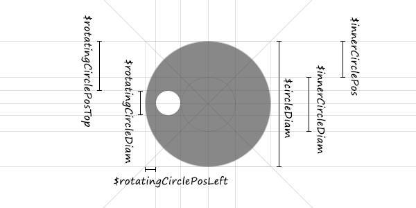
The sketch
The following rough sketch is meant to explain the above Sass variables and how they’re computed. At least that’s what it should be. :)
That’s it
I’m sure there’s plenty of room for improvements and enhancements, thus I’m listening to your ideas. You can view the live demo on CodePen, also feel free to fork it and play with it, the code is on GitHub too.