While working on this site, I tried to improve my email subscription box a little bit. The idea was to enable the action button only when the user types something in the email input. So I found a way to use :placeholder-shown CSS pseudo-class in an attempt to visually validate an input before form submission.
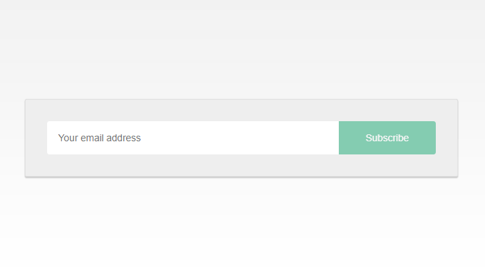
The result
See the Pen :placeholder-shown in action by Catalin Rosu (@catalinred) on CodePen.
:placeholder-shown
The :placeholder-shown CSS pseudo-class helps to make the distinction between form elements that are currently showing the placeholder attribute text versus those that aren’t.
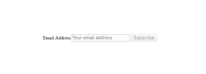
The clean HTML version
The submit button is enabled as you start typing within the text input.
I did use Tachyons for the CodePen demo, but that is completely optional. You can merely use the following markup:
  <form id="form">
    <label for="email">Email Address</label>
    <input placeholder="Your email address" type="email" id="email" required>
    <button type="submit" id="submit">Subscribe</button>
  </form>
Please note that to keep the markup simple, I used the weakest possible naming convention for my ID’s. Don’t do that in production, we have better naming conventions!
The CSS
To summarize, the next CSS selector says (from right to left): select the #submit element that has no focus and that is placed next to the #email element whose placeholder is shown.
  #email:placeholder-shown + #submit:not(:focus) {
    opacity: .5; /* fake the disabled state */
    pointer-events: none; /* disable mouse events */
  }
This CSS rule makes the submit button to look like a disabled one until the required email input is filled. Basically, the disabled state is visually faked with CSS rather than using native HTML disabled attribute.
Style the submit button to simulate the disabled state.
When it comes to keyboard tabbing, this trick might not be that effective so we avoid faking the disabled state when the #submit element is focused. This is basically what :not(:focus) is used for in the above selector.
Prevent any keyboard tabbing inconsistency.
:focus-within
While playing with the current demo, I thought about how the :focus-within can improve the form. In case you missed it, the :focus-within pseudo-class selects an element that has received focus or contains an element that has received focus.
It looks a bit like the CSS parent selector because it selects a parent element based on a child element, in this case the focused input.

Simple CSS drop shadow effect.
  #form:focus-within {
    box-shadow: 0 4px 6px rgba(0, 0, 0, .3);
    transform: translateY(-2px);
  }
That’s it
This solution doesn’t break the native form elements behavior of any kind, so I guess you can use this safely in order to add a small touch to your UX design with CSS only.
Feel free to play with the demo on CodePen and make sure you check the browser support too.