The title pretty much says it all. These days I was working on a small web project and while creating the so well known triangle effect using CSS borders I’ve noticed some rendering inconsistencies on Firefox I thought they were fixed by now.

Mozilla’s Firefox is one of the browsers that use anti-aliasing for CSS diagonal borders. But, there’s no problem at all with anti-aliasing for diagonal borders as long as the rendering is made accordingly. IE9 and IE10, the other browsers who use anti-aliasing, do it correctly but unfortunately at this time Firefox don’t.
First issue
I read and tweeted a while ago a good article by Chris Morgan where he explains how and why CSS’s “transparent” may not be transparent, especially on diagonal borders.
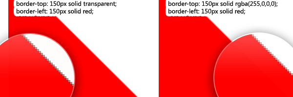
Let’s say you have the following CSS triangle made with:
div {
    border-top: 150px solid transparent;
    border-left: 150px solid red;
}
This is equivalent to:
/* red = rgba(255,0,0,0) */

div {
    border-top: 150px solid rgba(255,0,0,0);
    border-left: 150px solid red;
}
Workaround
So, to make it work nicely also in Firefox, you need to avoid the use of transparent value and use instead the appropriate RGB color with alpha = 0.
CSS tip
The transparent value is equivalent to rgba(0, 0, 0, 0).
Second issue
In my small project I was telling you earlier, I use an abstract block delimiter built with a CSS border triangle. The thing is that my block is quite large, as it’s meant to break two sections of a website.
Here’s the block delimiter example:
div {
    border-top: 70px solid rgba(0, 255, 0, 0);
    border-left: 600px solid green;
}
If you’re using Firefox, you can notice a blurry transition on the diagonals caused by the anti-aliasing. That’s quite annoying and the RGBA trick does not solve it.
My workaround
What does it is a dirty workaround I discovered while playing with it: -moz-transform: scale(.9999). Apparently, a small scaling is applied but visually you won’t see the difference. Also, technically you wouldn’t need the prefix for this transformation as Firefox support it unprefixed since version 16.
But, since this is a Firefox only hack, I think using the prefixed version is a good idea.
div {
    border-top: 70px solid rgba(0, 255, 0, 0);
    border-left: 600px solid green;
    -moz-transform: scale(.9999);
}
Firefox testing
Bad behavior on:
- Mozilla Firefox 17.0.1
- Mozilla Firefox 18.0 - beta channel
- Aurora 19.0a2 (2012-12-06)
As far as I tested, it seems that this behavior is fixed on Mozilla Firefox Nightly 20.0a1. So that’s really good news, even if we’ll have to wait a bit until Mozilla Firefox release hits that version.
That’s it
If you’re like me and like all these CSS small thingies, then you’ll enjoy this article. Don’t hesitate to leave a comment and thanks for reading!
P.S. Even if I wrote before that Firefox doesn’t allow cross-domain fonts, I still love Firefox because it’s the only one, at this time, that allows animations for CSS pseudo elements. Hopefully, the other browsers will catch up eventually.