Ever since I started working for one of my CSS breadcrumbs example, I thought about writing this tutorial. In this article, I will use a similar technique in order to create some good looking CSS3 tabs.
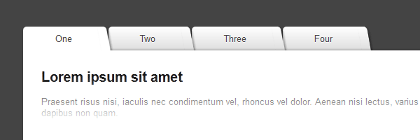
While in my previous CSS3 tabs tutorial I tried to simulate some beveled corners for the tabs, this time I will show you how to create folder tabs using nothing more than pure CSS3.
The HTML
The markup is self-explanatory. While the After reading your comments, I decided to update the title attributes might seem to be extra, in this case, they are needed for the jQuery stuff.title attribute with name. This way, you will avoid seeing unnecessary tooltip when hovering on the tabs.
<ul id="tabs">
    <li><a href="#" name="tab1">One</a></li>
    <li><a href="#" name="tab2">Two</a></li>
    <li><a href="#" name="tab3">Three</a></li>
    <li><a href="#" name="tab4">Four</a></li>
</ul>

<div id="content">
    <div id="tab1">...</div>
    <div id="tab2">...</div>
    <div id="tab3">...</div>
    <div id="tab4">...</div>
</div>
So, here are the ingredients:
#tabs- an unordered list that holds the tab navigation items.#content- a wrapper for each tab content.
The CSS
Below you’ll find the CSS lines necessary for creating these tabs. Also, the demo source contains all the prefixed CSS3 properties.
#tabs {
overflow: hidden;
width: 100%;
margin: 0;
padding: 0;
list-style: none;
}
#tabs li {
float: left;
margin: 0 .5em 0 0;
}
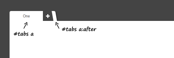
#tabs a {
position: relative;
background: #ddd;
background-image: linear-gradient(to bottom, #fff, #ddd);
padding: .7em 3.5em;
float: left;
text-decoration: none;
color: #444;
text-shadow: 0 1px 0 rgba(255,255,255,.8);
border-radius: 5px 0 0 0;
box-shadow: 0 2px 2px rgba(0,0,0,.4);
}
#tabs a:hover,
#tabs a:hover::after,
#tabs a:focus,
#tabs a:focus::after {
background: #fff;
}
#tabs a:focus {
outline: 0;
}
#tabs a::after {
content:'';
position:absolute;
z-index: 1;
top: 0;
right: -.5em;
bottom: 0;
width: 1em;
background: #ddd;
background-image: linear-gradient(to bottom, #fff, #ddd);
box-shadow: 2px 2px 2px rgba(0,0,0,.4);
transform: skew(10deg);
border-radius: 0 5px 0 0;
}
#tabs #current a,
#tabs #current a::after {
background: #fff;
z-index: 3;
}
#content {
background: #fff;
padding: 2em;
height: 220px;
position: relative;
z-index: 2;
border-radius: 0 5px 5px 5px;
box-shadow: 0 -2px 3px -2px rgba(0, 0, 0, .5);
}The jQuery
There is nothing to add here, it’s similar to my previous tabs article.
<script src="https://code.jquery.com/jquery-1.7.2.min.js"></script>
<script>
$(document).ready(function() {
    $("#content").find("[id^='tab']").hide(); // Hide all content
    $("#tabs li:first").attr("id","current"); // Activate the first tab
    $("#content #tab1").fadeIn(); // Show first tab's content

    $('#tabs a').click(function(e) {
        e.preventDefault();
        if ($(this).closest("li").attr("id") == "current"){ //detection for current tab
         return;
        }
        else{
          $("#content").find("[id^='tab']").hide(); // Hide all content
          $("#tabs li").attr("id",""); //Reset id's
          $(this).parent().attr("id","current"); // Activate this
          $('#' + $(this).attr('name')).fadeIn(); // Show content for the current tab
        }
    });
});
</script>
Again, I updated a bit the above code to add detection when clicking on the current tab. Now, everything should be just fine. Thanks for your suggestions!
The end (of this tutorial)
This is just another small example that shows the CSS3 awesomeness. Everything is great also for older browsers, the tabs degrade nice.
So, having said that, I hope you liked this article and thanks for reading it!
Update
I just updated the jQuery code a bit in order to fix the nested div’s issues. Now everything should be just fine. Good luck with coding!