If you’re about to launch a new web product or you just need to improve the user experience for an existing web form, then this tutorial is for you.
In this article you’ll find out how to design a clean and attractive CSS3 signup form.
In the past, I have designed some sign in forms, but never a signup form. So, to get the job completely done, I decided to write this article.
The HTML
Here’s how the markup looks like for this signup form:
<form id="signup">
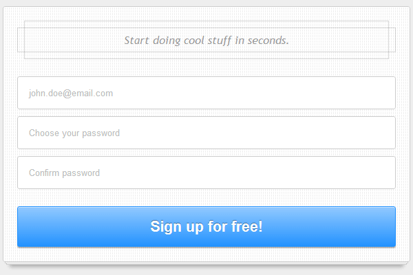
<h1>Start doing cool stuff in seconds.</h1>
<input type="email" placeholder="[email protected]" required="">
<input type="password" placeholder="Choose your password" required="">
<input type="password" placeholder="Confirm password" required="">
<button type="submit">Sign up for free!</button>
</form>For this example, I decided to use a buttton instead of the classic input type="submit". This way, further, it will be a lot easier to target the form’s elements (without adding any id’s or classes).
Placeholder polyfill
You can easily notice the new HTML5 stuff like type="email", placeholder or required. For the placeholder attribute, we’ll add a HTML5 polyfill that will simulate its effect for older browsers.
In this example, we’ll be using Mathias Bynens’s Placeholder jQuery plugin. That’s a very cool one and it’s highly recommended.
The CSS
As usual, I’ll list below the styles used for this example. Prefixed properties are missing here, but you can find them in the demo page source.
Form styles
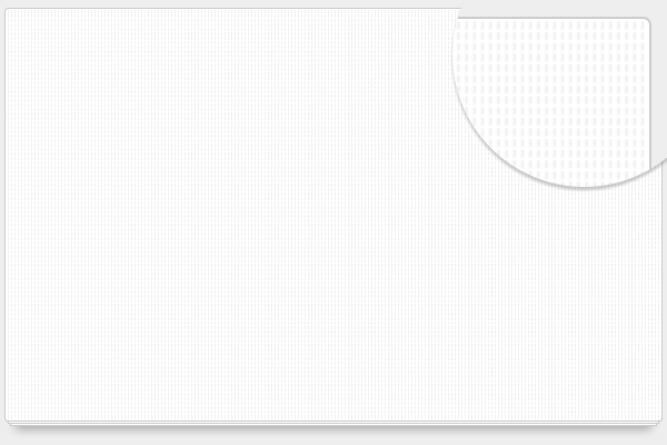
After I created a simple 3x4 image pattern, I converted it into a base64 string. To do that, I used this wonderful Image to Base64 Converter tool. You can see it in the styles as a background for #signup.
Regarding the paper stack effect, this time we’re using the ::before and ::after pseudo-elements to do that. Here’s one of my previous articles where I used a similar technique.
#signup {
    width: 550px;
    height: 330px;
    margin: 100px auto 50px auto;
    padding: 20px;
    position: relative;
    background: #fff url(data:image/png;base64,iVBORw0K[...]CYII=);
    border: 1px solid #ccc;
    border-radius: 3px;
}

#signup::before,
#signup::after {
    content: "";
    position: absolute;
    bottom: -3px;
    left: 2px;
    right: 2px;
    top: 0;
    z-index: -1;
    background: #fff;
    border: 1px solid #ccc;
}

#signup::after {
    left: 4px;
    right: 4px;
    bottom: -5px;
    z-index: -2;
    box-shadow: 0 8px 8px -5px rgba(0,0,0,.3);
}
Heading
I tried to create a nice and abstract design for the form’s heading, so here’s my result:

#signup h1 {
    position: relative;
    font: italic 1em/3.5em 'trebuchet MS',Arial, Helvetica;
    color: #999;
    text-align: center;
    margin: 0 0 20px;
}

#signup h1::before,
#signup h1::after{
    content:'';
    position: absolute;
    border: 1px solid rgba(0,0,0,.15);
    top: 10px;
    bottom: 10px;
    left: 0;
    right: 0;
}

#signup h1::after{
    top: 0;
    bottom: 0;
    left: 10px;
    right: 10px;
}
Using pseudo-elements (again) :)
Form elements
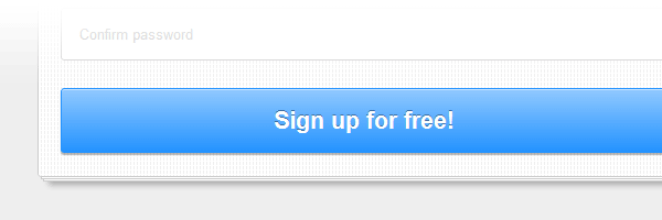
Not so much to say here. For the submit button, please notice the gradient transition workaround.
::-webkit-input-placeholder {
   color: #bbb;
}

:-moz-placeholder {
   color: #bbb;
}

.placeholder{
    color: #bbb; /* polyfill */
}

#signup input{
    margin: 5px 0;
    padding: 15px;
    width: 100%;
    *width: 518px; /* IE7 and below */
    box-sizing: border-box;
    border: 1px solid #ccc;
    border-radius: 3px;
}

#signup input:focus{
        outline: 0;
        border-color: #aaa;
    box-shadow: 0 2px 1px rgba(0, 0, 0, .3) inset;
}

#signup button{
    margin: 20px 0 0 0;
    padding: 15px 8px;
    width: 100%;
    cursor: pointer;
    border: 1px solid #2493FF;
    overflow: visible;
    display: inline-block;
    color: #fff;
    font: bold 1.4em arial, helvetica;
    text-shadow: 0 -1px 0 rgba(0,0,0,.4);
    background-color: #2493ff;
    background-image: linear-gradient(top, rgba(255,255,255,.5), rgba(255,255,255,0));
    transition: background-color .2s ease-out;
    border-radius: 3px;
    box-shadow: 0 2px 1px rgba(0, 0, 0, .3),
                0 1px 0 rgba(255, 255, 255, .5) inset;
}

#signup button:hover{
    background-color: #7cbfff;
        border-color: #7cbfff;
}

#signup button:active{
    position: relative;
    top: 3px;
    text-shadow: none;
    box-shadow: 0 1px 0 rgba(255, 255, 255, .3) inset;
}
That’s it!
I’m aware that this example does not contain revolutionary techniques, but neither shouldn’t. The possibilities are endless when it comes about web forms styling, as long as you follow up the best and recommended practices.
This is just another cool example created using CSS3’s great power. I hope you will find it useful for your projects, and please don’t forget to leave a comment if you liked it (or not). :)