We already know that CSS3 has the ability to create a lot of new possibilities to design and implement better web forms. Also, HTML5 has its important role when it comes about creating more usable forms, without actually needing any Javascript code.
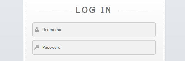
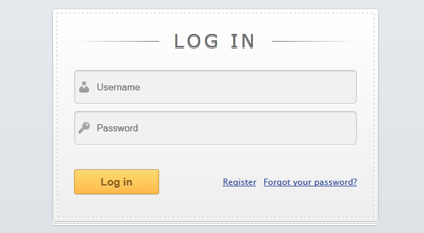
Knowing that, check out the below preview to see the login form we’re going to create in this article:
Markup
<form id="login">
    <h1>Log In</h1>
    <fieldset id="inputs">
        <input id="username" type="text" placeholder="Username" autofocus required>
        <input id="password" type="password" placeholder="Password" required>
    </fieldset>
    <fieldset id="actions">
        <input type="submit" id="submit" value="Log in">
        <a href="">Forgot your password?</a><a href="">Register</a>
    </fieldset>
</form>
The HTML5 stuff
New HTML5 attributes descriptions, according to latest specifications:
-
placeholder - A short hint (one word or a short phrase) intended to aid the user when entering data into the control represented by its element.
-
required - Specifies that the element is a required part of form submission.
-
autofocus - Specifies that the element represents a control to which a UA is meant to give focus as soon as the document is loaded.
-
type=”password” - Specifies that its input element is a one-line plain-text edit control for entering a password. (not HTML5 specific)
The CSS
For this article, I will not paste the whole lines here. Instead, I’ll just add the ones who help creating some cool effects.
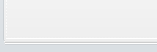
Paper stack effect
Box-shadow will help us creating this nice effect by defining multiple shadows that actually overlap.
#login {
box-shadow: 0 0 2px rgba(0, 0, 0, 0.2),
0 1px 1px rgba(0, 0, 0, .2),
0 3px 0 #fff,
0 4px 0 rgba(0, 0, 0, .2),
0 6px 0 #fff,
0 7px 0 rgba(0, 0, 0, .2);
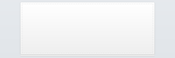
}Stitch effect
This effect is added using pseudo-elements. Using pseudo-elements helps you avoid extra markup and this is a perfect example: keep the markup clean and let the CSS do the magic.
#login {
position: absolute;
z-index: 0;
}
#login:before {
content: '';
position: absolute;
z-index: -1;
border: 1px dashed #ccc;
top: 5px;
bottom: 5px;
left: 5px;
right: 5px;
box-shadow: 0 0 0 1px #fff;
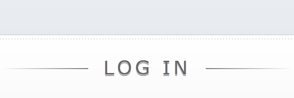
}Subtle gradient lines
I’ve first seen this effect on Gene Locklin’s page and I thought this is pretty cool. So, I decided to use it for highlighting the “Log in” heading. Using pseudo-elements (again) and CSS3 gradients some cool lines are added to simulate a strikeout effect.
h1 {
    text-shadow: 0 1px 0 rgba(255, 255, 255, .7), 0px 2px 0 rgba(0, 0, 0, .5);
    text-transform: uppercase;
    text-align: center;
    color: #666;
    margin: 0 0 30px 0;
    letter-spacing: 4px;
    font: normal 26px/1 Verdana, Helvetica;
    position: relative;
}

h1:after,
h1:before {
    background-color: #777;
    content: "";
    height: 1px;
    position: absolute;
    top: 15px;
    width: 120px;
}

h1:after {
    right: 0;
}

h1:before {
    background-image: linear-gradient(right, #777, #fff);
    left: 0;
}
The final result
Using the above techniques, here’s the final result:
Conclusion
This login form looks very well also on older browsers, as you can see below:
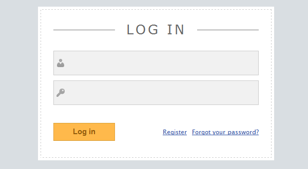
Internet Explorer 8 screenshot.
As a future improvement, you can add also HTML5 placeholder fallback as you have seen in one of my previous articles.