One of the elements most frequently used by websites is probably the search box. If you want to improve user experience in a simple way, and make it easy to search and find content for your users, then you have to add a search form on your website.
So, today we’re going to cover how to style a search form using the most exciting CSS3 features.
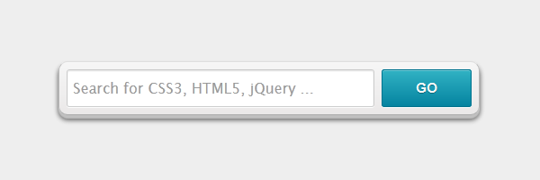
You’ve already seen before how to create a cool CSS3 search box and now you’ll see how can you create the above CSS3 search form with 3D look using CSS3 box-shadow.
The markup
Below you’ll find the HTML used for this search form. Note the HTML5-specific placeholder and required attributes.
While I initially wished to use the HTML5’s type="search" for the search input, I gave up because of cross browser inconsistency. For now, apparently you need to add some extra CSS lines to override the defaults.
<form class="form-wrapper">
    <input type="text" id="search" placeholder="Search for CSS3, HTML5, jQuery ..." required>
    <input type="submit" value="go" id="submit">
</form>
The CSS
Here are the minimal styles used to create this beautiful CSS3 search form:
.form-wrapper {
    width: 450px;
    padding: 8px;
    margin: 100px auto;
    overflow: hidden;
    border-width: 1px;
    border-style: solid;
    border-color: #dedede #bababa #aaa #bababa;
    box-shadow: 0 3px 3px rgba(255,255,255,.1), 0 3px 0 #bbb, 0 4px 0 #aaa, 0 5px 5px #444;
    border-radius: 10px;
    background-color: #f6f6f6;
    background-image: linear-gradient(top, #f6f6f6, #eae8e8);
}

.form-wrapper #search {
    width: 330px;
    height: 20px;
    padding: 10px 5px;
    float: left;
    font: bold 16px 'lucida sans', 'trebuchet MS', 'Tahoma';
    border: 1px solid #ccc;
    box-shadow: 0 1px 1px #ddd inset, 0 1px 0 #fff;
    border-radius: 3px;
}

.form-wrapper #search:focus {
    outline: 0;
    border-color: #aaa;
    box-shadow: 0 1px 1px #bbb inset;
}

.form-wrapper #search::-webkit-input-placeholder {
   color: #999;
   font-weight: normal;
}

.form-wrapper #search:-moz-placeholder {
    color: #999;
    font-weight: normal;
}

.form-wrapper #search:-ms-input-placeholder {
    color: #999;
    font-weight: normal;
}

.form-wrapper #submit {
    float: right;
    border: 1px solid #00748f;
    height: 42px;
    width: 100px;
    padding: 0;
    cursor: pointer;
    font: bold 15px Arial, Helvetica;
    color: #fafafa;
    text-transform: uppercase;
    background-color: #0483a0;
    background-image: linear-gradient(top, #31b2c3, #0483a0);
    -moz-border-radius: 3px;
    -webkit-border-radius: 3px;
    border-radius: 3px;
    text-shadow: 0 1px 0 rgba(0, 0 ,0, .3);
    box-shadow: 0 1px 0 rgba(255, 255, 255, 0.3) inset, 0 1px 0 #fff;
}

.form-wrapper #submit:hover,
.form-wrapper #submit:focus {
    background-color: #31b2c3;
    background-image: linear-gradient(top, #0483a0, #31b2c3);
}

.form-wrapper #submit:active {
    outline: 0;
    box-shadow: 0 1px 4px rgba(0, 0, 0, 0.5) inset;
}

.form-wrapper #submit::-moz-focus-inner {
    border: 0;
}
Browser support
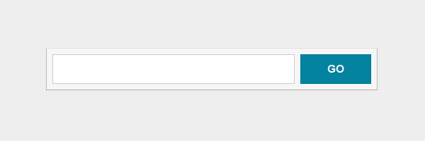
Below you can find some screenshots with the search form. You’ll notice that it degrades really nice across older browsers. I would add that this CSS3 search form is a ready-to-use one.
Modern browsers like Chrome, Firefox, Safari, Opera, IE10:
Please note that, at this time, Opera supports the HTML5 placeholder attribute but is not styleable for now.
A good news is that Internet Explorer 10 will also support the HTML5 placeholder.
IE trident (IE6/IE7/IE8):
Conclusion
If you read my previous articles, then you already know that here we’re doing stuff that works (with or without fallbacks) across all browsers. Also, this example is not an exception.
Besides using this CSS3 form to create a searchbox, you could easily adapt this for a signup form or for a email subscription form.
Feel free to use this CSS3 search form in your projects and please let me know your thoughts!