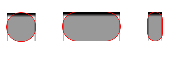
In my previous article, border, border-radius and CSS box-shadow properties were used to create a cool search box. As you may know, when using all these together, a well-known Chrome bug is triggered.
Although this bug was fixed in the latest Chrome beta releases, below you’ll see the strange (may I call it like that?) or should I better say different behavior:

Following one of my reader’s comment on how to create a CSS3 search box, I made a quick investigation and here is what I noticed.
After downloading the latest Chrome beta version (10.0.648.119 in this case), I’ve also noticed that my search box example (now updated) doesn’t looks well neither on this version (as it should look).
The normal behavior
Here’s what you need to make a perfect circle:
#circle {
    width: 100px;
    height: 100px;
    border-radius: 50px;
    background: #999
}
Note that you don’t need border-radius: 100px for that, just half of it. Here’s a CSS3 circle example with 50px radius.

Bug fixed
    #circle {
        width: 100px;
        height: 100px;
        background: #999;
        border: 2px solid red;
        border-radius: 52px;
        box-shadow: 0 10px 10px #000 inset;
    }
Check also the example - if you have the BETA Chrome version.
The strange behavior
This happens when you use for example:
#circle {
    width: 100px;
    height: 100px;
    background: #999;
    border: 2px solid red;
    border-radius: 100px;
    box-shadow: 0 10px 10px #000 inset;
}
Here’s the live example - again: you must have BETA Chrome version.
So, the problem (re-) appears only when the radius value is greater than half-width or half-height. If the box will have also some padding, plus the borders, height, width… Hm, should you always re-calculate the radius?! Do you get my point? :)
In order to avoid this type of situation, I think you should always be allowed to set a higher border-radius value - as a backup.
“Statement”
I love Google Chrome browser, as I also love the other modern browsers. The purpose of this article is about how to make things better, as I share the idea that reporting bugs is a web developer’s responsibility.
Conclusion
I suppose this is also a bug? Don’t you think so? Please let me know your opinions about this subject! Meanwhile, I think I’ll report this as a bug to the Google Chrome browser project.
Update
Tested also on Chrome 11.0.672.2 (Dev) version. The result is OK, any higher border-radius value is allowed without causing any problem.