Users log in every day on the web, so imagine how many times login forms are being used in a single day. Usually, it doesn’t take too much to fill a form like this, but using a dropdown solution will speed up things for you.
In this article, you will see how to create a good looking dropdown login form using CSS3 and a bit of jQuery.
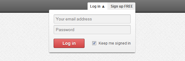
The dropdown login form concept
The main purpose is to avoid waiting to load a separate page in order to log in. This way you can increase user experience, as the user has the possibility to log in immediately.
Ingredients
Remember the CSS3 buttons we’ve created using HTML entities as icons? In this article we’ll use entities again to show an arrow that indicates the current state for our dropdown login box: expanded or collapsed.
Comparing to the latest HTML5 & CSS3 login tutorial you’ve seen here, this one uses some jQuery code to animate the box when clicking on the login button.
Also, HTML5 new form features do not miss here.
The login box HTML
Here’s the markup we’ll use to create our CSS3 dropdown login form box:
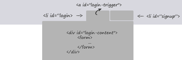
  <nav>
    <ul>
      <li id="login">
        <a id="login-trigger" href="#">
          Log in <span>▼</span>
        </a>
        <div id="login-content">
          <form>
            <fieldset id="inputs">
              <input  id="username"
                      type="email"
                      name="Email"
                      placeholder="Your email address"
                      required>
              <input  id="password"
                      type="password"
                      name="Password"
                      placeholder="Password"
                      required>
            </fieldset>
            <fieldset id="actions">
              <input  type="submit"
                      id="submit"
                      value="Log in">
              <label>
                <input  type="checkbox"
                        checked="checked">
                Keep me signed in
              </label>
            </fieldset>
          </form>
        </div>
      </li>
      <li id="signup">
        <a href="">Sign up FREE</a>
      </li>
    </ul>
  </nav>
The login box CSS
There are quite a lot of CSS lines, but I think is worth it:
  nav ul {
    margin: 0;
    padding: 0;
    list-style: none;
    position: relative;
    float: right;
    background: #eee;
    border-bottom: 1px solid #fff;
    border-radius: 3px;
  }

  nav li {
    float: left;
  }

  nav #login {
    border-right: 1px solid #ddd;
    box-shadow: 1px 0 0 #fff;
  }

  nav #login-trigger,
  nav #signup a {
    display: inline-block;
    *display: inline;
    *zoom: 1;
    height: 25px;
    line-height: 25px;
    font-weight: bold;
    padding: 0 8px;
    text-decoration: none;
    color: #444;
    text-shadow: 0 1px 0 #fff;
  }

  nav #signup a {
    border-radius: 0 3px 3px 0;
  }

  nav #login-trigger {
    border-radius: 3px 0 0 3px;
  }

  nav #login-trigger:hover,
  nav #login .active,
  nav #signup a:hover {
    background: #fff;
  }

  nav #login-content {
    display: none;
    position: absolute;
    top: 24px;
    right: 0;
    z-index: 999;
    background: #fff;
    background-image: linear-gradient(top, #fff, #eee);
    padding: 15px;
    box-shadow: 0 2px 2px -1px rgba(0,0,0,.9);
    border-radius: 3px 0 3px 3px;
  }

  nav li #login-content {
    right: 0;
    width: 250px;
  }

  #inputs input {
    background: #f1f1f1;
    padding: 6px 5px;
    margin: 0 0 5px 0;
    width: 238px;
    border: 1px solid #ccc;
    border-radius: 3px;
    box-shadow: 0 1px 1px #ccc inset;
  }

  #inputs input:focus {
    background-color: #fff;
    border-color: #e8c291;
    outline: none;
    box-shadow: 0 0 0 1px #e8c291 inset;
  }

  #login #actions {
    margin: 10px 0 0 0;
  }

  #login #submit {
    background-color: #d14545;
    background-image: linear-gradient(top, #e97171, #d14545);
    border-radius: 3px;
    text-shadow: 0 1px 0 rgba(0,0,0,.5);
    box-shadow: 0 0 1px rgba(0, 0, 0, 0.3),
                0 1px 0 rgba(255, 255, 255, 0.3) inset;
    border: 1px solid #7e1515;
    float: left;
    height: 30px;
    padding: 0;
    width: 100px;
    cursor: pointer;
    font: bold 14px Arial, Helvetica;
    color: #fff;
  }

  #login #submit:hover,
  #login #submit:focus {
    background-color: #e97171;
    background-image: linear-gradient(top, #d14545, #e97171);
  }

  #login #submit:active {
    outline: none;
    box-shadow: 0 1px 4px rgba(0, 0, 0, 0.5) inset;
  }

  #login label {
    float: right;
    line-height: 30px;
  }

  #login label input {
    position: relative;
    top: 2px;
    right: 2px;
  }
The login box jQuery code
The following code is quite self-explanatory. The if…else statement helps us indicate the current state for the login box. It basically toggle the span’s inner HTML between ▲ and ▼.
  $(document).ready(function(){
    $('#login-trigger').click(function(){
      $(this).next('#login-content').slideToggle();
      $(this).toggleClass('active');

      if ($(this).hasClass('active')) $(this).find('span').html('▲')
        else $(this).find('span').html('▼')
      })
  });
That’s it!
I hope you enjoyed this tutorial, thanks for reading!