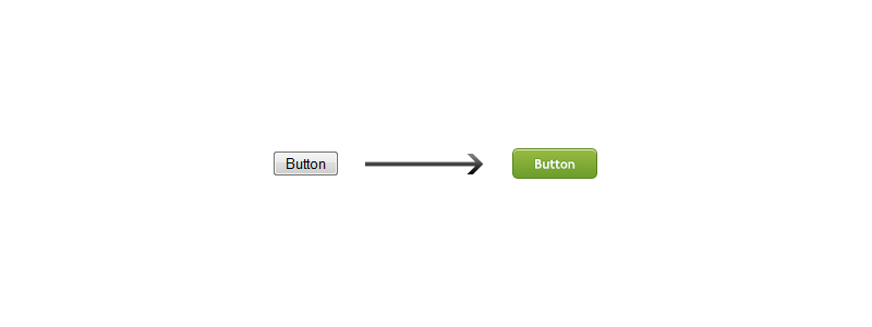
I assume there was at least one time when you wanted to add more appeal to an HTML input button and at that moment you didn’t know how to do it. We all know how boring looks an input when we use it without styling it and that’s why today I will show you a way to get rid of this old-style input.

For the beginning here is how a non-styled input looks like:
When styling and input button, we have two alternatives, to style it using only CSS with pout a background image, or using a custom background image.
Style an input button using CSS only
First, add a class or an id to your button. For this tutorial we will add an id because we do not intend to use this kind of button several times into a page:
Now let’s add some styles for the id:
#btn {
  border: 1px solid #777;
  background: #6e9e2d;
  color: #fff;
  font: bold 11px 'Trebuchet MS';
  padding: 4px;
  cursor: pointer;
  -moz-border-radius: 4px;
  -webkit-border-radius: 4px;
}
Conclusion
The final result looks like the image below, note that border-radius actually is working only on latest Firefox, Chrome and Safari.

That’s it, I hope you’ll find it useful!
Update
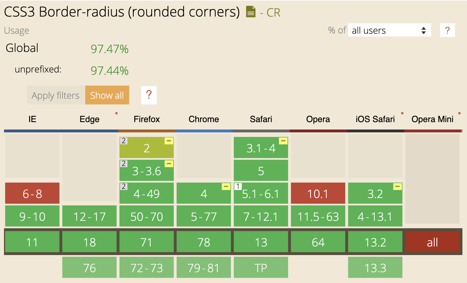
Lots have changed since this article was first published, including making the border corners round using border-radius support:

Check out below the current native HTML buttons and see their usage in this HTML study I made on milions of homepages from top twenty Google results:
buttoninput[type=image]input[type=button]
Also, speaking of styling buttons, here are some recent articles I wrote on CSS buttons:
If you want to dig more into best practices when it comes to buttons, check out these modern frameworks and libraries and see how they approach building and styling buttons: