You’ve seen progress bars everywhere, they are those bars that display the current completion state for a process, such as a download or a file transfer. Whether you’re building a desktop or a web application, at a certain point, you may need to use this UI element.
Having said that, in this article, you’ll learn how to create stylish and animated progress bars using CSS3.
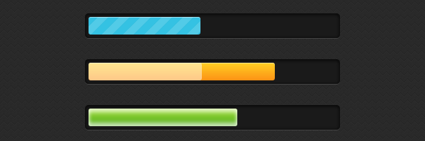
The progress bar markup
The markup could not be simpler than that:
<div class="progress-bar blue stripes">
<span style="width: 40%"></span>
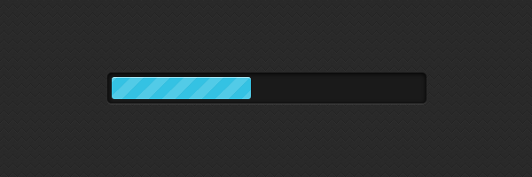
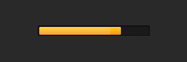
</div>.progress-bar- defines the general styles for our progress bar..blue- in this case, the.blueCSS class adds a blue style for the progress bar..stripes- animation type for the current progress bar.span- this will help you fill the progress bar. An inline setwidthwill help you specify thefillstate.
The progress bar CSS
General styles for the CSS3 progress bar and filled area:
  .progress-bar {
    background-color: #1a1a1a;
    height: 25px;
    padding: 5px;
    width: 350px;
    margin: 50px 0;
    border-radius: 5px;
    box-shadow: 0 1px 5px #000 inset, 0 1px 0 #444;
  }

  .progress-bar span {
    display: inline-block;
    height: 100%;
    border-radius: 3px;
    box-shadow: 0 1px 0 rgba(255, 255, 255, .5) inset;
    transition: width .4s ease-in-out;
  }
Let’s add some color and gradients:
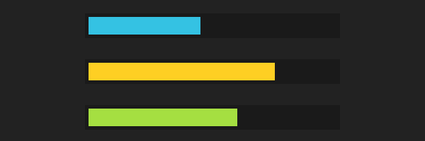
.blue span {
background-color: #34c2e3;
}
.orange span {
background-color: #fecf23;
background-image: linear-gradient(top, #fecf23, #fd9215);
}
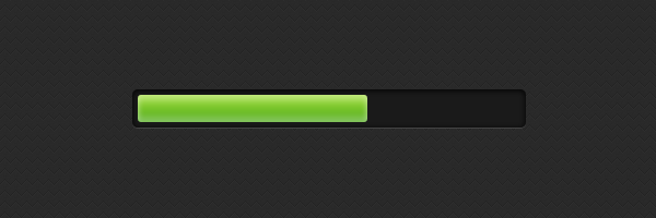
.green span {
background-color: #a5df41;
background-image: linear-gradient(top, #a5df41, #4ca916);
}CSS gradient stripes
You may have seen this CSS3 technique before, I just adapted it a little for this example:
  .stripes span {
    background-size: 30px 30px;
    background-image: linear-gradient(135deg, rgba(255, 255, 255, .15) 25%,
                      transparent 25%,
                      transparent 50%, rgba(255, 255, 255, .15) 50%, rgba(255, 255, 255, .15) 75%,
                      transparent 75%, transparent);
    animation: animate-stripes 3s linear infinite;
  }

  @keyframes animate-stripes {
    0% {
      background-position: 0 0;
    }
    100% {
      background-position: 60px 0;
    }
  }
Shining effect
Not sure if this is the best name I could find for this CSS3 animation, but here we go:
  .shine span {
    position: relative;
  }

  .shine span::after {
    content: '';
    opacity: 0;
    position: absolute;
    top: 0;
    right: 0;
    bottom: 0;
    left: 0;
    background: #fff;
    border-radius: 3px;
    animation: animate-shine 2s ease-out infinite;
  }

  @keyframes animate-shine {
    0% {
      opacity: 0;
      width: 0;
    }
    50% {
      opacity: .5;
    }
    100% {
      opacity: 0;
      width: 95%;
    }
  }
This CSS3 progress bar example uses an CSS3 ::after pseudo-element which animates. Currently, animating generated content with CSS3 is available only on latest Firefox browsers. I hope that soon it will be better support for that.
Glow effect
CSS3 keyframes animation based on box-shadow property:
.glow span {
  box-shadow: 0 5px 5px rgba(255, 255, 255, .7) inset,
              0 -5px 5px rgba(255, 255, 255, .7) inset;
  animation: animate-glow 1s ease-out infinite;
}

@keyframes animate-glow {
  0% {
    box-shadow: 0 5px 5px rgba(255, 255, 255, .7) inset,
                0 -5px 5px rgba(255, 255, 255, .7) inset;
  }
  50% {
    box-shadow: 0 5px 5px rgba(255, 255, 255, .3) inset,
                0 -5px 5px rgba(255, 255, 255, .3) inset;
  }
  100% {
    box-shadow: 0 5px 5px rgba(255, 255, 255, .7) inset,
                0 -5px 5px rgba(255, 255, 255, .7) inset;
  }
}
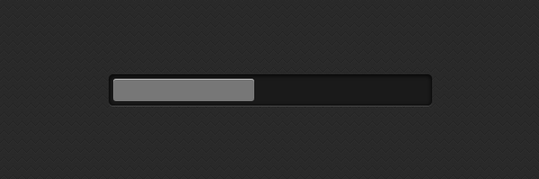
Hey, what about older browsers?
The progress bars look pretty well thanks to graceful degradation.
That’s all!
For further web development, to achieve the result you wish for, you just need to play with JavaScript or jQuery to change the span’s width value for these progress bars.
I hope you liked this tutorial, please feel free to share your thoughts. Thanks for reading!
Update
I just added some jQuery to the demo page. So, now you can also play with progress bars’ values.