Whether you’re designing a website or a web application, you’ll need custom styles for the HTML headings like h1 or h2. In this article, you’ll learn how to create some cool headings effects using CSS pseudo-elements.

Introduction
So, why pseudo-elements? The answer is very simple: there is no need to add extra markup. This fits perfectly for the HTML headings we’re going to create here.
The HTML
<h1 class="headline1">I took lessons</h1>As you can see above, there is no rocket science here. Just a simple HTML heading with a CSS class that will properly style it. All the other headings use a similar HTML structure, so it can’t easier than that.
<link href='http://fonts.googleapis.com/css?family=Droid+Sans:700' rel='stylesheet'>Also, for this demo, we’ll use a Google custom font.
The CSS
Further, we’ll use the body as our main wrapper:
  body {
    width: 60%;
    margin: 50px auto;
    padding: 15px;
    position: relative; /*needed for heading4 rule*/
    z-index: 0; /* again, just for heading4 rule*/
    border: 7px solid #cecece;
    border: 7px solid rgba(0,0,0,.05);
    background: #fff;
    background-clip: padding-box;
    box-shadow: 0 0 2px rgba(0, 0, 0, .5);
  }

  h1 {
    font-family: 'Droid Sans', sans-serif;
    font-size: 22px;
  }
Noticed the background-clip: padding-box CSS declaration? This will help you achieve a cool effect: transparent borders for the main wrapper. Basically, the CSS [background-clip](https://developer.mozilla.org/en-US/docs/Web/CSS/background-clip) property specifies whether an element’s background, either the color or image, extends underneath its border.
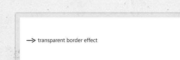
_Browser support for background-clip: Safari 5+, Chrome 7+, Firefox 3.6+, Opera 10+, IE 9+ _
Left-bordered heading
Below is a simple and good looking effect made using the CSS border property:
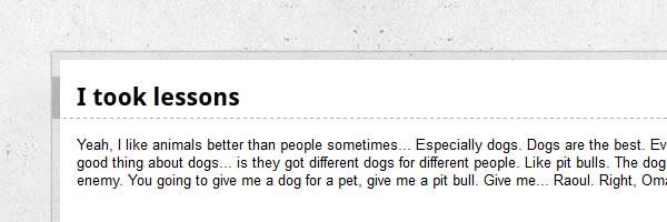
  .headline1 {
    border-bottom: 1px dashed #aaa;
    border-left: 7px solid #aaa;
    border-left: 7px solid rgba(0,0,0,.2);
    margin: 0 -15px 15px -22px;
    padding: 5px 15px;
  }
Chat border heading
This style is made using an CSS triangle shape:
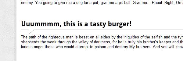
  .headline2 {
    border-bottom: 1px solid #aaa;
    margin: 15px 0;
    padding: 5px 0;
    position: relative;
  }

  .headline2:before,
  .headline2:after {
    content: '';
    border-right: 20px solid #fff;
    border-top: 15px solid #aaa;
    bottom: -15px;
    position: absolute;
    left: 25px;
  }

  .headline2:after {
    border-top-color: #fff;
    border-right-color: transparent;
    bottom: -13px;
    left: 26px;
  }
Ribbon heading
The below HTML heading style is created using the CSS ribbon effect:
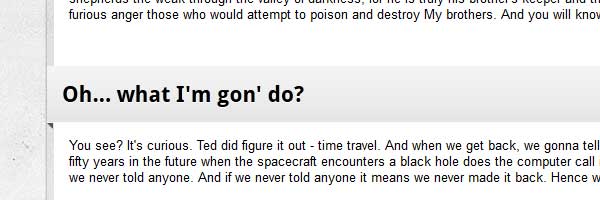
  .headline3 {
    position: relative;
    margin-left: -22px; /* 15px padding + 7px border ribbon shadow*/
    margin-right: -22px;
    padding: 15px;
    background: #e5e5e5;
    background: linear-gradient(#f5f5f5, #e5e5e5);
    box-shadow: 0 -1px 0 rgba(255,255,255,.8) inset;
    text-shadow: 0 1px 0 #fff;
  }

  .headline3:before,
  .headline3:after {
    position: absolute;
    left: 0;
    bottom: -6px;
    content:'';
    border-top: 6px solid #555;
    border-left: 6px solid transparent;
  }

  .headline3:before {
    border-top: 6px solid #555;
    border-right: 6px solid transparent;
    border-left: none;
    left: auto;
    right: 0;
    bottom: -6px;
  }
Headline 4
Using box-shadow, you can create some slick effects:
  .headline4 {
    position: relative;
    border-color: #eee;
    border-style: solid;
    border-width: 5px 5px 5px 0;
    background: #fff;
    margin: 0 0 15px -15px;
    padding: 5px 15px;
    box-shadow: 1px 1px 1px rgba(0,0,0,.3);
  }

  .headline4:after {
    content: "";
    position: absolute;
    z-index: -1;
    bottom: 15px;
    right: 15px;
    width: 70%;
    height: 10px;
    background: rgba(0, 0, 0, .7);
    box-shadow: 0 15px 10px rgba(0, 0, 0, .7);
    transform: rotate(2deg);
  }
That’s it!
I hope you liked the headings examples, and if you have some other cool ones to add, feel free to share your thoughts with me. Thanks for reading this!