There’s no need to explain what a tooltip is and you already know that using tooltips can help you increase usability. Therefore, in this article we’ll concentrate just on the practical side.
So, today you’ll learn how to create awesome CSS3 & jQuery tooltips.
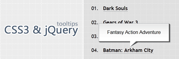
You may already read my previous CSS3 tooltips tutorial, but this time we’ll use some jQuery and HTML5 data-* attributes for our tooltips.
The major advantages of these tooltips are:
- the simplicity to use (as you’ll see below)
- they are animated using CSS3
The HTML
As you can see below, thanks to the new HTML5 custom data attributes, our tooltip structure looks as clean as possible:
<b data-tooltip="Fantasy Action Adventure">Batman: Arkham City</b>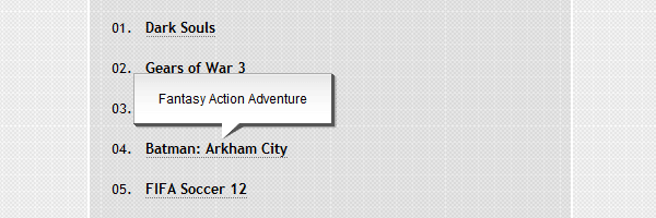
The CSS
Here are the styles used in order to create this 3D looking tooltip:
.tooltip {
    position: relative;
    display: inline-block;
    cursor: help;
    white-space: nowrap;
    border-bottom: 1px dotted #777;
}

.tooltip-content {
    opacity: 0;
    visibility: hidden;
    font: 12px Arial, Helvetica;
    text-align: center;
    border-color: #aaa #555 #555 #aaa;
    border-style: solid;
    border-width: 1px;
    width: 150px;
    padding: 15px;
    position: absolute;
    bottom: 40px;
    left: 50%;
    margin-left: -76px;
    background-color: #fff;
    background-image: linear-gradient(rgba(0,0,0,.1), rgba(255,255,255,0));
    box-shadow: 1px 1px 0 #555,
                2px 2px 0 #555,
                3px 3px 1px rgba(0, 0, 0, .3),
                0   1px 0   rgba(255,255,255, .5) inset;
    transition: bottom .2s ease, opacity .2s ease;
    }

.tooltip-content:after,
.tooltip-content:before {
    border-right: 16px solid transparent;
    border-top: 15px solid #fff;
    bottom: -15px;
    content: "";
    position: absolute;
    left: 50%;
    margin-left: -10px;
}

.tooltip-content:before {
    border-right-width: 25px;
    border-top-color: #555;
    border-top-width: 15px;
    bottom: -15px;
}

.tooltip:hover .tooltip-content{
    opacity: 1;
    visibility: visible;
    bottom: 30px;
}
The jQuery
Basically, the jQuery code does all the “dirty” job for you. Using the HTML5 data-tooltip attribute value, it appends a new HTML node: <span class="tooltip-content"> which will be animated using CSS3.
$(document).ready(function(){
$('[data-tooltip]').addClass('tooltip');
$('.tooltip').each(function() {
$(this).append('<span class="tooltip-content">' + $(this).attr('data-tooltip') + '</span>');
});
if ($.browser.msie && $.browser.version.substr(0,1)<7)
{
$('.tooltip').mouseover(function(){
$(this).children('.tooltip-content').css('visibility','visible');
}).mouseout(function(){
$(this).children('.tooltip-content').css('visibility','hidden');
})
}
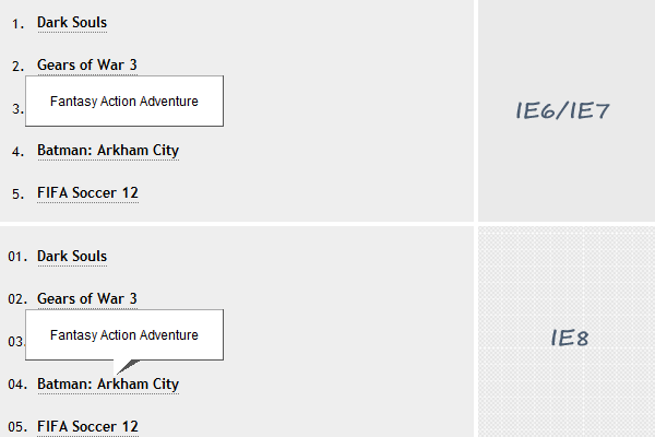
});IE6 gets some extra treatment, as you can see above.
Browser support
As usual, this demo also works across all major browsers:
That’s all
I hope that you enjoyed this tutorial and if you have any comments or questions feel free to add them below. Thanks for reading!