Nowadays, contact forms can be found everywhere. To attract visitors’ attention, you need a cool CSS3 contact form, with a catchy look, one that your visitor would love to fill.
In this article you’ll learn how to create a nice CSS3 contact form using also some HTML5 features.
First of all
What’s so cool about this CSS3 contact form? There are so many others CSS3 contact form examples in the wild, why another one?
I’d say that, with CSS3, there are endless possibilities to create a contact form and this article is just about how to design a cool envelope style contact form.
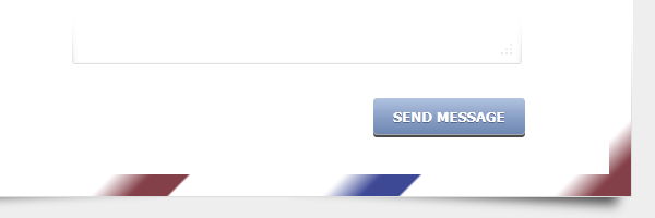
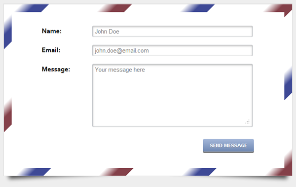 Contact form preview
HTML structure
<div id="form-wrapper">
    <form>
        <div id="form-inner">

            <label for="name">Name:</label>
            <input type="text" class="input" id="name" placeholder="John Doe">

            <label for="email">Email:</label>
            <input type="email" class="input" id="email" placeholder="[email protected]">

            <label for="message">Message:</label>
            <textarea class="input textarea" id="message" placeholder="Your message here"></textarea>

             <input type="submit" class="button" value="Send message">

        </div>
    </form>
</div>
The extra form-wrapper and form-inner ids are necessary for upcoming CSS styling.
Instead adding CSS classes for each form element, I could have used advanced CSS selectors like input[type="text"]. But, for this demo, I just wanted to look decent on IE6. If you don’t give a damn about older browsers like IE6, feel free to simplify your HTML and CSS code.
The for attribute for the HTML label element does not miss here. Its purpose is to increase usability.
HTML5
The HTML5 feature used for this CSS3 contact form is the placeholder attribute. This is perhaps one of the coolest HTML5 new stuff. For browsers that do not support this new feature, check one of my previous articles to see how to create placeholder fallback using Jquery.
The placeholder attribute represents a short hint (a word or short phrase) intended to aid the user with data entry.
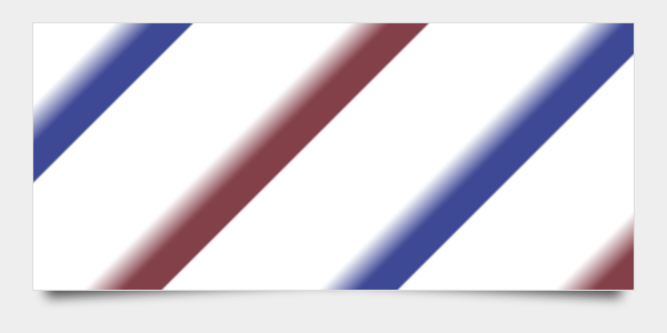
The layout
Using cool CSS3 box shadow and gradient effects , we’ll create a contact form with envelope look. Below you can see the initial CSS styling:
#form-wrapper {
width: 700px;
height: 400px;
margin: 0 auto;
padding: 20px;
position: relative;
border: 1px solid #ddd;
background-color: #fff;
background-image: repeating-linear-gradient
(135deg,#844049,#844049,
#fff 50px, #fff 150px,
#3e4996 100px, #3e4996,
#fff 200px, #fff 300px);
}
#form-wrapper:before, #form-wrapper:after {
z-index: -1;
position: absolute;
content: "";
bottom: 15px;
left: 10px;
width: 50%;
top: 80%;
max-width:300px;
background: rgba(0, 0, 0, 0.7);
box-shadow: 0 15px 10px rgba(0, 0, 0, 0.7);
transform: rotate(-3deg);
}
#form-wrapper:after {
transform: rotate(3deg);
right: 10px;
left: auto;
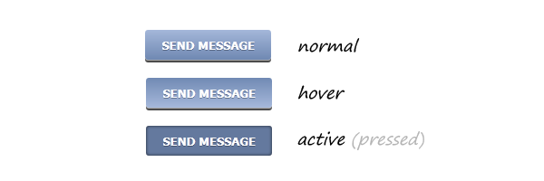
}The button
Below you have a beautiful CSS3 button, no images as you probably guessed:
CSS
#form-wrapper .button {
    float: right;
    margin: 10px 0 0 0;
    padding: 7px 15px;
    cursor: pointer;
    color: #fff;
    font: bold 13px Tahoma, Verdana, Arial;
    text-transform: uppercase;
    overflow: visible; /* IE6/7 fix */
    border: 0;
    background-color: #7089b3;
    background-image: linear-gradient(#a5b8da, #7089b3);
    border-radius: 3px;
    text-shadow: 0 1px 0 rgba(0,0,0,.3);
    box-shadow: 0 1px 0 rgba(255, 255, 255, 0.5), 0 3px 0 rgba(0, 0, 0, 0.7);
}

#form-wrapper .button:hover {
    background-color: #a5b8da;
    background-image: linear-gradient(#7089b3, #a5b8da);
}

#form-wrapper .button:active {
    background: #64799e;
    position: relative;
    top: 2px;
    box-shadow: 0 0 3px rgba(0, 0, 0, 0.7) inset;
}
Final words
This CSS3 contact form is awesome. Period. I hope you all agree with me and thanks for reading this article.