Hey there, this is my first post on 2012 and today you’ll learn how to create a simple and clean CSS3 menu in just a few steps.
I know, there are so many CSS3 menu tutorials in the wild (including here on RTD) but I hope you will love this one also.
CSS3 menu tutorials
Below is a list with other CSS3 menu articles you may have read here:
- Sexy CSS3 menu
- CSS3 animated dropdown menu
- Cool CSS3 navigation menu
- Vertical dropdown menu with CSS3 and jQuery
The idea
The idea for this CSS3 navigation menu came to me while seeing a similar button styling in the wild. Usually, when I see design stuff on the internet, I try to image how can I make it using CSS3. I think this a professional habit.
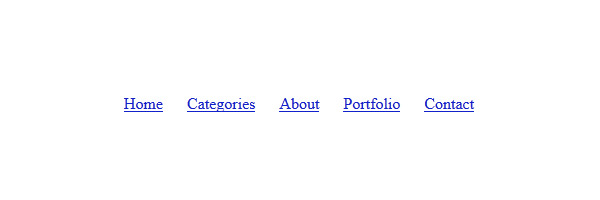
The HTML
Check the markup below, simple and effective:
<nav>
    <ul>
        <li><a href="">Home</a></li>
        <li><a href="">Categories</a></li>
        <li><a href="">About</a></li>
        <li><a href="">Portfolio</a></li>
        <li><a href="">Contact</a></li>
    </ul>
</nav>
Also, do not forget to include the following snippet when using HTML5 specific tags like nav:
<!--[if lt IE 9]>
    <script src="http://html5shim.googlecode.com/svn/trunk/html5.js"></script>
<![endif]-->
The CSS
The following lines do not contain the vendor-specific properties like -moz- or -webkit-. From now on, I think this is how I’ll present the CSS in my articles. Just keep in mind that you can always find the full code in the demo page source.
Step 1
To be short: reset the margin and padding for the unordered list, also center align the inline-block list elements:

nav{
    width: 960px;
    margin: 80px auto;
    text-align: center;
}

nav ul{
    margin: 0;
    padding: 0;
}
Step 2
For the menu elements, instead using float I chose the inline-block alternative. If you want to find out more about inline-block pros and cons, I’d recommend Robert Nyman’s article: CSS display: inline-block: why it rocks, and why it sucks.
nav li{
    margin: 0 10px; /* Add some horizontal spacing */
    display: inline-block;
    *display: inline;  /* IE7 and below */
    zoom: 1;
}
Step 3
Using cool CSS3 properties like gradients and shadows we’re going to style the anchor elements:
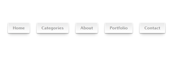
nav a{
    display: inline-block;
    position: relative;
    padding: 8px 15px;
    border: 2px solid #fff;
    text-decoration: none;
    color: #999;
    font: bold 14px 'Lucida sans', Arial, Helvetica;
    background-color: #eaeaea;
    background-image: linear-gradient(top, #eaeaea, #fff);
    border-radius: 3px;
    box-shadow: 0 1px 1px rgba(0, 0, 0, .05) inset,
                0 0 1px 0 rgba(0, 0, 0, .2),
                0 2px 2px rgba(0, 0, 0, .3),
                0 10px 10px -5px rgba(0, 0, 0, .2);
}

nav a:hover{
    background-color: #eee;
    background-image: linear-gradient(top, #eee, #fff);
}

nav a:active{
        top: 1px; /* Simulate the push button effect */
    background: #f5f5f5;
    box-shadow: 0 1px 1px rgba(0, 0, 0, .05) inset,
                0 0 1px 0px rgba(0, 0, 0, .2),
                0 1px 2px rgba(0, 0, 0, .3);
}
Step 4
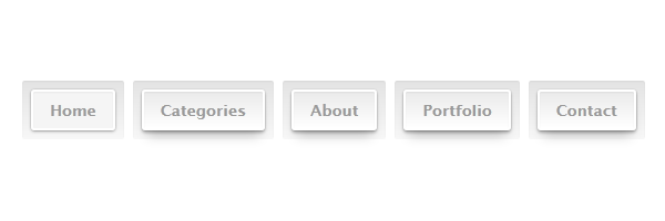
The below is the most interesting part, in my opinion. Without, adding any extra markup and using a pseudo-element you will be able to create a cool effect:
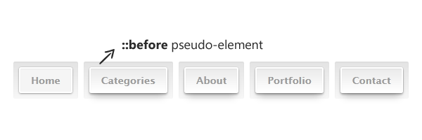
nav a::before{
    content: '';
    position: absolute;
    top: -10px;
    right: -10px;
    bottom: -10px;
    left: -10px;
    z-index: -1;
    background-color: #e3e3e3;
    background-image: linear-gradient(top, #e3e3e3, #f7f7f7);
    border-radius: 2px;
    box-shadow: 0 1px 1px rgba(0,0,0,.05) inset;
}

nav a:active::before{
    top: -11px; /* Hey you, don't move! */
}
That’s it!
I hope you enjoyed this article and I’m looking forward to hear your thoughts about it. Thanks for reading!