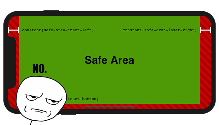
Upon the iPhone X release, I did enjoy the jokes and memes on Jony Ive and his notch haircut, or how to implement a scrolling list that shifts to avoid the notch. Those were funny. But the below excerpt from latest WebKit post on “Designing websites for iPhone X” isn’t.
… selectively apply padding to elements that contain important content, in order to ensure that they are not obscured by the shape of the screen.

It happens pretty often to encounter situations when you don’t like a default style for an HTML element. The methodology that has proven to be reliable over time is to use the so-called CSS utility classes. Their purpose is to allow you to quickly make HTML class adjustments until the result looks just right.
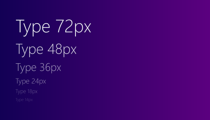
In this article, we’ll try to walk through the naming conventions that various frameworks and design systems use when it comes to typography, especially headings sizing.

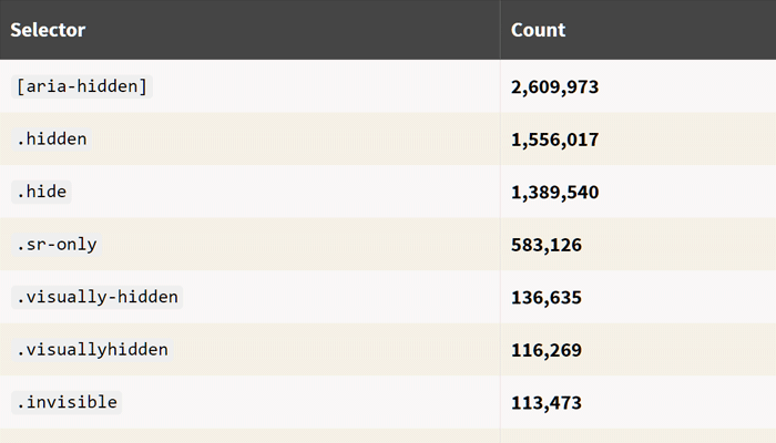
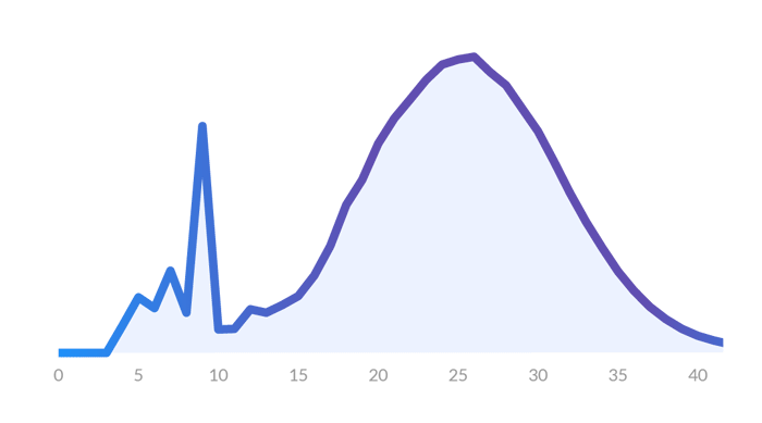
Last time, we saw how the average web page looks like using data from about 8 million websites. So I wrote another guest post for CSS-Tricks that aims to showcase some random and hopefully interesting facts on markup usage.

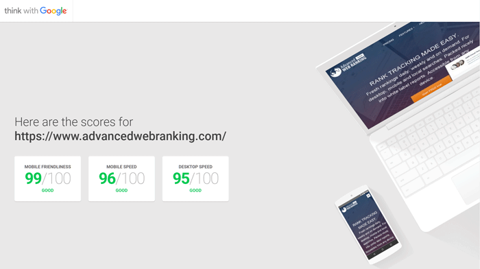
Last month we’ve launched the new Advanced Web Ranking website and I wrote some lines on how we did it. It’s mostly about the workflow and tools that helped us in order to achieve a faster and more accessible website.

Yaaay! I wrote my very first article for CSS-Tricks. It’s based on a HTML study I made with my colleagues at AWRCloud, a study about the average web page, after analyzing 8 million websites.

Yeah I know the title is a cliche but I just couldn’t help it. Everyone could be a little better, but the thing is that some people don’t even try.

If you’d ask me what I’ve been up lately, I’d say: working, reading, learning - pretty much just like you, I guess. The thing is it’s been a while since I wrote something here and my first article this year is about AWRstudyr, a Chrome extension I’ve been working lately and it’s something I’ve put lots of effort into it.

I’ve wanted to write this article for some time now, and this time I made it.
It’s been a while since doing web design isn’t just like making stuff nice in Photoshop and then pass it to somebody else to slice it and deliver. In the meantime, designers have learned to code and nowadays, being a good web designer means to have the ability to combine your design skills with things like usability and accessibility knowledge in order to deliver the best user experience. Oh, and I almost forgot about SEO - you really need to know to handle your markup so that search engines like you.

There are a lot of great icon packs in the wild, but if you’re particularly looking for some SEO icons like stats, analytics, rankings or localization then you may want a bit more diversity to choose from.

You know Unicode characters, those glyphs we’re inserting most of times via HTML or CSS in order to add a soft touch to our buttons, form controls and so on. Well, if you’re using Firefox on Windows 8.1, then you should check the newly colored Unicode characters in your web pages.

