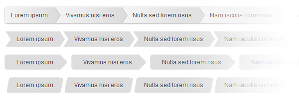
A breadcrumb navigation or breadcrumbs allows users to know where they are in a hierarchical structure and navigate back to higher-level pages in the hierarchy. Also, the breadcrumb navigation can reduce the number of actions a user needs to perform in order to navigate back.
To keep it simple, if you have a website with a lot of pages and sub-levels, in order to increase the usability for your content, you need to use breadcrumbs.
Having said that, in this article, you will learn how to create a CSS breadcrumb navigation with CSS pseudo-elements.

Whether you’re designing a website or a web application, you’ll need custom styles for the HTML headings like h1 or h2. In this article, you’ll learn how to create some cool headings effects using CSS pseudo-elements.

Hey there, this is my first post on 2012 and today you’ll learn how to create a simple and clean CSS3 menu in just a few steps.

I think 2011 was a great year for me. I published quite many articles here and just to recap some of my best content, here are my top 10 of 2011:

You can now create stunning animations with CSS3. But, I bet you know that. The keyword when it comes about CSS3 animations is the CSS3 @keyframes rule and in this article you will learn how to create an awesome CSS3 animated header using it.

On the “CSS4” term, you should know that there is no such thing as CSS4. Also, the term “CSS3” refers to everything published after CSS 2.1.
You may already know that, when speaking about web development, CSS3 and HTML5 are the two main buzz words. This matter might change in the future because, almost two months ago, the latest CSS Selectors Level 4 Working Draft was released by the World Wide Web Consortium (W3C).
In this article you’ll find out some interesting stuff about the new CSS4 selectors.

When designing a pricing table for a product or service, your job as a web designer/developer is to make sure that the table is easy to understand, intuitive and clear. This way, you will help users to choose the best plan for theirs needs.
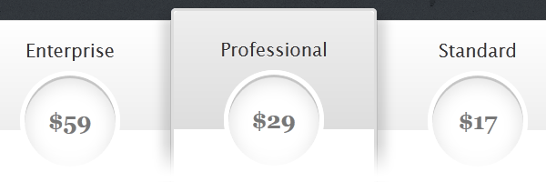
So, in this article you’ll learn how to build an awesome CSS3 pricing table, with no images and minimal HTML markup.

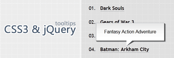
There’s no need to explain what a tooltip is and you already know that using tooltips can help you increase usability. Therefore, in this article we’ll concentrate just on the practical side.
So, today you’ll learn how to create awesome CSS3 & jQuery tooltips.

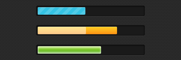
You’ve seen progress bars everywhere, they are those bars that display the current completion state for a process, such as a download or a file transfer. Whether you’re building a desktop or a web application, at a certain point, you may need to use this UI element.
Having said that, in this article, you’ll learn how to create stylish and animated progress bars using CSS3.

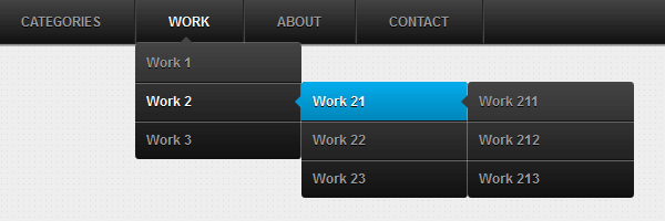
It’s a sure thing that CSS3 features like transitions, animations and transforms can add extra spice to your designs. In this article, you will see how you can build a CSS3 dropdown menu that appears using a small animation when the user hovers over an element with the cursor.
